Chapter 2 Description
Description provides quantitative summary of the acquired data sample. These quantitative summaries are termed descriptive statistics or descriptive estimators and are usually broken down into two main categories: measures of central tendency, and measures of spread / dispersion. The stance taken in this book is that descriptive statistics involve all quantitative summaries (or aggregates) that are used to describe data without making predictive or causal claims. For example, linear regression between two variables can be used as a descriptive tool if the aim is to measure linear association between two variables, but it can be also used in predictive and causal tasks. Effect sizes such as change, percent change or Cohen's d represent descriptive statistics used to compare two or more groups, and are commonly used in causal tasks to estimate average causal effect of the treatment.
To provide further explanation of the descriptive statistics, three common descriptive tasks in sport science are given as examples: (1) comparing two independent groups, (2) comparing two dependent groups, (3) measuring association between two variables.
2.1 Comparing two independent groups
Imagine we carried collection of body height measurements and we obtained N=100 observations using N=50 female and N=50 male subjects. Collected data is visualized in Figure 2.1.
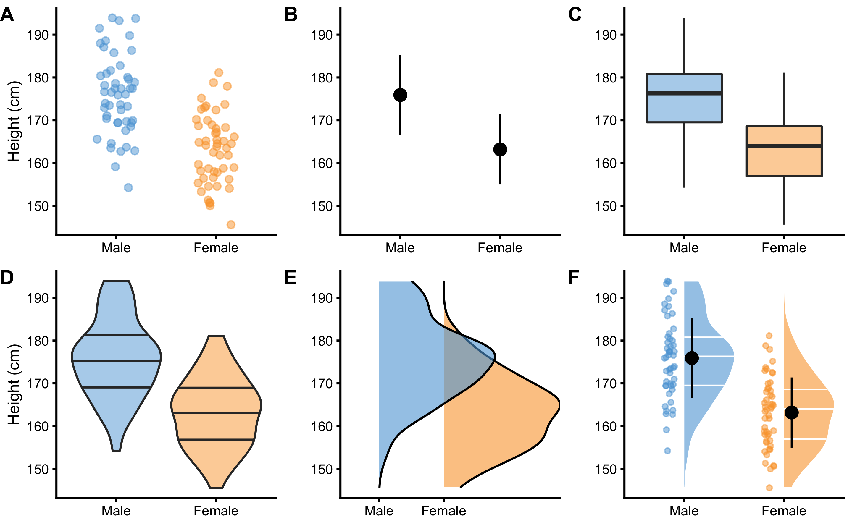
Figure 2.1: Common techniques to visualize independent groups observations. Before any analysis takes place, it is always a good practice to visualize the data first. Ideally, we want to visualize the complete data set, rather than only provide descriptive summaries, such as means. A. Simple scatter-plot with jitter to avoid overlap between the points. B. Mean and standard deviation as error bars. C. Box-plot. Horizontal line represents median, or 50th percentile, whereas boxes represent 25th and 75th percentile. Vertical lines usually represent min and max, although they can extend up to 1.5xIQR (inter-quartile range) with point outside of that interval plotted as outliers. D. Violin plots representing double-side density plots with 25th, 50th and 75th percentile lines. E. Density plots indicating sample distribution. F. Raincloud plot (5,6) which combine kernel density plots as clouds with accompanying 25th, 50th and 75th percentile lines, mean±SD error bars and jittered points as rain
Commonly provided descriptive statistics for each group can be found in the Table 2.1. Mean, median and mode are common measures of central tendencies. Standard deviation (SD), median absolute difference (MAD), inter-quartile range (IQR), min, max and range are common measures of spread or dispersion. Percent coefficient of variation (% CV) is also a measure of dispersion, but standardized1 which allows comparison of variables that are on different scales. Skewness (skew) is usually described as a measure of a symmetry. A perfectly symmetrical data set will have a skewness of 0. Kurtosis measures the tail-heaviness of the distribution. More in depth discussion of descriptive estimators, particularly robust estimators (161,198–200) is beyond the topic of this short overview.
| Estimator | Male | Female |
|---|---|---|
| n | 50.00 | 50.00 |
| mean (cm) | 175.90 | 163.18 |
| SD (cm) | 9.32 | 8.20 |
| % CV | 5.30 | 5.02 |
| median (cm) | 176.30 | 164.00 |
| MAD (cm) | 9.52 | 8.86 |
| IQR (cm) | 11.24 | 11.67 |
| mode (cm) | 176.26 | 164.94 |
| min (cm) | 154.24 | 145.59 |
| max (cm) | 193.90 | 181.12 |
| range (cm) | 39.66 | 35.53 |
| skew | 0.08 | 0.08 |
| kurtosis | -0.53 | -0.69 |
2.1.1 Sample mean as the simplest statistical model
In the Introduction of this book, statistical models are defined as “Small Worlds” or simplifications of the complex and uncertain reality. From this perspective, sample mean can be considered the simplest statistical model. With this estimator we are representing all of the data points with one quantitative summary (i.e. aggregate). However, how do we choose an estimate that represents the sample the best? Estimate that has the minimal error is selected as the optimal representative. Error is defined using a loss function that penalizes difference between the model estimate or prediction (\(\hat{y_i}\)) and observations (\(y_i\)) (Equation (2.1)). The difference between model prediction (\(\hat{y_i}\)) and observations (\(y_i\)) is called residual.
\[\begin{equation} Loss \: function = f(observed, predicted) \tag{2.1} \end{equation}\]
Two most common loss functions are absolute loss (also referred to as \(L1\)) (Equation (2.2)) and quadratic loss (also referred to as squared errors or \(L2\)) (Equation (2.3)). Please refer to section Sample mean as the simplest predictive model in Prediction chapter for more examples.
\[\begin{equation} absolute \: loss = \mid{\hat{y_i} - y_i\mid} \tag{2.2} \end{equation}\]
\[\begin{equation} quadratic \: loss = (\hat{y_i} - y_i)^2 \tag{2.3} \end{equation}\]
Cost function is an aggregate of the loss function (Equation (2.4)).
\[\begin{equation} Cost \: function = f(Loss \: function (observed, predicted)) \tag{2.4} \end{equation}\]
Since loss function is defined on a data point (i.e. \(y_i\)), we need to aggregate losses into a single metric. This is done with a cost function, usually using sum or mean.
One such cost function is root-mean-square-error (RMSE) (Equation (2.5)). RMSE takes the square root of the mean of the quadratic loss (note the \((\hat{y_i} - y_i)^2\) in the RMSE equation, which represent quadratic loss). RMSE thus represents a measure of the model fit, or how good the model fits the data. Lower RMSE means lower error and thus a better fit.
\[\begin{equation} RMSE = \sqrt{\frac{1}{n}\Sigma_{i=1}^{n}(\hat{y_i} - y_i)^2} \tag{2.5} \end{equation}\]
By using body height data from the female group, we can search for a body height estimate that minimizes the RMSE (Figure 2.2). That body height estimate would be considered the best representative of the sample, and thus the simplest statistical model.
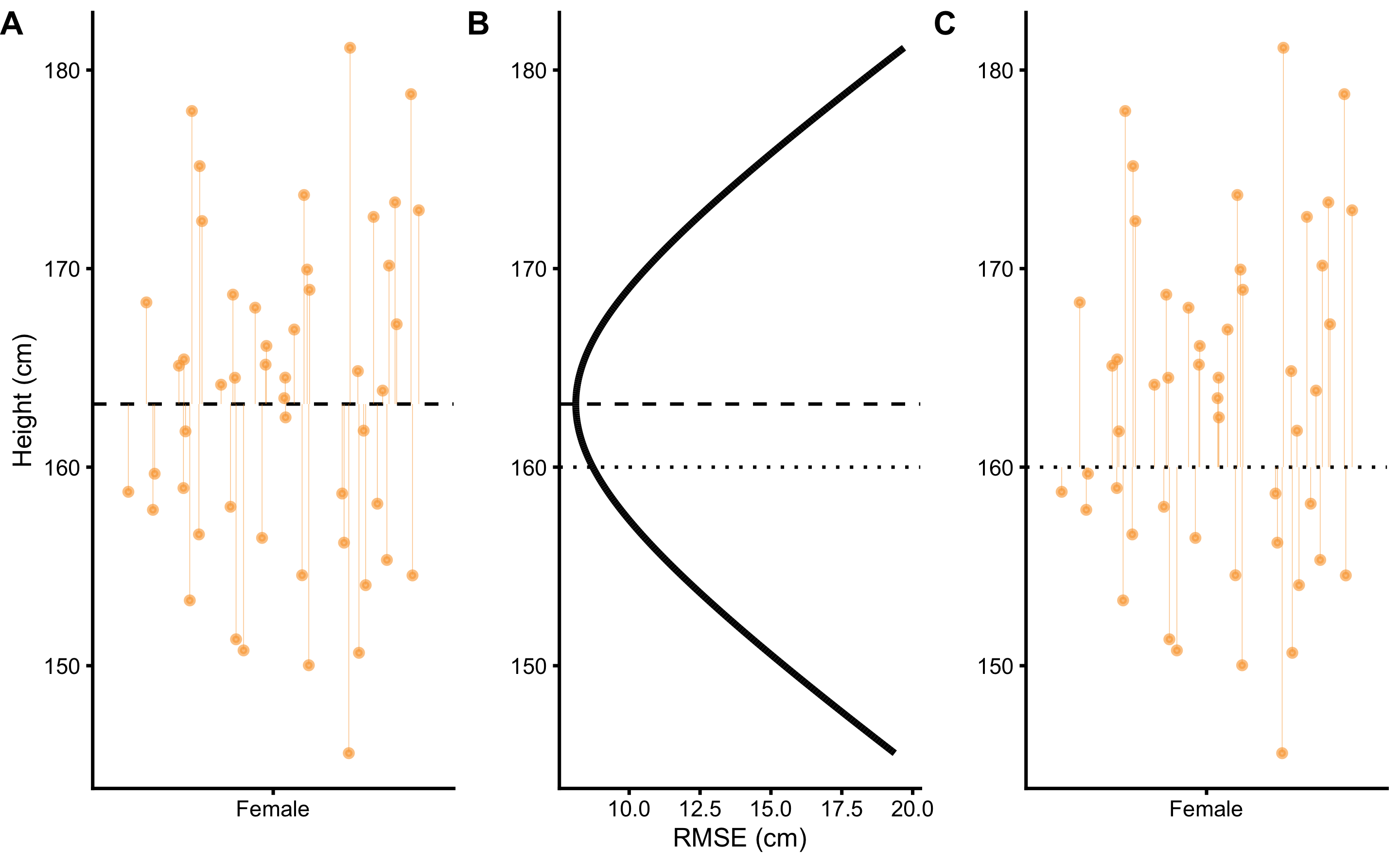
Figure 2.2: Sample mean as the simplest statistical model. A. Dashed line represents the estimate, in this case the mean of the sample. Vertical line represent residuals between estimate and observed values. B. Each estimate has a RMSE value. Central tendency estimate with the lowest RMSE value is the sample mean. C. Similar to panel A, this panel depicts residuals for a central tendency estimate with higher RMSE
As the result of this search, the body height estimate that minimizes the error is 163.18cm, and accompanying RMSE is equal to 8.12cm. As it can be read from the Table 2.1, this optimal body height estimate is equal to calculated sample mean. Standard deviation of the sample is equal to RMSE2. From statistical modeling perspective, sample mean can be considered sample estimate that minimizes the sample SD, and sample SD can be seen as the measure of the model fit.
This search for the optimal estimate that minimizes the cost function can be expanded to other statistical models. For example, linear regression can be seen as a search for the line that minimizes RMSE. This approach of estimating model parameters or estimators belongs to the family of ordinary least squares (OLS) methods, although there are other approaches such as maximum likelihood estimation (MLE) which will be discussed in Statistical inference section (48). The solutions to some of these models can be found analytically3, but for some there is no analytic solution and computational approaches must be utilized. These computation approaches are referred to as optimization algorithms. The example given here involves only one parameter that needs to be optimized, in this case body height estimate, but real-life problems involve numerous parameters. The simple search through parameters state-space would take forever when it comes to problems involving more than only a few parameters. Algorithms that solve this computational problems are numerous, out of which the most popular ones are gradient descent, and Markov Chain Monte-Carlo (MCMC), which is utilized in Bayesian inference (will be discussed in Bayesian perspective section).
The take-home message from this short interlude is that even the simple descriptive statistics can be seen as statistical models.
If we take another cost function, for example mean absolute error (MAE) (Equation (2.6)) and if we optimize so that the sample central tendency estimate minimizes MAE, we will get median estimator.
\[\begin{equation} MAE = \frac{1}{n}\Sigma_{i=1}^{n}\mid{\hat{y_i} - y_i\mid} \tag{2.6} \end{equation}\]
We will expand this discussion about loss functions, cost functions, and performance metrics in Sample mean as the simplest predictive model section. For more information please check the package Metrics (64) and the following references (12,25,33,203).
2.1.2 Effect Sizes
Besides describing groups, we are often interested in comparing them. In order to achieve this task, a collection of estimators termed effect size statistics are utilized. Effect size can be defined in a narrow sense or in a broad sense. Briefly, the narrow sense refers to a family of standardized measures such as Cohen’s d, while the broad sense refers to any measure of interest, standardized or not. The approach to effect size statistics in this book is thus in a broad sense of the definition, in which all group comparison estimators are considered effect sizes statistics. In order to estimate effect sizes, one group needs to be considered baseline or control. The most common effect size statistics can be found in the Table 2.2 where female body height is considered baseline and compared with male body height.
| Difference (cm) | SDdiff (cm) | % CVdiff | % Difference | Ratio | Cohen’s d | CLES | OVL |
|---|---|---|---|---|---|---|---|
| 12.73 | 12.41 | 97.55 | 7.8 | 1.08 | 1.45 | 0.85 | 0.47 |
Difference, or mean difference (mean diff) is calculated by subtracting group means. Using body height as an example, the mean diff between males and females is calculated by using the following equation (2.7):
\[\begin{equation} \begin{split} mean_{difference} &= mean_{males} - mean_{females} \\ mean_{males} &= \frac{1}{n}\Sigma_{i=1}^{n}male_i \\ mean_{females} &= \frac{1}{n}\Sigma_{i=1}^{n}female_i \end{split} \tag{2.7} \end{equation}\]
% CVdiff, or percent coefficient of variation of the difference is the standard deviation of the difference (SDdiff - explained shortly) divided by mean diff (Equation (2.8)):
\[\begin{equation} \%\;CV_{difference} = 100\times\frac{SD_{difference}}{mean_{difference}} \tag{2.8} \end{equation}\]
% Difference, or mean percent difference is calculated by dividing mean diff with the mean of the baseline group, in this case the female group, multiplied by 100 (Equation (2.9)):
\[\begin{equation} mean_{\% difference} = 100\times\frac{mean_{difference}}{mean_{females}} \tag{2.9} \end{equation}\]
Mean ratio, as its name suggests, is simple ratio between the two means (Equation (2.10)):
\[\begin{equation} mean_{ratio} = \frac{mean_{males}}{mean_{females}} \tag{2.10} \end{equation}\]
Cohen's d represent standardized effects size and thus preferable effect size statistic. For this reason, Cohen's d is commonly written as ES, short of effect size. Cohen's d for the independent groups is calculated by dividing mean diff (Equation (2.7)) with pooled standard deviation ((2.11)).
\[\begin{equation} Cohen's\;d = \frac{mean_{difference}}{SD_{pooled}} \tag{2.11} \end{equation}\]
Pooled standard deviation represents combined standard deviations from two groups (Equation (2.12)).
\[\begin{equation} SD_{pooled} = \sqrt{\frac{(n_{males} - 1) SD_{males}^2 + (n_{females} - 1) SD_{females}^2}{n_{males}+n_{females} - 2}} \tag{2.12} \end{equation}\]
Why Cohen's d should be used instead of other effect size estimators can be demonstrated by a simple example, coming from a study by (28). In this study, authors examined the relationship between the performance in the YoYo Intermittent Recovery Test Level 1 (YoYoIR1) and the 30-15 Intermittent Fitness Test (30-15IFT), and compared the sensitivity of both tests to the training. Although this study used two dependent groups (Pre-training and Post-training), the rationale can be applied to the topic of estimating effect sizes between the two independent groups. Table 2.3 contains Pre-training results and the effect sizes estimated with percent change4 and Cohen's d.
| Test | Pre-training | % Change | Cohen’s d |
|---|---|---|---|
| YoYoIR1 | 1031 ± 257 m | 35 % | 1.2 |
| 30-15IFT | 17.4 ± 1.1 kmh/h | 7 % | 1.1 |
Since YoYoIR1 and 30-15IFT utilize different scales (total meters covered and velocity reached respectively), percent change estimator is not a good choice to compare the effect sizes between the two tests5. Since Cohen's d is standardized estimator, it should be used when comparing tests or measures that are at different scales.
After estimating effect sizes, the question that naturally follows up is the question of magnitude. In other words - “how big is the effect?”. Since Cohen's d is standardized estimator, it allows for establishment of qualitative magnitude thresholds. Based on the original work by Cohen (35), Hopkins (88,90) suggested the following magnitudes of effect (Table (2.4). According to the Table (2.4, the body height difference between males and females would be considered large, as well as changes in both YoYoIR1 and 30-15IFT.
| Magnitude of effect | Trivial | Small | Moderate | Large | Very Large | Nearly Perfect |
|---|---|---|---|---|---|---|
| Cohen’s d | 0 - 0.2 | 0.2 - 0.6 | 0.6 - 1.2 | 1.2 - 2.0 | 2.0 - 4.0 | > 4.0 |
Cohen's d, as well as associated magnitudes of effect, are commonly hard to interpret by non-statistically trained professionals (e.g. coaches). (131) suggested common language effect size (CLES) estimator instead, which could be more intuitive to understand. CLES represents the probability that an observation sampled at random from one group will be greater than an observation sampled at random from other group. For example, if we take random male and random female from our two groups and repeat that 100 times6, how many times a male would be taller than a female (Figure 2.3)?
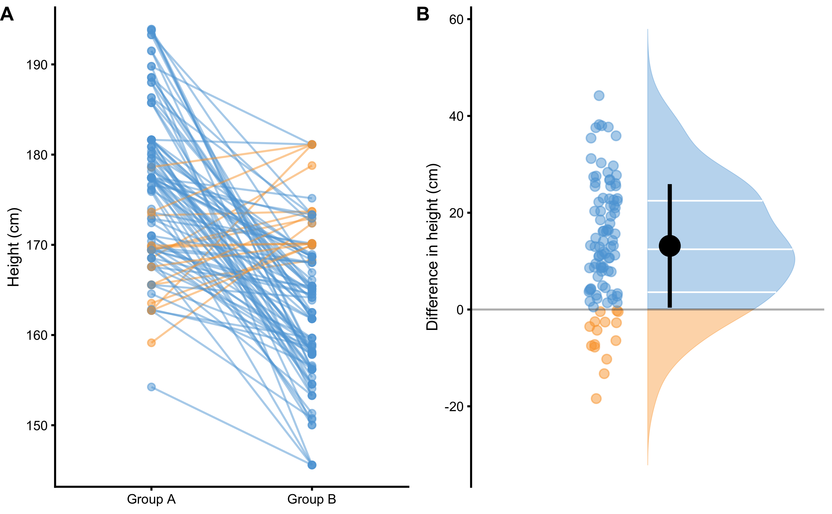
Figure 2.3: Drawing random 100 pairs to estimate probability of males being taller than females. A. Scatterplot of 100 pairs drawn at random from two samples. Since we are comparing paired males and females, lines can be drawn between each of 100 draws. Blue line indicates taller male, while orange line indicates taller female. B. Distribution of the difference between males and females for each of 100 pairs drawn
By using simple counting from 100 random paired samples, males are taller in 85 cases, or 85%. By using probability, that is equal to 0.85. In other words, if I blindfoldedly, randomly select a male and a female from the two groups and if I bet that the male is taller, I would be correct 85% of the time.
CLES can be estimated using brute-force computational method, or algebraic method. Brute-force method involves generating all possible pair-wise combinations from two groups, and in our example that is equal to \(50 \times 50 = 2500\) cases, and then simply counting in how many cases males are taller than females. This method can become very computationally intensive for groups with large sample number. Algebraic method, on the other hand, assumes normal distribution of the observations in the groups, and estimates standard deviation of the difference (SDdiff) (Equation (2.13)). Note that standard deviation of the all pairwise differences estimated with brute-force method would be very similar to algebraically derived SDdiff.
\[\begin{equation} SD_{difference} = \sqrt{SD_{males}^{2} + SD_{females}^{2}} \tag{2.13} \end{equation}\]
Algebraically, CLES is then derived assuming normal distribution (where mean of the distribution is equal to mean diff between the groups, and standard deviation of the distribution is equal to SDdiff) by calculating probability of the difference scores higher than zero (see Figure 2.3B for a visual representation). Table 2.2 contains algebraically computed CLES estimate.
CLES equivalent is utilized as a performance metric in class prediction tasks, termed area under curve (AUC), where 0.5 is a predictive performance equal to a random guess, and 1 is perfect predictive separation between the two classes (92,111).
Overlap (OVL) estimator represents the overlap between the two sample distributions. Providing that samples are identical, the OVL is equal to 1. Providing there is complete separation between the two samples, then OVL is equal to 0 (Figure 2.4A). OVL can be estimated with brute-force computational methods (which doesn’t make assumptions regarding sample distribution) and with algebraic methods that make normality assumptions.
Since Cohen's d, CLES and OVL are mathematically related, it is possible to convert one to another (assuming normal distribution of the samples and equal SD between the two groups for the OVL estimation). Figure 2.4B depicts relationship between the Cohen's d, CLES, and OVL. Figure 2.4C depicts relationship between the CLES and OVL.
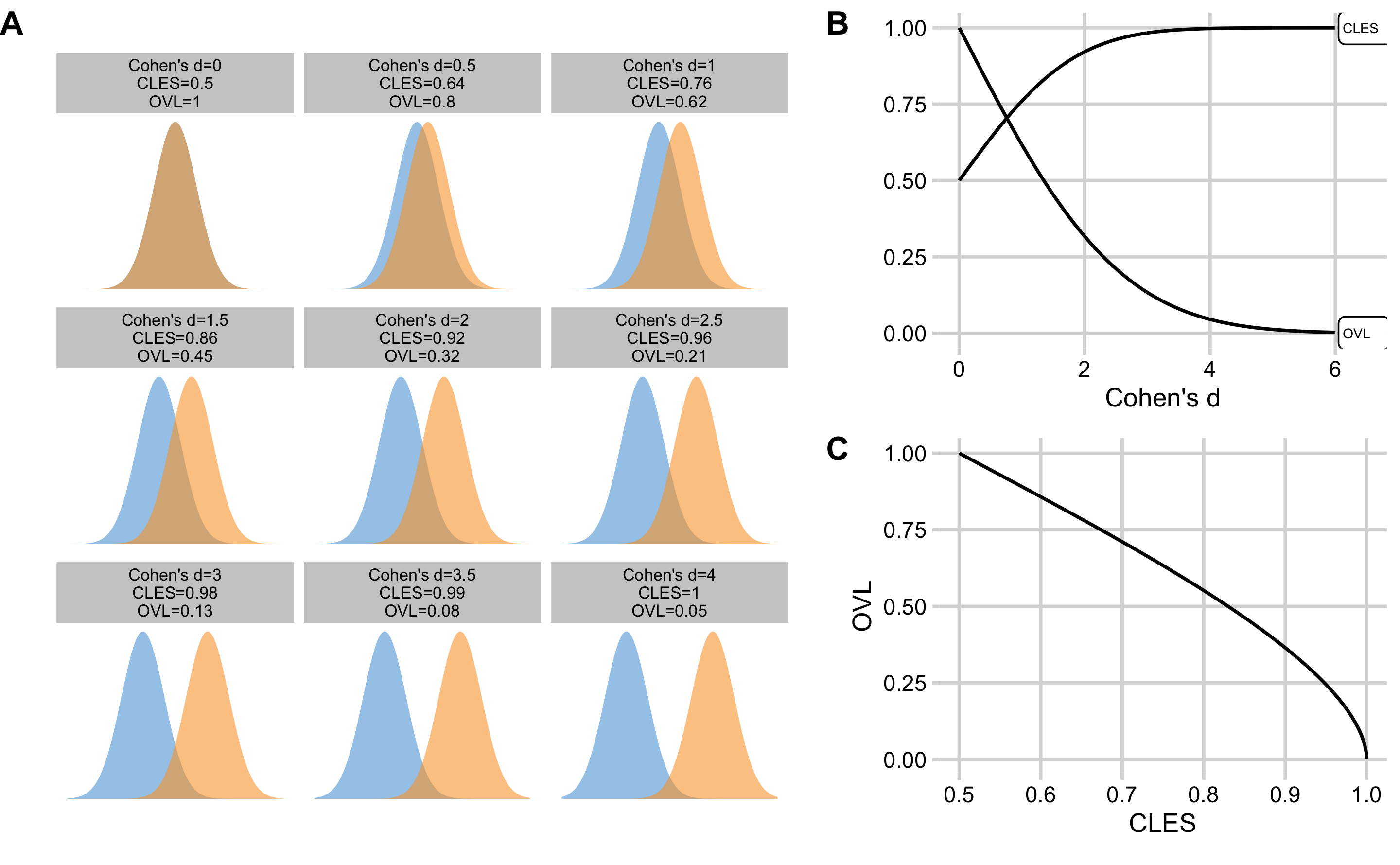
Figure 2.4: Relationship between the Cohen's d, CLES, and OVL. A. Visual display of the samples of varying degrees of separations, and calculated Cohen's d, CLES, and OVL. B. Relationship between the CLES and OVL to the Cohen's d. C. Relationship between the CLES and OVL
Table 2.5 contains Cohen's d magnitudes of effect with accompanying estimated CLES and OVL thresholds.
| Magnitude of effect | Trivial | Small | Moderate | Large | Very Large | Nearly Perfect |
|---|---|---|---|---|---|---|
| Cohen’s d | 0 - 0.2 | 0.2 - 0.6 | 0.6 - 1.2 | 1.2 - 2.0 | 2.0 - 4.0 | > 4.0 |
| CLES | 0.50 - 0.56 | 0.56 - 0.66 | 0.66 - 0.80 | 0.80 - 0.92 | 0.92 - 1.00 | 1.00 |
| OVL | 1.00 - 0.92 | 0.92 - 0.76 | 0.76 - 0.55 | 0.55 - 0.32 | 0.32 - 0.05 | 0.00 |
2.1.3 The Smallest Effect Size Of Interest
According to (35), the qualitative magnitude thresholds from Table 2.5 are “arbitrary conventions, recommended for use only when no better basis for estimating the effect size is available” (p. 12). But what if practitioners a priori know what is the minimal important effect size and are interested in judging the practical or clinical significance (164) of the results (in this case difference between the groups)? In other words, the smallest effect size of interest (SESOI)7.
There is no single way to approach definition and estimation of SESOI, but it usually tends to be based on either the known measurement error (ME) (e.g. the minimum detectable effect size), or the effect size that is large enough to be practically meaningful (e.g. the minimal important difference, or the smallest worthwhile change) (10,29,87,89,102,114,179,183). In this book, statistical models and estimators that utilize SESOI are referred to as magnitude-based.
To introduce magnitude-based estimators, consider ±2.5cm to be body height SESOI8, or the difference that would be practically significant. In other words, individuals with height difference within ±2.5cm would be considered practically equivalent (from the minimal important effect perspective), or it might be hard to detect this difference with a quick glance (from minimum detectable effect perspective).
The simplest magnitude-based statistics would be mean diff divided by SESOI (Difference to SESOI) (Equation (2.14)). This estimator, similar to other standardized estimators (e.g. Cohen's d) allows comparison of variables at different scales, but it would also give more insight into differences from practical significance perspective.
\[\begin{equation} Difference\;to\;SESOI = \frac{mean_{difference}}{SESOI_{upper} - SESOI_{lower}} \tag{2.14} \end{equation}\]
Second magnitude-based statistic is SDdiff divided by SESOI (SDdiff to SESOI) (Equation (2.15)). This estimator, similar to % CVdiff, would answer how variable are the differences compared to SESOI.
\[\begin{equation} SDdiff\;to\;SESOI = \frac{SD_{difference}}{SESOI_{upper} - SESOI_{lower}} \tag{2.15} \end{equation}\]
Similarly, CLES estimator can become magnitude-based by utilizing SESOI. Rather than being interested in probability of a random male being taller than a random female (out of the two sample groups), we might be interested in estimating how probable are lower, equivalent, and higher (or usually defined as harmful, trivial, and beneficial) differences defined by SESOI. Practically equivalent (trivial) differences are differences ranging from \(SESOI_{lower}\) to \(SESOI_{upper}\), while everything over \(SESOI_{upper}\) is higher (or beneficial) difference and everything lower than \(SESOI_{lower}\) is lower (or harmful) difference.
Using brute-force computational method and drawing all pair-wise combinations from the two groups (50x50 = 2500 cases), and using ±2.5cm SESOI as a practically equivalent difference9, we can estimate probabilities of lower (pLower), equivalent (pEquivalent) and higher difference (pHigher) by calculating proportion of cases within each magnitude band (Figure 2.5).
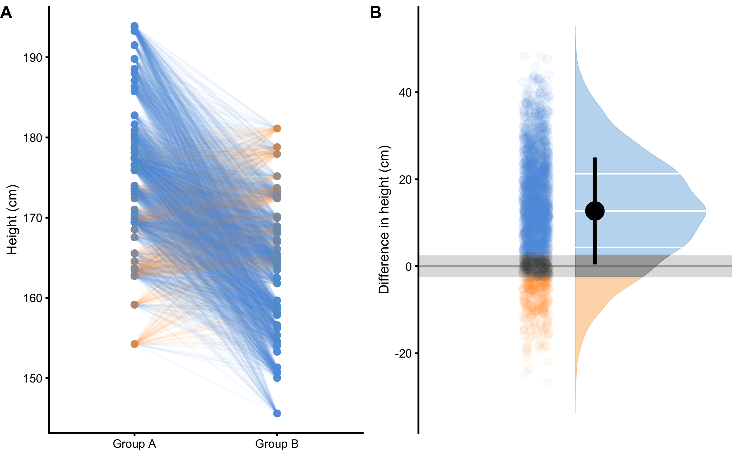
Figure 2.5: Pairwise comparison of males and females to estimate probability of lower, equivalent, and higher magnitude of difference. A. Scatterplot of all pair-wise combinations (50x50 = 2500), drawn at random out of two samples. Since we are comparing paired males and females, lines can be drawn between each of 2500 draws. Blue line indicates males taller than females higher than SESOI, equivalent lines indicates pairs with a height difference less or equal to SESOI, while orange line indicates females taller than males higher than SESOI. B. Distribution of the differences between males and females for all 2500 pair-wise combinations. Grey band indicates SESOI. Surface of the distribution over SESOI (blue color) indicates probability of randomly selected male being taller than a randomly selected female (pHigher), with a height difference of at least SESOI magnitude. Surface of the distribution under SESOI (orange color) indicates probability of randomly selected female being taller than a randomly selected female (pLower), with a height difference of at least SESOI magnitude. Grey surface area indicates probability of randomly selecting male and female with a height difference within SESOI band (pEquivalent)
Table 2.6 contains estimated probabilities of observing lower, equivalent, and higher differences in height between the randomly selected male and female using brute-force computational method and algebraic method. These estimates answer the following question “If I compare random male and random female from my sample, how probable are lower/equivalent/higher magnitudes of difference in height?”. Asking such a magnitude-based question regarding the random individual difference represents a form of prediction question and predictive task. In this book, such questions are answered with magnitude-based prediction approaches.
| Method | pLower | pEquivalent | pHigher |
|---|---|---|---|
| brute-force | 0.110 | 0.096 | 0.794 |
| algebraic | 0.111 | 0.095 | 0.794 |
It is common to represent means as systematic component or fixed effect (e.g. mean difference), and variability around the mean (i.e. SDdiff) as stochastic component or random effect. It is unfortunate that the common statistical modeling and analysis, particularly in sport science, takes the stance of approaching and treating between-individual variation as random error. The approach suggested in this book complements group-based or average-based statistics with magnitude-based predictions that aim to help in answering individual-based questions, common to sport practitioners. Table 2.7 contains discussed magnitude-based estimators that can complement common effect size statistics (Table 2.2) when comparing two independent groups.
| SESOI lower (cm) | SESOI upper (cm) | Difference to SESOI | SDdiff to SESOI | pLower | pEquivalent | pHigher |
|---|---|---|---|---|---|---|
| -2.5 | 2.5 | 2.55 | 2.48 | 0.11 | 0.09 | 0.79 |
2.2 Comparing dependent groups
As an example of dependent or paired groups descriptive analysis, let’s consider the simple Pre-test and Post-test design. We have given training intervention to a group of N=20 males involving bench-press training. Training intervention involved performing bench pressing two times a week for 16 weeks. One-repetition-maximum (1RM) in the bench press was performed before (Pre-test) and after (Post-test) training intervention. Table 2.8 contains individual Pre-test and Post-test scores, as well as the Change in the bench press 1RM.
| Athlete | Pre-test (kg) | Post-test (kg) | Change (kg) |
|---|---|---|---|
| Athlete 01 | 111.80 | 121.42 | 9.62 |
| Athlete 02 | 95.95 | 102.13 | 6.18 |
| Athlete 03 | 105.87 | 125.56 | 19.69 |
| Athlete 04 | 98.79 | 109.67 | 10.87 |
| Athlete 05 | 95.81 | 108.11 | 12.30 |
| Athlete 06 | 95.27 | 92.67 | -2.60 |
| Athlete 07 | 97.75 | 106.03 | 8.28 |
| Athlete 08 | 106.50 | 109.51 | 3.01 |
| Athlete 09 | 80.62 | 95.96 | 15.34 |
| Athlete 10 | 100.40 | 94.30 | -6.11 |
| Athlete 11 | 82.71 | 78.91 | -3.80 |
| Athlete 12 | 102.89 | 93.98 | -8.91 |
| Athlete 13 | 91.34 | 105.21 | 13.87 |
| Athlete 14 | 111.14 | 108.07 | -3.07 |
| Athlete 15 | 95.13 | 96.01 | 0.88 |
| Athlete 16 | 109.12 | 112.12 | 3.00 |
| Athlete 17 | 91.87 | 103.41 | 11.54 |
| Athlete 18 | 92.16 | 103.93 | 11.77 |
| Athlete 19 | 108.88 | 119.72 | 10.84 |
| Athlete 20 | 97.94 | 95.91 | -2.03 |
The results of this simple Pre-test and Post-test design can be described in multiple ways. Here, I will present the three most common approaches.
2.2.1 Describing groups as independent
The simplest analysis involve descriptive statistics assuming groups as independent. Table 2.9 contains descriptive statistics applied to Pre-test, Post-test and Change scores as independent. Figure 2.6 visualizes the scores using three raincloud plots.
| Estimator | Pre-test | Post-test | Change |
|---|---|---|---|
| n | 20.00 | 20.00 | 20.00 |
| mean (kg) | 98.60 | 104.13 | 5.53 |
| SD (kg) | 8.70 | 11.08 | 8.05 |
| % CV | 8.83 | 10.64 | 145.46 |
| median (kg) | 97.84 | 104.57 | 7.23 |
| MAD (kg) | 8.64 | 11.94 | 8.46 |
| IQR (kg) | 11.64 | 13.60 | 13.77 |
| mode (kg) | 96.49 | 105.76 | 10.78 |
| min (kg) | 80.62 | 78.91 | -8.91 |
| max (kg) | 111.80 | 125.56 | 19.69 |
| range (kg) | 31.18 | 46.64 | 28.60 |
| skew | -0.26 | -0.05 | -0.16 |
| kurtosis | -0.73 | -0.28 | -1.28 |
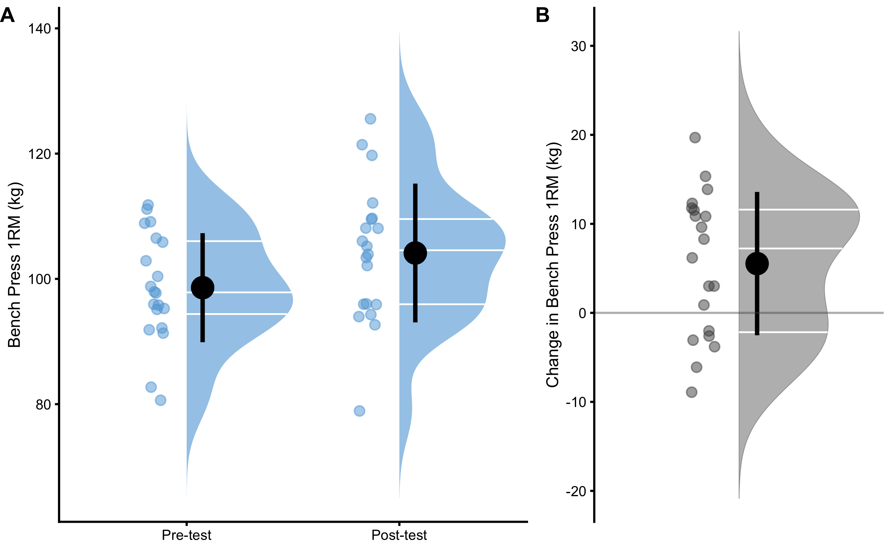
Figure 2.6: Raincloud plots of the Pre-test, Post-test and Change scores in the bench press 1RM. A. Distribution of the Pre-test and Post-test scores. B. Distribution of the Change score
2.2.2 Effect Sizes
Table 2.10 contains the most common effect size estimators utilized when describing change in the Pre-Post paired design. The terminology utilized in this book differentiates between the difference which is used in independent groups and the change which is used in paired or dependent groups
| Change (kg) | SDchange (kg) | % CVchange | % Change | Ratio | Cohen’s d | CLES | OVL |
|---|---|---|---|---|---|---|---|
| 5.53 | 8.05 | 145.46 | 5.75 | 1.06 | 0.64 | 0.65 | 0.75 |
Change, or mean change is calculated by taking average of the change score (Equation (2.16)). Change score is simple difference between Pre-test and Post-test.
\[\begin{equation} \begin{split} mean_{change} &= \frac{1}{n}\Sigma_{i=1}^{n}(post_{i}-pre_{i}) \\ mean_{change} &= \frac{1}{n}\Sigma_{i=1}^{n}change_{i} \\ change_{i} &= post_{i}-pre_{i} \end{split} \tag{2.16} \end{equation}\]
SDchange, or standard deviation of the change is a simple standard deviation of the change (Equation (2.17)). It represents a measure of dispersion of the change scores.
\[\begin{equation} SD_{change} = \sqrt{\frac{1}{n-1}\Sigma_{i=1}^{n}(change_i -mean_{change})^2} \tag{2.17} \end{equation}\]
% CVchange, or percent coefficient of variation of the change is the SDchange divided by mean change (Equation (2.18)).
\[\begin{equation} \%\;CV_{change} = 100\times\frac{SD_{change}}{mean_{change}} \tag{2.18} \end{equation}\]
% Change, or Mean percent change is calculated by taking a mean of the ratio between the change and the Pre-test, multiplied by 100 (Equation (2.19)).
\[\begin{equation} mean_{\% change} = 100\times\frac{1}{n}\Sigma_{i}^{n}\frac{change_{i}}{pre_{i}} \tag{2.19} \end{equation}\]
Mean ratio represents mean of the Post-test to Pre-test scores ratios (Equation (2.20)).
\[\begin{equation} mean_{ratio} = \frac{1}{n}\Sigma_{i}^{n}\frac{post_{i}}{pre_{i}} \tag{2.20} \end{equation}\]
Cohen's d represents standardized effect size of the change. In the paired design, Cohen's d is calculated by dividing mean change with standard deviation of the Pre-test scores (SDpre) (Equation (2.21)).
\[\begin{equation} Cohen's\;d = \frac{mean_{change}}{SD_{pre}} \tag{2.21} \end{equation}\]
CLES for the paired groups represents probability of observing positive change. OVL, equally to the independent groups, represents overlap between the Pre-test and Post-test scores.
Magnitude-based effect size estimators involve the use of SESOI and can be found on Table 2.11. Similarly to magnitude-based effect size estimators with the independent groups, magnitude-based effect size estimators with the paired group involve Change to SESOI, SDchange to SESOI as well as proportions of lower (pLower), equivalent (pEquivalent) and higher (pHigher) change scores.
| SESOI (kg) | Change to SESOI | SDchange to SESOI | pLower | pEquivalent | pHigher |
|---|---|---|---|---|---|
| ±5 | 0.55 | 0.81 | 0.1 | 0.37 | 0.53 |
Figure 2.7 depicts visually how proportions of lower, equivalent, and higher change scores are estimated. Same as with two independent groups, these proportions can be estimated using the brute-force method (i.e. simple counting of the change scores withing lower, trivial, and higher zones), or algebraic where SDchange is utilized and assumption of the normally distributed change scores is made.
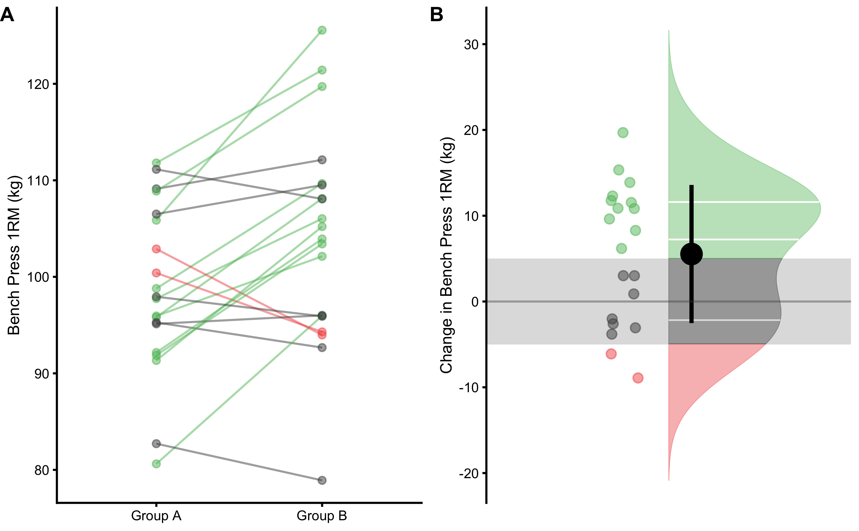
Figure 2.7: Visual analysis of the dependent groups scores using SESOI. A. Scatter plot of Pre-test and Post-test scores. Green line indicates change higher than SESOI upper, grey line indicates change within SESOI band, and red line indicates negative change lower than SESOI lower. B. Distribution of the change scores. Green area represents proportion of change scores higher than SESOI upper, red area represents proportion of negative change scores lower than SESOI lower, and grey area indicates equivalent change, which is within SESOI band
It might be tempting to claim that this intervention is causing changes in the bench press 1RM, but we should be vary of doing that. It is important to keep in mind that the effect size estimators are used only descriptively without any causal connotation. To make causal claims, further criteria needs to be taken into account. This is discussed in more details in the Causal inference section of this book.
2.3 Describing relationship between two variables
So far, we have dealt with single variable descriptive statistics. However, we are often interested in relationship or association between two variables. One of these variables takes the role of the dependent variable (outcome or target variable) and the other of the independent variable (or predictor variable).
Let’s assume we tested N=30 female soccer athletes by using two tests: (1) YoYoIR1 test (expressed in meters), and (2) maximum aerobic speed (MAS) test (expressed in km/h)10. Variables in this example represent observations in each test (Table 2.12).
| Athlete | YoYoIR1 (m) | MAS (km/h) |
|---|---|---|
| Athlete 01 | 1640 | 15.5 |
| Athlete 02 | 1080 | 15.0 |
| Athlete 03 | 1440 | 15.0 |
| Athlete 04 | 1200 | 15.0 |
| Athlete 05 | 960 | 14.5 |
| Athlete 06 | 1120 | 15.0 |
| Athlete 07 | 1000 | 14.5 |
| Athlete 08 | 1440 | 15.0 |
| Athlete 09 | 640 | 14.0 |
| Athlete 10 | 1360 | 15.0 |
| Athlete 11 | 760 | 14.5 |
| Athlete 12 | 1240 | 15.0 |
| Athlete 13 | 1000 | 15.0 |
| Athlete 14 | 1600 | 15.5 |
| Athlete 15 | 1160 | 15.0 |
| Athlete 16 | 1520 | 15.0 |
| Athlete 17 | 1000 | 14.5 |
| Athlete 18 | 1000 | 14.5 |
| Athlete 19 | 1480 | 15.5 |
| Athlete 20 | 1280 | 15.0 |
| Athlete 21 | 1200 | 14.5 |
| Athlete 22 | 1200 | 14.5 |
| Athlete 23 | 1200 | 15.0 |
| Athlete 24 | 1120 | 14.5 |
| Athlete 25 | 1560 | 15.5 |
| Athlete 26 | 1120 | 14.5 |
| Athlete 27 | 1640 | 15.5 |
| Athlete 28 | 1280 | 15.0 |
| Athlete 29 | 1040 | 14.5 |
| Athlete 30 | 880 | 14.0 |
Descriptive statistics for YoYoIR1 and MAS test results can be found in the Table 2.13.
| Estimator | YoYoIR1 | MAS |
|---|---|---|
| n | 30.00 | 30.00 |
| mean | 1205.33 | 14.85 |
| SD | 255.96 | 0.42 |
| % CV | 21.24 | 2.82 |
| median | 1200.00 | 15.00 |
| MAD | 296.52 | 0.74 |
| IQR | 410.00 | 0.50 |
| mode | 1131.68 | 15.00 |
| min | 640.00 | 14.00 |
| max | 1640.00 | 15.50 |
| range | 1000.00 | 1.50 |
| skew | -0.02 | -0.11 |
| kurtosis | -0.68 | -0.72 |
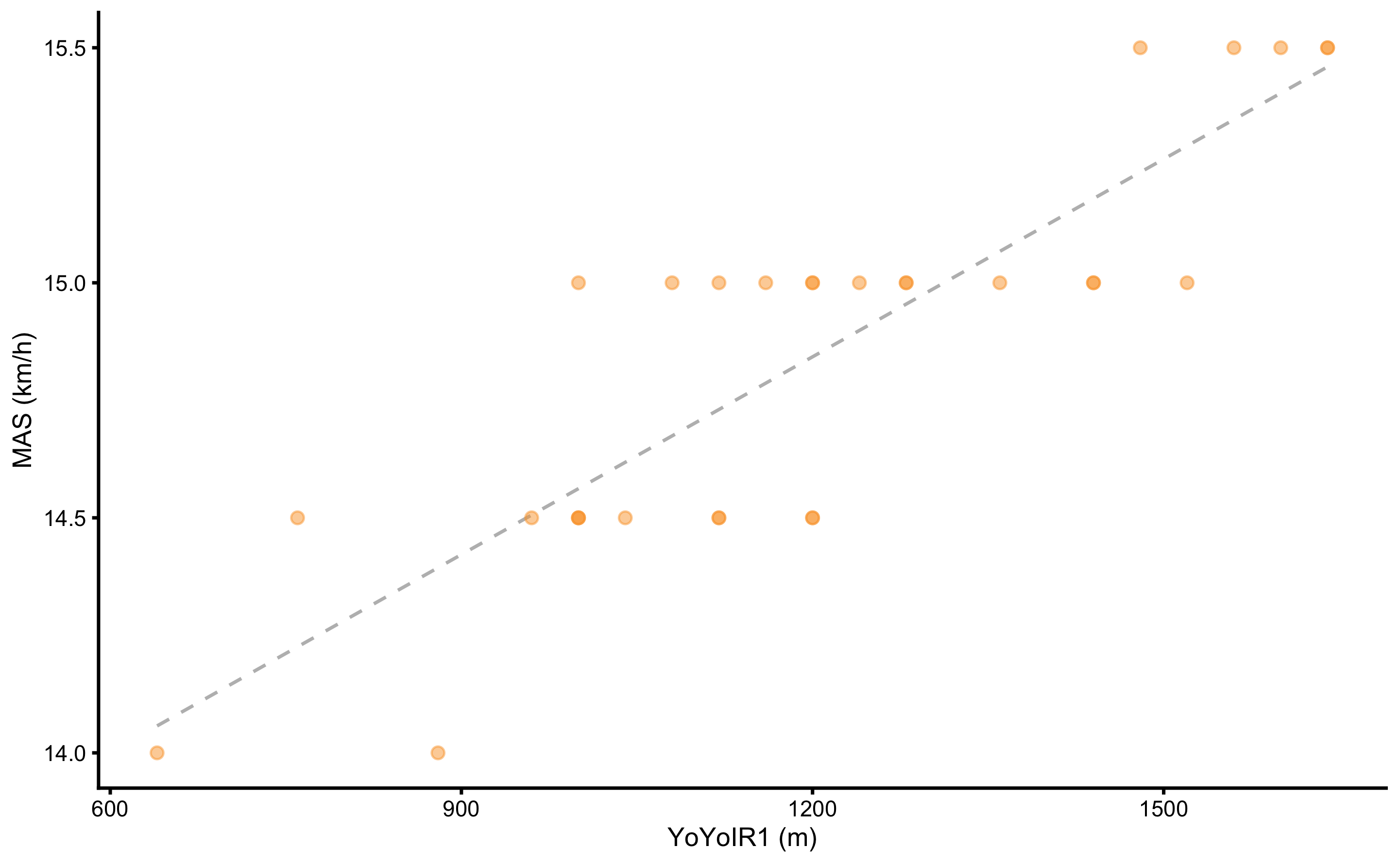
Figure 2.8: Scatter plot between two variables. Dashed line represents linear regression line
Table 2.14 contains common estimators of the association between two variables. All estimators except maximum information coefficient (MIC) (2,155) assumes linear relationship between two variables. It is thus important to visually analyze the association (see Figure 2.8) before trusting numerical estimators.
| Pearson r | R-squared | MIC |
|---|---|---|
| 0.86 | 0.74 | 0.55 |
The Pearson product-moment correlation coefficient (Pearson's r) is a measure of the strength of the linear relationship between two variables (Equation (2.22)).
\[\begin{equation} r = \frac{{}\sum_{i=1}^{n} (x_i - \overline{x})(y_i - \overline{y})} {\sqrt{\sum_{i=1}^{n} (x_i - \overline{x})^2(y_i - \overline{y})^2}} \tag{2.22} \end{equation}\]
Pearson's r is standardized measure that can take values ranging from -1 to +1, where 0 indicates no relationship, and -1 and +1 indicates perfect relationship. Negative Pearson's r value represents negative association (i.e. as one variable increases the other decreases), while positive Pearson's r value represents positive association (i.e., as one variable increases so does the other).
R-squared (\(R^2\)) represents variance explained, i.e. how much the model explains variance in the target variable. In this example the model is linear regression. R-squared is standardized measure of association that can take values ranging from zero (no association, or no variance explained) to 1 (perfect association, or all variance explained). R-squared, as its name suggests, represents Pearson’s r squared, but for more complex models it can be calculated using variances or mean squares (MS) (Equation (2.22)):
\[\begin{equation} \begin{split} R^2 &= \frac{MS_{model}}{MS_{total}} \\ MS_{model} &= \frac{1}{n}\Sigma_{i=1}^{n}(\hat y_i - \overline y)^2 \\ MS_{total} &= \frac{1}{n}\Sigma_{i=1}^{n}(y_i - \overline y)^2 \end{split} \tag{2.23} \end{equation}\]
Maximal information coefficient (MIC) is a novel measure of the strength of the linear or non-linear association between two variables and belongs to the maximal information-based non-parametric exploration (MINE) class of statistics (2,155). MIC is standardized measure of association that can take values ranging from zero (no association) to 1 (perfect association). As opposed to Pearson r, MIC can pick up non-linear association between two variables.
Statistical model, or machinery underlying Pearson r and R-squared is linear regression. Similar to a sample mean (see section Sample mean as the simplest statistical model), linear regression can be seen as optimization algorithm that tries to find a line that passes through the data with the minimal error.11 A solution to this problem can be found computationally or analytically12. Either way, the coefficients (or parameters) that need to be estimated in this example with two variables are intercept (\(\hat{\beta}_0\)), slope coefficient (\(\hat{\beta}_1\)), and residual error (\(\hat{\epsilon}\)) (Equation (2.24)).
\[\begin{equation} \hat{y}_i = \hat{\beta}_0 + \hat{\beta}_1 x_i + \hat{\epsilon} \tag{2.24} \end{equation}\]
Table 2.15 contains estimates for intercept, slope, and residual error. Residual error (\(\epsilon\)) is estimated by using residual standard error (RSE), which is similar to already discussed RMSE, but rather than dividing sum of square errors by \(n\) observations, it is divided by \(n-p\) (Equation (2.25)). The \(p\) is the number of model parameters, in this case 2 (intercept and one slope coefficient).
\[\begin{equation} RSE = \sqrt{\frac{1}{n-p}\Sigma_{i=1}^{n}(y_i -\hat{y_i})^2} \tag{2.25} \end{equation}\]
| Intercept (km/h) | Slope | RSE (km/h) |
|---|---|---|
| 13.16 | 0.0014 | 0.22 |
Estimated parameters in the Table 2.15 can be written using the linear equation format (Equation (2.26)).
\[\begin{equation} MAS = 13.16 + 0.0014 \times YoYoIR1 \pm 0.22 \: km/h \tag{2.26} \end{equation}\]
Slope coefficient of 0.0014 can be interpreted the following way: if YoYoIR1 increases by 500m, then MAS would increase by 500 x 0.0014 or 0.7km/h.
Although measures of association between two variables, such as Pearson's r and R-squared, are symmetrical (meaning it doesn’t matter which variable is predictor or target), one cannot reverse the linear regression equation to get YoYoIR1 from MAS as done in the Equation (2.25).
\[\begin{equation} \begin{split} MAS &= \hat{\beta}_0 + \hat{\beta}_1 \times YoYoIR1 \\ YoYoIR1 &= \frac{-\hat{\beta}_0 + MAS}{\hat{\beta}_1} \\ YoYoIR1 &= -\frac{\hat{\beta}_0}{\hat{\beta}_1} + \frac{1}{\hat{\beta}_1}\times MAS \\ YoYoIR1 &= -9385.59 + 713.19 \times MAS \end{split} \tag{2.27} \end{equation}\]
It can be seen that the reverse parameters from (2.25) differ from the parameters in the Table 2.16 which are estimated using YoYoIR1 as the target variable an MAS as the predictor variable.
| Intercept (m) | Slope | RSE (m) |
|---|---|---|
| -6589.82 | 524.93 | 133.84 |
This difference between reversed parameters and correctly estimated can be visually seen as non-identical linear regression lines in the Figure 2.9.
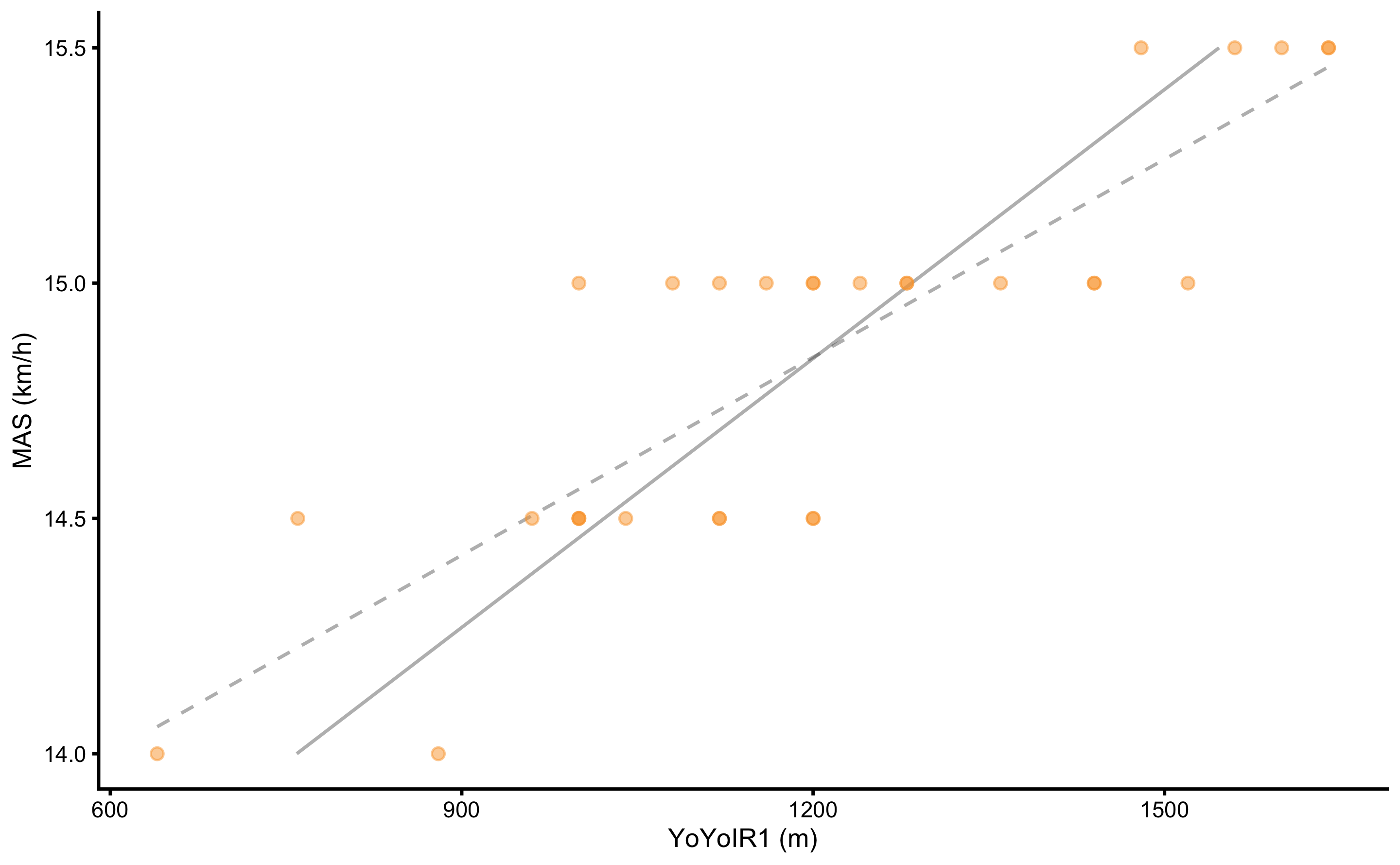
Figure 2.9: Regression line differs depending which variable is target or the outcome variable. Dashed grey line represents regression line when MAS is the target variable. Grey line represents regression line when YoYoIR1 is the target variable. Since they are not identical, one cannot reverse the equation to predict YoYoIR1 from MAS score, when such equation is estimated by predicting MAS from YoYoIR1
Unfortunately, this is common practice in sport science. Rather than reversing parameters, one needs to fit, in this case, linear regression model again with the properly defined target and predictor variables. In certain scenarios, such as Reliability analysis, we do not know which variable represents predictor and which represents target or outcome. For this reason, different approaches to regression, such as ordinary least products (OLP) are utilized (121–124,140). These topics will be covered in the second part of this book.
2.3.1 Magnitude-based estimators
Similarly to independent and dependent group analysis, with association we might be interested in the practical significance of the results. In order to judge results from practical significance perspective, we need to define SESOI of both variables (i.e. YoYoIR1 and MAS). Using minimal test increment, SESOI for the YoYoIR1 test is defined as ±40m, and SESOI for the MAS test is defined as ±0.5km/h.
One question we might ask is whether the YoYoIR1 SESOI is associated with MAS SESOI. This can be answered with the sensitivity estimator (Equation (2.28)).
\[\begin{equation} \begin{split} Sensitivity &= \frac{(SESOI_{YoYoIR1_{upper}} - SESOI_{YoYoIR1_{lower}})\times\hat{\beta}_1}{SESOI_{MAS_{upper}}-SESOI_{MAS_{lower}}} \\ Sensitivity &= \frac{(40 - -40)\times 0.0014}{0.5--0.5} \\ Sensitivity &= \frac{(80)\times 0.0014}{1} \\ Sensitivity &= \frac{0.11}{1} \\ Sensitivity &= 0.11 \end{split} \tag{2.28} \end{equation}\]
This means that the change in the YoYoIR1 test equal to SESOI will yield only a small proportion of SESOI in the MAS test.
In the case where SESOI of the MAS test is unknown, using known SESOI of the YoYoIR1 test can be used to estimate it. This is done by using estimated \(\hat{\beta}_1\) (slope coefficient), as demonstrated in the Equation (2.29).
\[\begin{equation} \begin{split} SESOI_{MAS_{upper}} &= \hat{\beta}_1\times SESOI_{YoYoIR1_{upper}} \\ SESOI_{MAS_{upper}} &= 0.0014\times 40 \\ SESOI_{MAS_{upper}} &= 0.06 \: km/h \\ \\ SESOI_{MAS_{lower}} &= \hat{\beta}_1\times SESOI_{YoYoIR1_{lower}} \\ SESOI_{MAS_{lower}} &= 0.0014\times -40 \\ SESOI_{MAS_{lower}} &= -0.06 \: km/h \end{split} \tag{2.29} \end{equation}\]
Next magnitude-based question might be related to the practically significant strength of the association between two variables. For example, we would like to know if the residuals are higher or lower than the SESOI in the target variable (i.e. MAS, which is equal to ±0.5km/h). Figure 2.10 depicts scatter plot between two variable (panel A) and residuals (panel B) utilizing SESOI in MAS as the grey area.
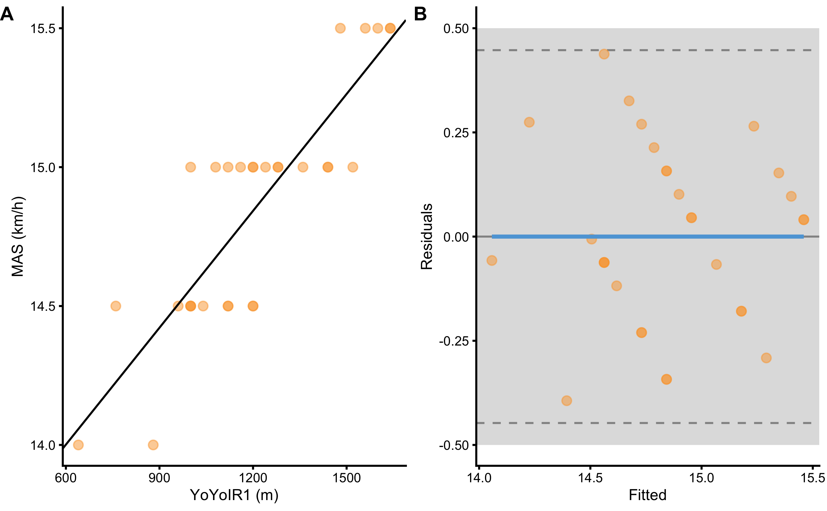
Figure 2.10: Scatter plot between two variables using SESOI to indicate practically significant difference A. Scatterplot with SESOI depicted as grey band around linear regression line. B. Residual plot, where the difference between MAS and linear regression line (model estimate) is plotted against linear regression line (fitted or predicted MAS). SESOI is represented with the grey band. Residuals within SESOI band are of no practical difference. Dashed lines represent upper and lower levels of agreement using RSE and 95% confidence level (or in other words, 95% of the residuals distribution will be within these two dashed lines).
Magnitude-based estimators of the practically significant strength of the two variable association involve ratio between the SESOI (\(SESOI_{upper} - SESOI_{lower}\)) and RSE (SESOI to RSE), and PPER. SESOI to RSE indicates how big are the residuals compared to the SESOI, and thus a metric of the practical strength of the association. Assuming that residuals are being normally distributed, SESOI to RSE over 4 (or \(2\times 1.96\)) would indicate excellent practical strength of the association. If you look at the Table 15, estimated SESOI to RSE in this example is not great, indicating poor practical strength of association.
Proportion of practically equivalent residuals (PPER) as a measure of the practical strength of the association revolves around estimating proportions of residuals in the equivalent range, defined as SESOI in the target variable (which is exactly the same as already introduced pEquivalent estimator). PPER can be estimated with the brute-force method by simply counting residuals in the equivalent zone, or using algebraic method and assuming normally distributed residuals (i.e. using RSE of the residuals13).
Figure 2.11 graphically depicts how PPER is calculated. Practically significant association between two variables would have PPER equal to 1, which indicates that all residuals are within confines of the SESOI. If you look at the Table 2.17, estimated PPER in this example is almost perfect, indicating great practical strength of the association between YoYoIR1 and MAS tests.
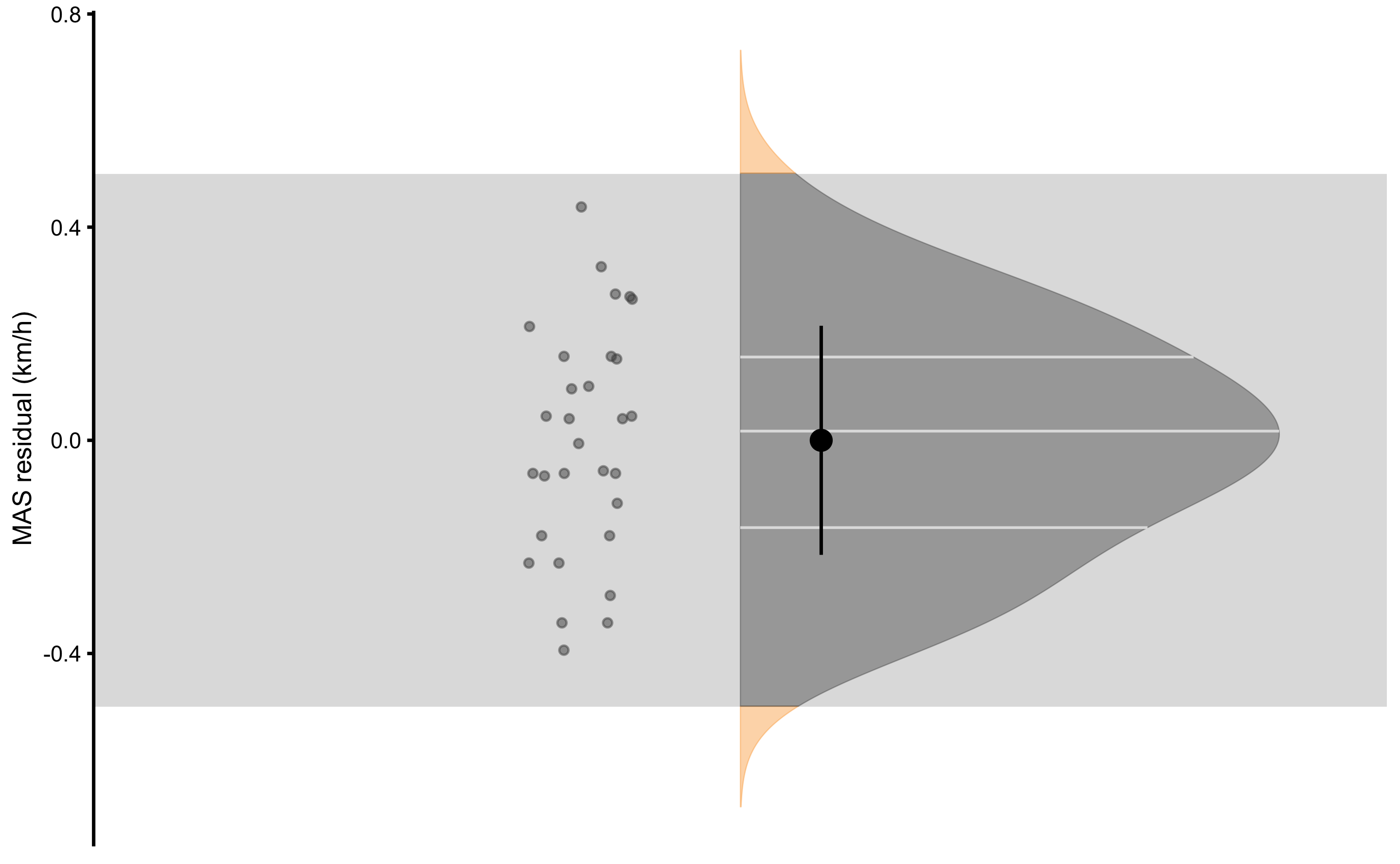
Figure 2.11: Residuals of the linear regression model predicting MAS from YoYoIR1 test. Proportion of residuals within SESOI band represent PPER
| SESOI YoYoIR1 (m) | SESOI MAS (km/h) | Sensitivity | RSE | SESOI MAS to RSE | PPER |
|---|---|---|---|---|---|
| ±40 | ±0.5 | 0.11 | 0.22 | 4.57 | 0.98 |
Visual inspection from the Figure 2.11 and magnitude-based estimates from the Table 2.17 indicate that using YoYoIR1 test scores, we are able to predict14 MAS test scores with the error within SESOI. But would that be the case if the we want to predict YoYoIR1 from MAS test scores? Predictive performance of such model is depicted on the Figure 2.12 and magnitude-based estimator are enlisted in the Table 2.18.
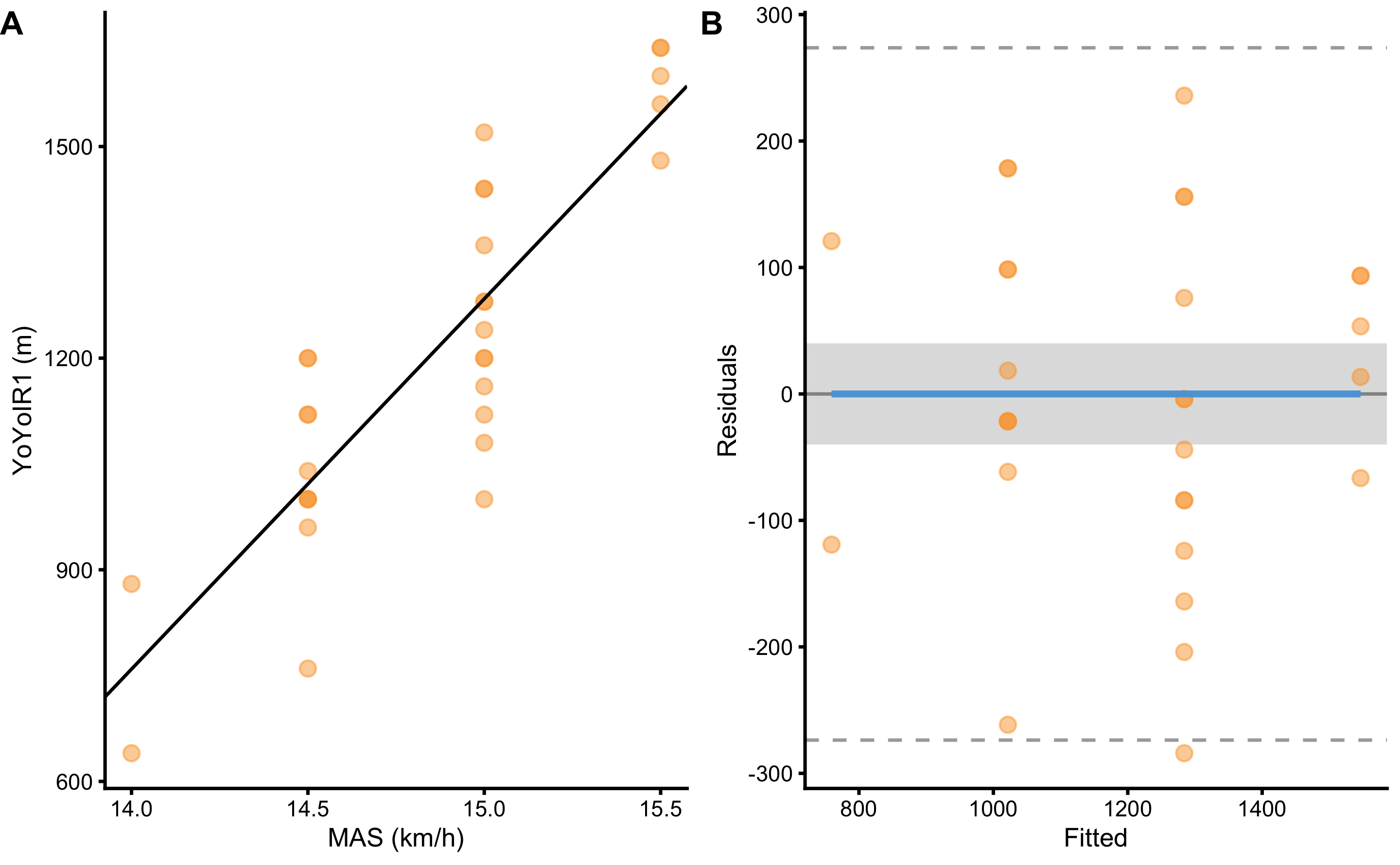
Figure 2.12: Linear regression model estimating association between YoYoIR1 and MAS tests where YoYoIR1 is now the target variable. A. Scatterplot with SESOI depicted as grey band around linear regression line. B. Residual plot, where the difference between YoYoIR1 and linear regression line (model estimate) is plotted against MAS variable. SESOI is represented with the grey band. Residuals within SESOI band are of no practical difference. Proportion of residuals within SESOI band represent PPER
| SESOI YoYoIR1 (m) | SESOI MAS (km/h) | Sensitivity | RSE | SESOI YoYoIR1 to RSE | PPER |
|---|---|---|---|---|---|
| ±40 | ±0.5 | 6.56 | 133.84 | 0.6 | 0.23 |
As clearly indicated with this example, when estimating practical association between two variables, it is very important which variable is the target and which is predictor. When it comes to Pearson's r, R-Squared and MIC, this is not the case and results are same regardless of which variable is predictor and which is target.
From the analysis performed, it seems that predicting MAS from YoYoIR1 is practically useful and the association is practically significant. Unfortunately, the same is not the case when we try to predict YoYoIR1 from MAS. This might be due different physical traits that determine the test scores. For example, results in the YoYoIR1 test might depend on the traits that include, but are not limited to, same traits important for the MAS test.
The purpose of descriptive analysis is only to describe - further analysis involving answering the why questions is in the domain of explanatory modeling and causal inference (which are covered in the Causal inference section), as well as Advanced uses of descriptive modeling, such as latent variable modeling. What is important to remember is that to describe magnitude-based association, it is important to clearly state which variable is the target and which is the predictor.
2.4 Advanced uses
Advanced techniques in the descriptive statistics involve dimension reduction, such as principal component analysis (PCA), latent variable modeling, such as factor analysis (FA), or cluster analysis (14,23,24,45,46,100). These techniques are beyond the scope of this book and the interested readers are directed to references provided.
References
2. Albanese, D, Filosi, M, Visintainer, R, Riccadonna, S, Jurman, G, and Furlanello, C. Minerva and minepy: A C engine for the MINE suite and its R, Python and MATLAB wrappers. Bioinformatics bts707, 2012.
5. Allen, M, Poggiali, D, Whitaker, K, Marshall, TR, and Kievit, R. Raincloudplots Tutorials And Codebase., 2018.
6. Allen, M, Poggiali, D, Whitaker, K, Marshall, TR, and Kievit, RA. Raincloud plots: A multi-platform tool for robust data visualization. Wellcome Open Research 4: 63, 2019.
10. Anvari, F and Lakens, D. Using Anchor-Based Methods to Determine the Smallest Effect Size of Interest., 2019.
12. Barron, JT. A General and Adaptive Robust Loss Function. arXiv:170103077 [cs, stat], 2019.Available from: http://arxiv.org/abs/1701.03077
14. Beaujean, AA. Latent variable modeling using R: A step by step guide. New York: Routledge/Taylor & Francis Group, 2014.
23. Borsboom, D. Latent Variable Theory. Measurement: Interdisciplinary Research & Perspective 6: 25–53, 2008.
24. Borsboom, D, Mellenbergh, GJ, and van Heerden, J. The theoretical status of latent variables. Psychological Review 110: 203–219, 2003.
25. Botchkarev, A. A New Typology Design of Performance Metrics to Measure Errors in Machine Learning Regression Algorithms. Interdisciplinary Journal of Information, Knowledge, and Management 14: 045–076, 2019.
28. Buchheit, M and Rabbani, A. The 3015 Intermittent Fitness Test Versus the Yo-Yo Intermittent Recovery Test Level 1: Relationship and Sensitivity to Training. International Journal of Sports Physiology and Performance 9: 522–524, 2014.
29. Caldwell, AR and Cheuvront, SN. Basic statistical considerations for physiology: The journal Temperature toolbox. Temperature 1–30, 2019.
33. Chai, T and Draxler, RR. Root mean square error (RMSE) or mean absolute error (MAE)? Arguments against avoiding RMSE in the literature. Geoscientific Model Development 7: 1247–1250, 2014.
35. Cohen, J. Statistical power analysis for the behavioral sciences. 2nd ed. Hillsdale, N.J: L. Erlbaum Associates, 1988.
45. Everitt, B and Hothorn, T. An introduction to applied multivariate analysis with R. New York: Springer, 2011.
46. Finch, WH and French, BF. Latent variable modeling with R. New York: Routledge, Taylor & Francis Group, 2015.
48. Foreman, JW. Data smart: Using data science to transform information into insight. Hoboken, New Jersey: John Wiley & Sons, 2014.
64. Hamner, B and Frasco, M. Metrics: Evaluation metrics for machine learning. 2018.Available from: https://CRAN.R-project.org/package=Metrics
87. Hopkins, WG. How to Interpret Changes in an Athletic Performance Test. 2, 2004.
88. Hopkins, WG. New View of Statistics: Effect Magnitudes., 2006.Available from: https://www.sportsci.org/resource/stats/effectmag.html
89. Hopkins, WG. Individual responses made easy. Journal of Applied Physiology 118: 1444–1446, 2015.
90. Hopkins, WG, Marshall, SW, Batterham, AM, and Hanin, J. Progressive Statistics for Studies in Sports Medicine and Exercise Science: Medicine & Science in Sports & Exercise 41: 3–13, 2009.
92. James, G, Witten, D, Hastie, T, and Tibshirani, R. An Introduction to Statistical Learning: With Applications in R. 1st ed. 2013, Corr. 7th printing 2017 edition. New York: Springer, 2017.
100. Kabacoff, R. R in action: Data analysis and graphics with R. Second edition. Shelter Island: Manning, 2015.
102. King, MT. A point of minimal important difference (MID): A critique of terminology and methods. Expert Review of Pharmacoeconomics & Outcomes Research 11: 171–184, 2011.
111. Kuhn, M and Johnson, K. Applied Predictive Modeling. 1st ed. 2013, Corr. 2nd printing 2016 edition. New York: Springer, 2018.
114. Lakens, D, Scheel, AM, and Isager, PM. Equivalence Testing for Psychological Research: A Tutorial. Advances in Methods and Practices in Psychological Science 1: 259–269, 2018.
121. Ludbrook, J. SPECIAL ARTICLE COMPARING METHODS OF MEASUREMENT. Clinical and Experimental Pharmacology and Physiology 24: 193–203, 1997.
124. Ludbrook, J. A primer for biomedical scientists on how to execute Model II linear regression analysis: Model II linear regression analysis. Clinical and Experimental Pharmacology and Physiology 39: 329–335, 2012.
131. McGraw, KO and Wong, SP. A common language effect size statistic. Psychological Bulletin 111: 361–365, 1992.
140. Mullineaux, DR, Barnes, CA, and Batterham, AM. Assessment of Bias in Comparing Measurements: A Reliability Example. Measurement in Physical Education and Exercise Science 3: 195–205, 1999.
155. Reshef, DN, Reshef, YA, Finucane, HK, Grossman, SR, McVean, G, Turnbaugh, PJ, et al. Detecting Novel Associations in Large Data Sets. Science 334: 1518–1524, 2011.
161. Rousselet, GA, Pernet, CR, and Wilcox, RR. Beyond differences in means: Robust graphical methods to compare two groups in neuroscience. European Journal of Neuroscience 46: 1738–1748, 2017.
164. Sainani, KL. Clinical Versus Statistical Significance. PM&R 4: 442–445, 2012.
179. Swinton, PA, Hemingway, BS, Saunders, B, Gualano, B, and Dolan, E. A Statistical Framework to Interpret Individual Response to Intervention: Paving the Way for Personalized Nutrition and Exercise Prescription. Frontiers in Nutrition 5, 2018.
183. Turner, A, Brazier, J, Bishop, C, Chavda, S, Cree, J, and Read, P. Data Analysis for Strength and Conditioning Coaches: Using Excel to Analyze Reliability, Differences, and Relationships. Strength and Conditioning Journal 37: 76–83, 2015.
198. Wilcox, R, Peterson, TJ, and McNitt-Gray, JL. Data Analyses When Sample Sizes Are Small: Modern Advances for Dealing With Outliers, Skewed Distributions, and Heteroscedasticity. Journal of Applied Biomechanics 34: 258–261, 2018.
200. Wilcox, RR and Rousselet, GA. A guide to robust statistical methods in neuroscience. bioRxiv, 2017.
203. Willmott, C and Matsuura, K. Advantages of the mean absolute error (MAE) over the root mean square error (RMSE) in assessing average model performance. Climate Research 30: 79–82, 2005.
Standardization is the process of putting different variables on the same scale. This allows for easier comparison, as well as graphing using a common axis. For example, variables are usually standardized by using Z-Score (\(z_{i} = \frac{x_{i} - \overline{x}}{SD_{x}}\)) which has a mean of zero and a standard deviation of 1.↩︎
As can be noticed,
RMSEandSDare not exactly the same. This is because a sampleSDequation uses \(n-1\) instead of \(n\): \(SD = \sqrt{\frac{1}{n-1}\Sigma_{i=1}^{n}(y_i -\bar{y})^2}\), where \(\bar{y}\) represents themean. Remember that \(\hat{y_i}\) represents the model estimate. In this case model estimate \(\hat{y_i}\) and samplemean\(\bar{y}\) are the same. SampleSDuses \(n-1\) since this represents unbiased estimator of the populationSD. More about this topic will be covered in Statistical inference section.↩︎The analytic solution for the central tendency estimate that minimizes
SDis, of course, the samplemean(\(\frac{1}{n}\Sigma_{i=1}^{n}y_i\)).↩︎Percent changeis the same estimator aspercent difference, but applied to difference between the two dependent groups (see section Comparing dependent groups).↩︎However, let’s admit that we would rather report estimators of higher value, particularly if we are biased toward a specific test. “Athletes improved on average for 35%” sounds much more appealing than 7%, even if the effects estimated using
Cohen's dare the same.↩︎In other words, we are drawing 100 paired samples from the two independent groups. This makes the drawn 100 observations paired or dependent.↩︎
Other term for SESOI that is commonly used is region of practical equivalence (ROPE) (107,108).↩︎
SESOI has two thresholds: lower and upper, or negative and positive. In this example these thresholds are -2.5cm and +2.5cm. This makes SESOI range equal to 5cm, which is calculated as \(SESOI_{upper} - SESOI_{lower}\). This range can also be referred to as equivalence range.↩︎
It is assumed here that SESOI is symmetrical in both positive and negative directions. This makes the equivalent difference ranging from -2.5cm to +2.5cm. SESOI doesn’t necessary needs to be symmetrical in both positive and negative directions.↩︎
Since YoYoIR1 test is performed in 2x20m shuttles, the minimal increment is equal to 40m. For the MAS test the minimal increment is 0.5km/h.↩︎
This approach, as already explained, belongs to the OLS approach. On the other hand, MLE tries to find a line that maximizes likelihood of the data.↩︎
The benefit of using squared errors in OLS approaches, is that this optimization (or the search for parameters that minimize
RMSEas a cost function in this case) can be done analytically. One of the drawbacks of using squared errors (or squared residuals) is sensitivity to outliers. Other regression approaches, such as quantiles regression or ordinary least products (OLP) for example, use different loss and cost functions. OLP regression will be utilized in the Reliability section of the book.↩︎To estimate
PPERalgebraically, one can use residualSD,RSE, orRMSEsince these are all measures of dispersion. In predictive models (see Prediction section)RMSEis utilized to estimatePPER.↩︎This is not ideal estimate of the predictive performance of this model as will be explained in the next section on Prediction.↩︎