Chapter 4 Causal inference
Does playing basketball makes one taller? This is a an example of a causal question. Wrestling with the concept of causality, as a philosophical construct is outside the scope of this book (and the author too), but I will define it using the counterfactual theory or potential outcomes perspective (9,54,76,105,150) that define causes in terms of how things would have been different had the cause not occurred, as well as from causality-as-intervention perspective (54), which necessitates clearly defined interventions (73,75,78). In other words, would someone be shorter if basketball was never trained?
There are two broad classes of inferential questions that focus on what if and why: forward causal inference (“What might happen if we do X?”) and reverse causal inference (“What causes Y? Why?”) (54). Forward causation is more clearly defined problem, where the goal is to quantify the causal effect of treatment. Questions of forward causation are most directly studied using randomization (54) and are answered from the above mentioned causality-as-intervention and counterfactual perspectives. Reverse causation is more complex and it is more related to explaining the causal chains using the system-variable approach. Article by (54) provides great overview of the most common causal perspectives, out of which I will mostly focus on forward causation.
4.1 Necessary versus sufficient causality
Furthermore, we also need to distinguish between four kinds of causation (105,150): necessary causation, sufficient causation and neither or both. For example, if someone says that A causes B, then:
- If A is necessary for B, it means that if A never happened (counterfactual reasoning), then B will never happen. Or, in other words, B can never happen without A. But sufficient causality also means that A can happen without B happening.
- If A is sufficient for B, it means that if you have A, you will always have B. In other words, B always follows A. However, sometimes B can happen without A
- If A is neither sufficient nor necessary for B, then sometimes when A happens B will happen. B can also happen without A.
- If A is both necessary and sufficient for B, then B will always happen after A, and B will never happen without A.
Table 4.1 contains summary of the above necessary and sufficient causality. In all four types of causation, the concept of counterfactual reasoning is invoked.
| Cause | Necessary | Sufficient | Neither | Both |
|---|---|---|---|---|
| A happens | B might happen | B always happen | B might happen | B always happen |
| A doesn’t happen | B never happens | B might happen | B might happen | B never happens |
Although the causal inference is a broad area of research, philosophical discussion and conflicts, there are a few key concepts that need to be introduced to get the big picture and understand the basics behind the aims of causal inference. Let’s start with an example involving the aforementioned question whether playing basketball makes one taller.
4.2 Observational data
In order to answer this question, we have collected height data (expressed in cm) for the total of N=30 athletes, of which N=15 play basketball, and N=15 don’t play basketball (Table 4.2). Playing basketball can be considered intervention or treatment, in which causal effect we are interested in. Basketball players are considered intervention group or treatment group and those without the treatment are considered comparison group or control group
| Athlete | Treatment | Height (cm) |
|---|---|---|
| Athlete 27 | Basketball | 214 |
| Athlete 01 | Basketball | 214 |
| Athlete 25 | Basketball | 211 |
| Athlete 19 | Basketball | 210 |
| Athlete 03 | Basketball | 207 |
| Athlete 21 | Basketball | 200 |
| Athlete 23 | Basketball | 199 |
| Athlete 15 | Basketball | 198 |
| Athlete 17 | Basketball | 193 |
| Athlete 07 | Basketball | 192 |
| Athlete 29 | Basketball | 192 |
| Athlete 13 | Basketball | 191 |
| Athlete 05 | Basketball | 191 |
| Athlete 11 | Basketball | 184 |
| Athlete 09 | Basketball | 180 |
| Athlete 02 | Control | 189 |
| Athlete 28 | Control | 183 |
| Athlete 06 | Control | 181 |
| Athlete 14 | Control | 180 |
| Athlete 04 | Control | 179 |
| Athlete 12 | Control | 176 |
| Athlete 18 | Control | 176 |
| Athlete 08 | Control | 173 |
| Athlete 26 | Control | 173 |
| Athlete 24 | Control | 170 |
| Athlete 30 | Control | 168 |
| Athlete 20 | Control | 168 |
| Athlete 16 | Control | 165 |
| Athlete 10 | Control | 165 |
| Athlete 22 | Control | 163 |
Using descriptive estimators introduced in the Description section, one can quickly calculate the group mean and SD as well as their difference (Table 4.3). But does mean difference between basketball and control represent average causal effect (ACE)26? No, unfortunately not!
| Mean (cm) | SD (cm) | |
|---|---|---|
| Basketball | 198.59 | 10.86 |
| Control | 174.04 | 7.54 |
| Difference | 24.55 | 13.22 |
4.3 Potential outcomes or counterfactuals
To explain why this is the case, we need to imagine alternate counterfactual reality. What is needed are two potential outcomes: \(Height_{0}\), which represents height of the person if one doesn’t train basketball, and \(Height_{1}\) which represents height of the person if basketball is being played (Table 4.4). As can be guessed, the Basketball group has known \(Height_{1}\), but unknown \(Height_{0}\) and vice versa for the Control group.
| Athlete | Treatment | Height_0 (cm) | Height_1 (cm) | Height (cm) | Causal Effect (cm) |
|---|---|---|---|---|---|
| Athlete 27 | Basketball | ??? | 214 | 214 | ??? |
| Athlete 01 | Basketball | ??? | 214 | 214 | ??? |
| Athlete 25 | Basketball | ??? | 211 | 211 | ??? |
| Athlete 19 | Basketball | ??? | 210 | 210 | ??? |
| Athlete 03 | Basketball | ??? | 207 | 207 | ??? |
| Athlete 21 | Basketball | ??? | 200 | 200 | ??? |
| Athlete 23 | Basketball | ??? | 199 | 199 | ??? |
| Athlete 15 | Basketball | ??? | 198 | 198 | ??? |
| Athlete 17 | Basketball | ??? | 193 | 193 | ??? |
| Athlete 07 | Basketball | ??? | 192 | 192 | ??? |
| Athlete 29 | Basketball | ??? | 192 | 192 | ??? |
| Athlete 13 | Basketball | ??? | 191 | 191 | ??? |
| Athlete 05 | Basketball | ??? | 191 | 191 | ??? |
| Athlete 11 | Basketball | ??? | 184 | 184 | ??? |
| Athlete 09 | Basketball | ??? | 180 | 180 | ??? |
| Athlete 02 | Control | 189 | ??? | 189 | ??? |
| Athlete 28 | Control | 183 | ??? | 183 | ??? |
| Athlete 06 | Control | 181 | ??? | 181 | ??? |
| Athlete 14 | Control | 180 | ??? | 180 | ??? |
| Athlete 04 | Control | 179 | ??? | 179 | ??? |
| Athlete 12 | Control | 176 | ??? | 176 | ??? |
| Athlete 18 | Control | 176 | ??? | 176 | ??? |
| Athlete 08 | Control | 173 | ??? | 173 | ??? |
| Athlete 26 | Control | 173 | ??? | 173 | ??? |
| Athlete 24 | Control | 170 | ??? | 170 | ??? |
| Athlete 30 | Control | 168 | ??? | 168 | ??? |
| Athlete 20 | Control | 168 | ??? | 168 | ??? |
| Athlete 16 | Control | 165 | ??? | 165 | ??? |
| Athlete 10 | Control | 165 | ??? | 165 | ??? |
| Athlete 22 | Control | 163 | ??? | 163 | ??? |
Unfortunately, these potential outcomes are unknown, and thus individual causal effects are unknown as well. We just do not know what might have happened to individual outcomes in counterfactual world (i.e. alternate reality). A good control group serves as a proxy to reveal what might have happened on average to the treated group in the counterfactual world where they are not treated. Since the basketball data is simulated, the exact DGP is known (the true systematic or main causal effect of playing basketball on height is exactly zero), which again demonstrates the use of simulations as a great learning tool, in this case understanding the underlying causal mechanisms (Table 4.5). Individual causal effect in this case is the difference between two potential outcomes: \(Height_{1}\) and \(Height_{0}\).
| Athlete | Treatment | Height_0 (cm) | Height_1 (cm) | Height (cm) | Causal Effect (cm) |
|---|---|---|---|---|---|
| Athlete 27 | Basketball | 214 | 214 | 214 | 0.12 |
| Athlete 01 | Basketball | 214 | 214 | 214 | 0.00 |
| Athlete 25 | Basketball | 212 | 211 | 211 | -1.10 |
| Athlete 19 | Basketball | 210 | 210 | 210 | 0.90 |
| Athlete 03 | Basketball | 208 | 207 | 207 | -0.07 |
| Athlete 21 | Basketball | 200 | 200 | 200 | 0.20 |
| Athlete 23 | Basketball | 198 | 199 | 199 | 0.57 |
| Athlete 15 | Basketball | 198 | 198 | 198 | 0.18 |
| Athlete 17 | Basketball | 193 | 193 | 193 | 0.44 |
| Athlete 07 | Basketball | 193 | 192 | 192 | -0.09 |
| Athlete 29 | Basketball | 193 | 192 | 192 | -0.40 |
| Athlete 13 | Basketball | 192 | 191 | 191 | -0.36 |
| Athlete 05 | Basketball | 191 | 191 | 191 | -0.15 |
| Athlete 11 | Basketball | 183 | 184 | 184 | 0.46 |
| Athlete 09 | Basketball | 179 | 180 | 180 | 0.72 |
| Athlete 02 | Control | 189 | 189 | 189 | 0.06 |
| Athlete 28 | Control | 183 | 184 | 183 | 0.41 |
| Athlete 06 | Control | 181 | 181 | 181 | 0.42 |
| Athlete 14 | Control | 180 | 180 | 180 | -0.66 |
| Athlete 04 | Control | 179 | 179 | 179 | 0.10 |
| Athlete 12 | Control | 176 | 176 | 176 | -0.39 |
| Athlete 18 | Control | 176 | 175 | 176 | -0.31 |
| Athlete 08 | Control | 173 | 173 | 173 | -0.55 |
| Athlete 26 | Control | 173 | 174 | 173 | 0.77 |
| Athlete 24 | Control | 170 | 170 | 170 | 0.02 |
| Athlete 30 | Control | 168 | 168 | 168 | 0.27 |
| Athlete 20 | Control | 168 | 168 | 168 | -0.03 |
| Athlete 16 | Control | 165 | 165 | 165 | -0.01 |
| Athlete 10 | Control | 165 | 164 | 165 | -0.81 |
| Athlete 22 | Control | 163 | 163 | 163 | 0.00 |
From Table 4.5, we can state that the mean difference between the groups consists of two components: average causal effect and the selection bias (9) (Equation (4.1)).
\[\begin{equation} \begin{split} mean_{difference} &= Average \; causal\; effect + Selection\; bias \\ Average \; causal\; effect &= \frac{1}{N_{Basketball}}\Sigma_{i=1}^{n}(Height_{1i} - Height_{0i}) \\ Selection\; bias &= \frac{1}{N_{Basketball}}\Sigma_{i=1}^{n}Height_{0i} - \frac{1}{N_{Control}}\Sigma_{i=1}^{n}Height_{0i} \end{split} \tag{4.1} \end{equation}\]
The mean group difference we have observed (24.55cm) is due to average causal effect (0.1cm) and selection bias (24.46cm). In other words, observed mean group difference can be explained solely by selection bias. Since we know the DGP behind the basketball data, we know that there is no systematic causal effect of playing basketball on height.
On top of the selection bias involved in the example above, other confounders might be involved, such as age, sex, race, experience and others, some of which can be measured and some might be unknown. These are also referred to as the third variable which confounds the causal relationship between treatment and the outcome. In this example, all subjects from the Basketball group might be older males, whereas all the subjects from the Control group might be be younger females, and this can explain the group differences, rather than causal effect of playing basketball.
4.4 Ceteris paribus and the biases
It is important to understand that, in order to have causal interpretation, comparisons need to be made under ceteris paribus conditions (9), which is Latin for other things equal. In the basketball example above, we cannot make causal claim that playing basketball makes one taller, since comparison between the groups is not done in the ceteris paribus conditions due to the selection bias involved. We also know this since we know the DGP behind the observed data.
Causal inference thus aims to achieve ceteris paribus conditions needed to make causal interpretations by careful considerations of the known and unknown biases involved (9,73,74,76,77,119,158,178).
According to Hernan et al. (74,77), there are three types of biases involved in causal inference: confounding, selection bias and measurement bias.
Confounding is the bias that arises when treatment and outcome share causes. This is because treatment was not randomly assigned (74,77). For example, athletes that are naturally taller might be choosing to play basketball due to success and enjoyment over their shorter peers. On the other hand, it might be some hidden confounder that motivates to-be-tall athletes to choose basketball. Known and measured confounders from the observational studies can be taken into account to create ceteris paribus conditions when estimating causal effects (9,74,77,119,158,178).
4.4.1 Randomization
The first line of defence against confounding and selection bias is to randomly assign athletes to treatment, otherwise known as randomized trial or randomized experiment. Random assignment makes comparison between groups ceteris paribus providing the sample is large enough to ensure that differences in the individual characteristics such as age, sex, experience and other potential confounders are washed out (9). In other words, random assignment works not by eliminating individual differences but rather by ensuring that the mix of the individuals being compared is the same, including the ways we cannot easily measure or observe (9).
In case the individuals from the basketball example were randomly assigned, given the known causal DGP, then the mean difference between the groups would be more indicative of the causal effect of playing basketball on height (Table 4.6).
| Athlete | Treatment | Height (cm) |
|---|---|---|
| Athlete 01 | Basketball | 214 |
| Athlete 25 | Basketball | 211 |
| Athlete 19 | Basketball | 210 |
| Athlete 03 | Basketball | 207 |
| Athlete 23 | Basketball | 199 |
| Athlete 15 | Basketball | 198 |
| Athlete 13 | Basketball | 191 |
| Athlete 02 | Basketball | 189 |
| Athlete 28 | Basketball | 184 |
| Athlete 14 | Basketball | 180 |
| Athlete 04 | Basketball | 179 |
| Athlete 12 | Basketball | 176 |
| Athlete 26 | Basketball | 174 |
| Athlete 24 | Basketball | 170 |
| Athlete 16 | Basketball | 165 |
| Athlete 27 | Control | 214 |
| Athlete 21 | Control | 200 |
| Athlete 29 | Control | 193 |
| Athlete 07 | Control | 193 |
| Athlete 17 | Control | 193 |
| Athlete 05 | Control | 191 |
| Athlete 11 | Control | 183 |
| Athlete 06 | Control | 181 |
| Athlete 09 | Control | 179 |
| Athlete 18 | Control | 176 |
| Athlete 08 | Control | 173 |
| Athlete 30 | Control | 168 |
| Athlete 20 | Control | 168 |
| Athlete 10 | Control | 165 |
| Athlete 22 | Control | 163 |
If we calculate the mean differences in this randomly assigned basketball treatment (Table 4.7), we can quickly notice that random assignment washed out selection bias involved with the observational study, and that the mean difference is closer to the known systematic (or average or expected) causal effect. The difference between estimated systematic causal effect using mean group difference from the randomized trial and the true causal effect is due to the sampling error which will be explained in the Statistical inference section.
| Mean (cm) | SD (cm) | |
|---|---|---|
| Basketball | 189.91 | 16.15 |
| Control | 182.65 | 14.44 |
| Difference | 7.25 | 21.66 |
Apart from creating ceteris paribus conditions, randomization generates a good control group that serves as a proxy to reveal what might have happened to the treated group in the counterfactual world where they are not treated, since \(Height_0\) is not known for the basketball group. Creating those conditions with randomized trial demands careful considerations and balance checking since biases can crawl inside the causal interpretation. The logic of randomized trial is simple, yet the logistics can be quite complex. For example, a sample of sufficient size might not be practically feasible, and imbalances in the known confounders can be still found in the groups, thus demanding further control and adjustment in the analysis (e.g. using ANCOVA instead of ANOVA, adjusting for confounders in the linear regression by introducing them as interactions) in order to create ceteris paribus conditions needed to evaluate causal claims. Belief effect can sneak in, for example, if the treatment group knows they are being treated, or if researchers motivate treatment groups harder, since they expect and hope for better outcomes. For this reason, blinding both the subjects and researches can be considered, as well as providing placebo treatment to the Control group. In sport science research blinding and providing placebo can be problematic. For example, if our intervention is a novel training method or a technology, both researchers and subjects will expect better outcomes which can bias causal interpretations.
4.5 Subject matter knowledge
One of the main problems with randomized trials is that it cannot be done in most real life settings, either due to the ethical or practical reasons. For example, if studying effects of smoking on baby mortality and birth defects, which parent would accept being in the treatment group. Or if studying effects of resistance training on injury risk in football players, which professional organization would allow random assignment to the treatment that is lesser than the known best practices and can predispose athletes to the injuries or sub-par preparation?
For this reason, reliance on observation studies is the best we can do. However, in order to create ceteris paribus conditions necessary to minimize bias in the causal interpretations, expert subject-matter knowledge is needed, not only to describe the causal structure of the system under study, but also to specify the causal questions and identify relevant data sources (76). Imagine asking the following causal question: “Does training load lead to overuse injuries in professional sports”. It takes expert subject matter knowledge to specify the treatment construct (i.e. “training load”), to figure out how should be measured, as well as to quantify the measurement error which can induce measurement bias, to state over which time period the treatment is done, as well as to specify the outcome construct (i.e. “overuse-injuries”), and to define the variables and constructs that confound and define the causal network underlying such a question. This subject matter is fallible of course, and the constructs, variables and the causal network can be represented with pluralistic models that represents “Small World” maps of the complex “Large World”, in which we are hoping to deploy the findings (please refer to the Introduction for more information about this concept). Drawing assumptions that underly causal structure using direct acyclical graphs (DAGs) (74,77,150,158,163,178,181) represents a step forward in acknowledging the issues above, by providing transparency of the assumptions involved and bridging the subjective - objective dichotomy.
4.6 Example of randomized control trial
Let’s consider the following example. We are interested in estimating causal effect of the plyometric training on the vertical jump height. To estimate causal effect, randomized control trial (RCT) is utilized. RCT utilizes two groups: Treatment (N=15) and Control (N=15), measured two times: Pre-test and Post-test. Treatment group received plyometric training over the course of three months, while Control group continued with normal training. The results of RCT study can be found in the Table 4.8. To estimate practical significance of the treatment effect, SESOI of ±2.5cm is selected to indicate minimal change of the practical value. It is important to have “well defined interventions” (73,75,78), thus the question that should be answered is as follows: “Does plyometric training added to normal training improves vertical jump height over period of three months?”
| Athlete | Group | Pre-test (cm) | Post-test (cm) | Change (cm) |
|---|---|---|---|---|
| Athlete 01 | Treatment | 37.98 | 52.86 | 14.93 |
| Athlete 27 | Treatment | 44.79 | 58.50 | 13.43 |
| Athlete 19 | Treatment | 46.77 | 59.76 | 12.99 |
| Athlete 25 | Treatment | 38.90 | 49.58 | 10.81 |
| Athlete 03 | Treatment | 41.29 | 51.41 | 10.34 |
| Athlete 23 | Treatment | 48.41 | 57.57 | 8.58 |
| Athlete 17 | Treatment | 44.81 | 51.41 | 7.85 |
| Athlete 21 | Treatment | 37.14 | 44.95 | 7.37 |
| Athlete 15 | Treatment | 46.69 | 52.73 | 6.14 |
| Athlete 29 | Treatment | 42.77 | 47.38 | 5.02 |
| Athlete 13 | Treatment | 49.66 | 54.11 | 4.46 |
| Athlete 05 | Treatment | 37.92 | 41.63 | 3.78 |
| Athlete 07 | Treatment | 41.03 | 45.41 | 3.42 |
| Athlete 11 | Treatment | 45.27 | 46.72 | 1.82 |
| Athlete 12 | Control | 42.56 | 44.29 | 1.01 |
| Athlete 28 | Control | 47.06 | 47.98 | 0.55 |
| Athlete 04 | Control | 44.53 | 45.13 | 0.12 |
| Athlete 02 | Control | 49.63 | 48.86 | -0.01 |
| Athlete 08 | Control | 41.11 | 42.13 | -0.45 |
| Athlete 26 | Control | 42.31 | 41.61 | -0.51 |
| Athlete 06 | Control | 45.96 | 45.70 | -0.52 |
| Athlete 14 | Control | 44.51 | 42.89 | -0.63 |
| Athlete 18 | Control | 42.57 | 42.15 | -0.74 |
| Athlete 16 | Control | 37.63 | 37.83 | -0.75 |
| Athlete 22 | Control | 36.52 | 34.83 | -0.97 |
| Athlete 24 | Control | 40.15 | 39.88 | -1.03 |
| Athlete 30 | Control | 39.34 | 38.34 | -1.21 |
| Athlete 09 | Treatment | 47.61 | 45.62 | -1.57 |
| Athlete 20 | Control | 38.94 | 36.97 | -1.72 |
| Athlete 10 | Control | 36.77 | 34.15 | -2.26 |
Descriptive summary statistics for Treatment and Control groups are enlisted in the Table 4.9, and visually depicted in the Figure 4.1.
| Group | Pre-test (cm) | Post-test (cm) | Change (cm) |
|---|---|---|---|
| Treatment | 43.4 ± 4.15 | 50.64 ± 5.4 | 7.29 ± 4.65 |
| Control | 41.97 ± 3.87 | 41.52 ± 4.49 | -0.61 ± 0.83 |
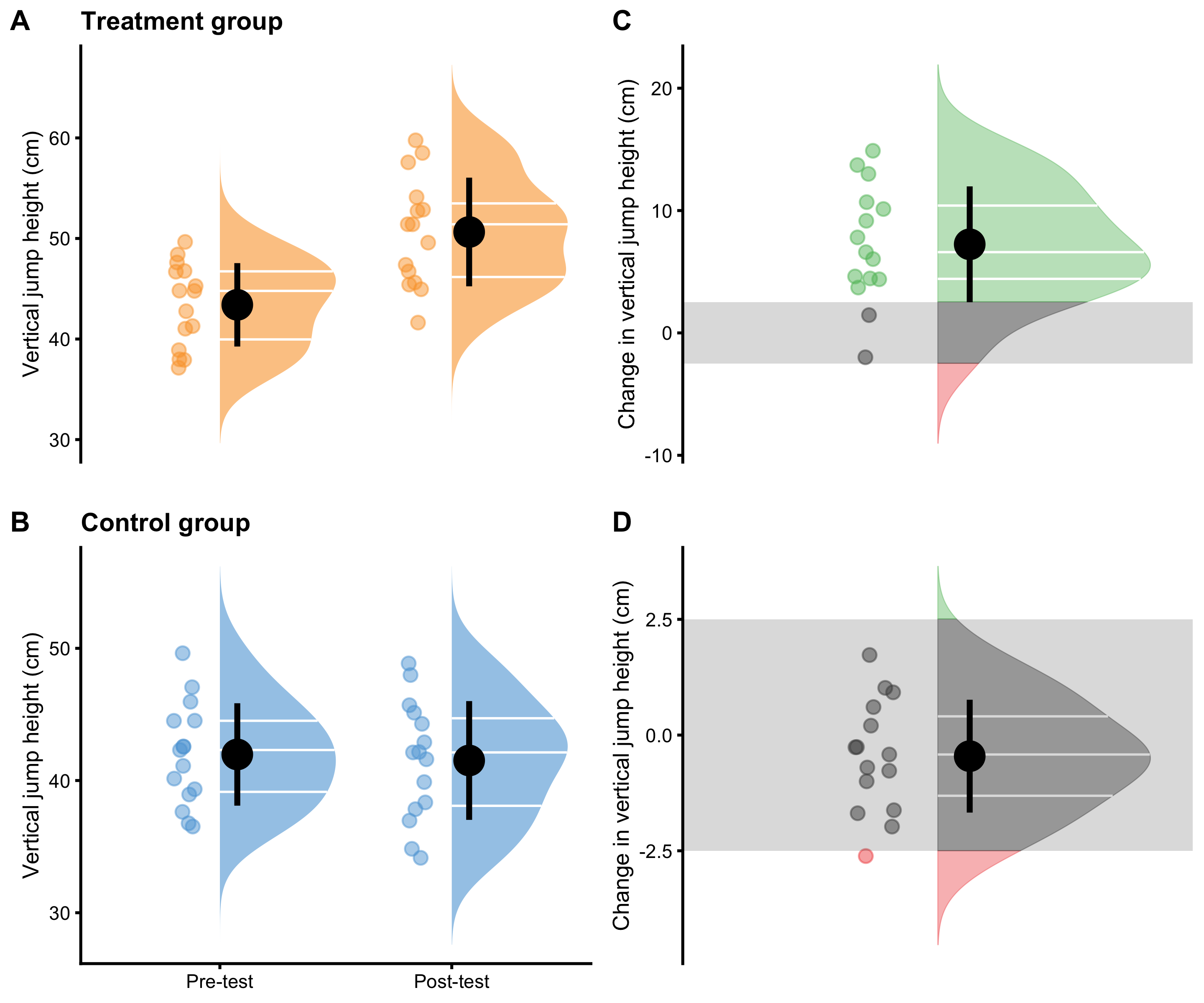
Figure 4.1: Visual analysis of RCT using Treatment and Control groups. A and B. Raincloud plot of the Pre-test and Post-test scores for Treatment and Control groups. Blue color indicates Control group and orange color indicates Treatment group. C and D. Raincloud plot of the change scores for the Treatment and Control groups. SESOI is indicated with a grey band
Further analysis might involve separate dependent groups analysis for both Treatment and Control (Table 4.10), or in other words, the analysis of the change scores. To estimate Cohen's d, pooled SD of the Pre-test scores in both Treatment and Control is utilized. (see Equation (2.11)).
| Estimator | Control | Treatment |
|---|---|---|
| Mean change (cm) | -0.61 | 7.29 |
| SDchange (cm) | 0.83 | 4.65 |
| SDpre-test pooled (cm) | 4.01 | 4.01 |
| Cohen’s d | -0.15 | 1.82 |
| SESOI lower (cm) | -2.50 | -2.50 |
| SESOI upper (cm) | 2.50 | 2.50 |
| Change to SESOI | -0.12 | 1.46 |
| SDchange to SESOI | 0.17 | 0.93 |
| pLower | 0.06 | 0.03 |
| pEquivalent | 0.93 | 0.14 |
| pHigher | 0.01 | 0.83 |
Figure 4.2 depicts same information as Figure 4.1 but organized differently and conveying different comparison.
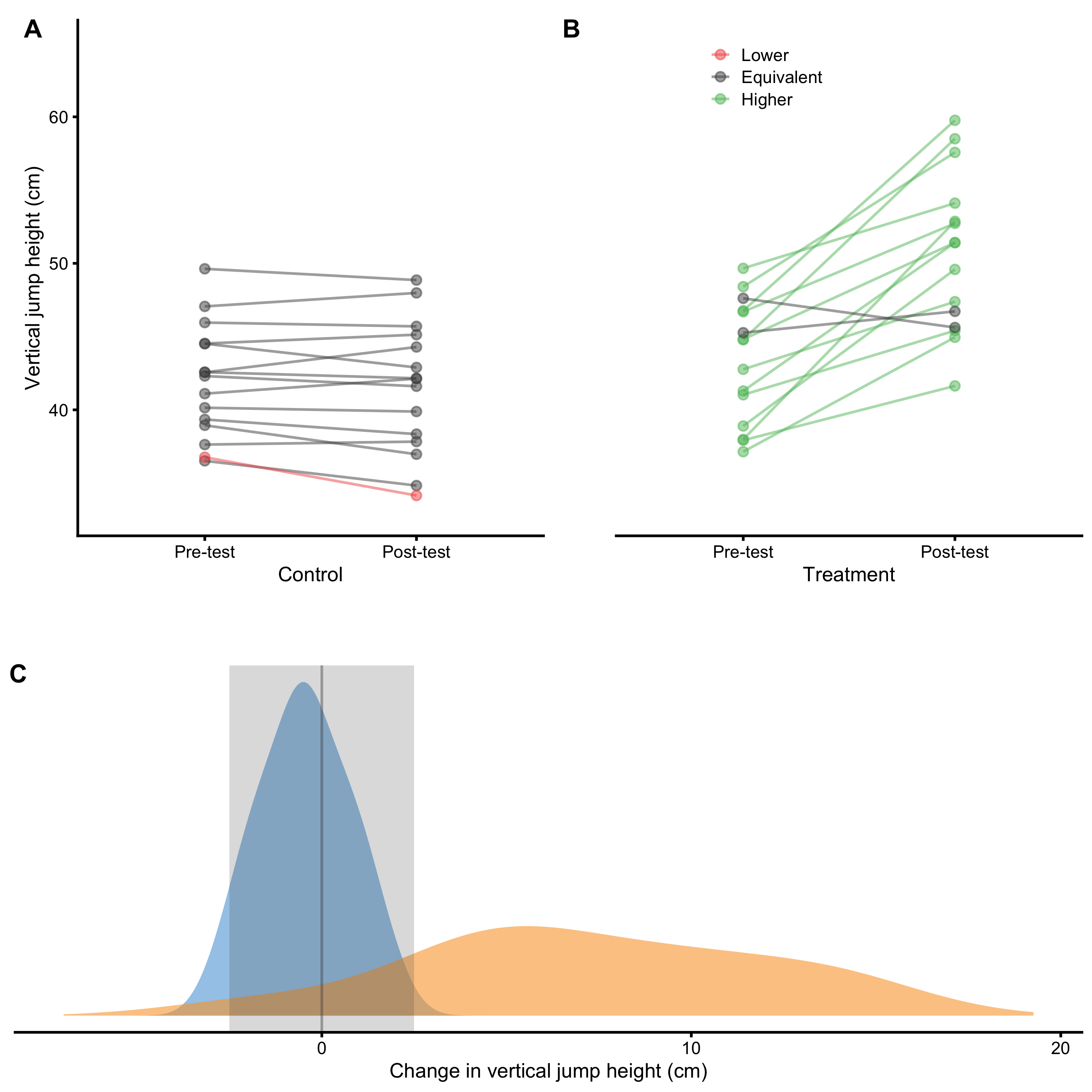
Figure 4.2: Visual analysis of RCT using Treatment and Control groups. A and B. Scatter plot of Pre-test and Post-test scores for Treatment and Control groups. Green line indicates change higher than SESOI upper, grey line indicates change within SESOI band, and red line indicates negative change lower than SESOI lower. C. Distribution of the change scores for Treatment (orange) and Control (blue) groups. Grey rectangle indicates SESOI band.
But we are not that interested in independent analysis of Treatment and Control groups, but rather on their differences and understanding of the causal effect of the treatment (i.e. understanding and estimating parameters of the underlying DGP). As stated, treatment effect consists of two components: systematic component or main effect (i.e. expected or average causal effect), and stochastic component or random effect (i.e. that varies between individuals) (see Figure 4.3). As already explained, Control group serves as a proxy to what might have happened to the Treatment group in the counterfactual world, and thus allows for casual interpretation of the treatment effect. There are two effects at play with this RCT design: treatment effect and non-treatment effect. The latter captures all effects not directly controlled by a treatment, but assumes it affects both groups equally (Figure 4.3). For example, if we are treating kids for longer period of time, non-treatment effect might be related to the growth and associated effects. Another non-treatment effect is measurement error (discussed in more details in Measurement Error section).
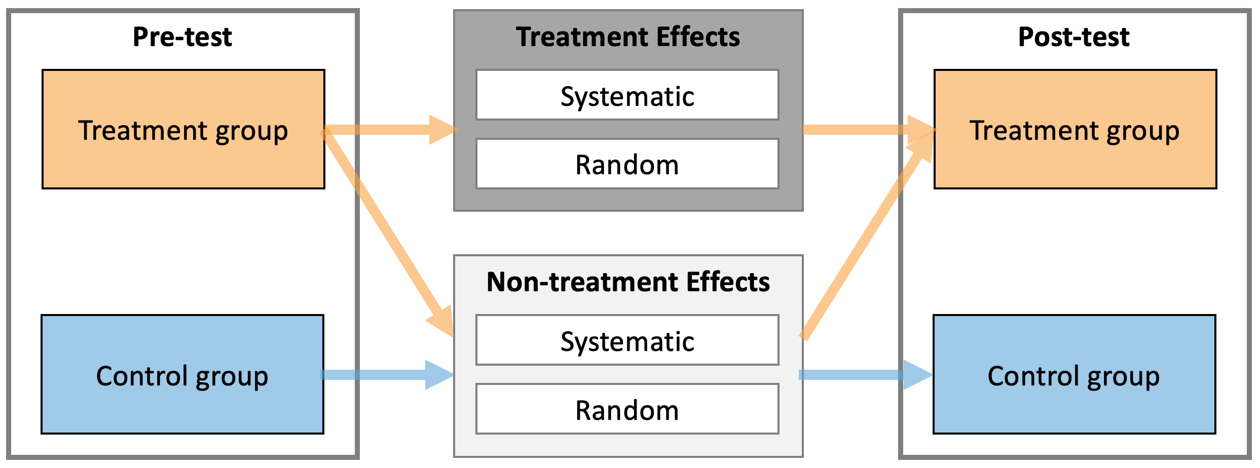
Figure 4.3: Treatment and Non-treatment effects of intervention. Both treatment and non-treatment effects consists of two components: systematic and random. Treatment group experiences both treatment and non-treatment effects, while Control group experiences only non-treatment effects.
The following equation captures the essence of estimating Treatment effects from Pre-test and Post-test scores in the Treatment and Control groups (Equation (4.2)):
\[\begin{equation} \begin{split} Treatment_{post} &= Treat_{pre} + Treat \; Effect + NonTreat \; Effect \\ Control_{post} &= Control_{pre} + NonTreat \; Effect \\ \\ NonTreatment \; Effect &= Control_{post} - Control_{pre} \\ Treatment \; Effect &= Treat_{post} - Treat_{pre} - NonTreat \; Effect \\ \\ Treatment \; Effect &= (Treat_{post} - Treat_{pre}) - (Control_{post} - Control_{pre}) \\ Treatment \; Effect &= Treat_{change} - Control_{change} \end{split} \tag{4.2} \end{equation}\]
From the Equation (4.2), the differences between the changes in Treatment and Control groups can be interpreted as the estimate of the causal effect of the treatment. More precisely, average causal effect or expected causal effect represent systematic treatment effect. This is estimated using difference between mean Treatment change and mean Control change.
Table 4.11 contains descriptive statistics of the change score differences. Panel C in the Figure 4.2 depicts distribution of the change scores and reflect the calculus in the Table 4.11 graphically.
| Mean difference (cm) | Cohen’s d | Difference to SESOI | pLower diff | pEquivalent diff | pHigher diff |
|---|---|---|---|---|---|
| 7.9 | 9.56 | 1.58 | -0.03 | -0.79 | 0.82 |
Cohen's d in the Table 4.11 is calculated by using the Equation (4.3) and it estimates standardized difference between change scores in Treatment and the Control groups.
\[\begin{equation} Cohen's\;d = \frac{mean_{treatment\; group \; change} - mean_{control\; group \;change}}{SD_{control\; group \; change}} \tag{4.3} \end{equation}\]
Besides estimating systematic component of the treatment (i.e. the difference between the mean change in Treatment and Control groups), we might be interested in estimating random component and proportions of lower, equivalent and higher effects compared to SESOI (pLower, pEquivalent, and pHigher). Unfortunately, differences in pLower, pEquivalent, and pHigher from Table 4.11 don’t answer this question, but rather the expected difference in proportions compared to Control (e.g. the expected improvement of 0.82 in observing proportion of higher change outcomes compared to Control).
Since the changes in Treatment group are due both to the treatment and non-treatment effects (equation 29), the average treatment effect (systematic component) represents the difference between the mean changes in Treatment and Control groups (Table 4.11). In the same manner, the variance of the change scores in the Treatment group are due to the random component of the treatment and non-treatment effects. Assuming normal (Gaussian) distribution of the random components, the SD of the treatment effects (\(SD_{TE}\))27 is estimated using the following Equation (4.4).
\[\begin{equation} \begin{split} \epsilon_{treatment \;group \;change} &= \epsilon_{treatment \; effect} + \epsilon_{nontreatment \; effect} \\ \epsilon_{control \;group \;change} &= \epsilon_{nontreatment \; effect} \\ \epsilon_{treatment \; effect} &= \epsilon_{treatment \;group \;change} - \epsilon_{control \;group \;change} \\ \\ \epsilon_{treatment \; effect} &\sim \mathcal{N}(0,\,SD_{TE}) \\ \epsilon_{nontreatment \; effect} &\sim \mathcal{N}(0,\,SD_{NTE}) \\ \epsilon_{treatment \;group \;change} &\sim \mathcal{N}(0,\,SD_{treatment \;group \;change}) \\ \epsilon_{control \;group \;change} &\sim \mathcal{N}(0,\,SD_{control \;group \;change}) \\ \\ SD_{TE} &= \sqrt{SD_{treatment \;group \;change}^2 - SD_{control \;group \;change}^2} \end{split} \tag{4.4} \end{equation}\]
This neat mathematical solution is due to assumption of Gaussian error, assumption that random treatment and non-treatment effects are equal across subjects (see Ergodicity section for more details about this assumption), and the use of squared errors. This is one beneficial property of using squared errors that I alluded to in the section Cross-Validation section.
Thus, the estimated parameters of the causal treatment effects in the underlying DGP are are summarized with the following Equation (4.5). This treatment effect is graphically depicted in the Figure 4.4.
\[\begin{equation} \begin{split} Treatment \; effect &\sim \mathcal{N}(Mean_{TE},\,SD_{TE}) \\ \\ Mean_{TE} &= Mean_{treatment \;group \;change} - Mean_{control \;group \;change} \\ \\ SD_{TE} &= \sqrt{SD_{treatment \;group \;change}^2 - SD_{control \; group \; change}^2} \end{split} \tag{4.5} \end{equation}\]
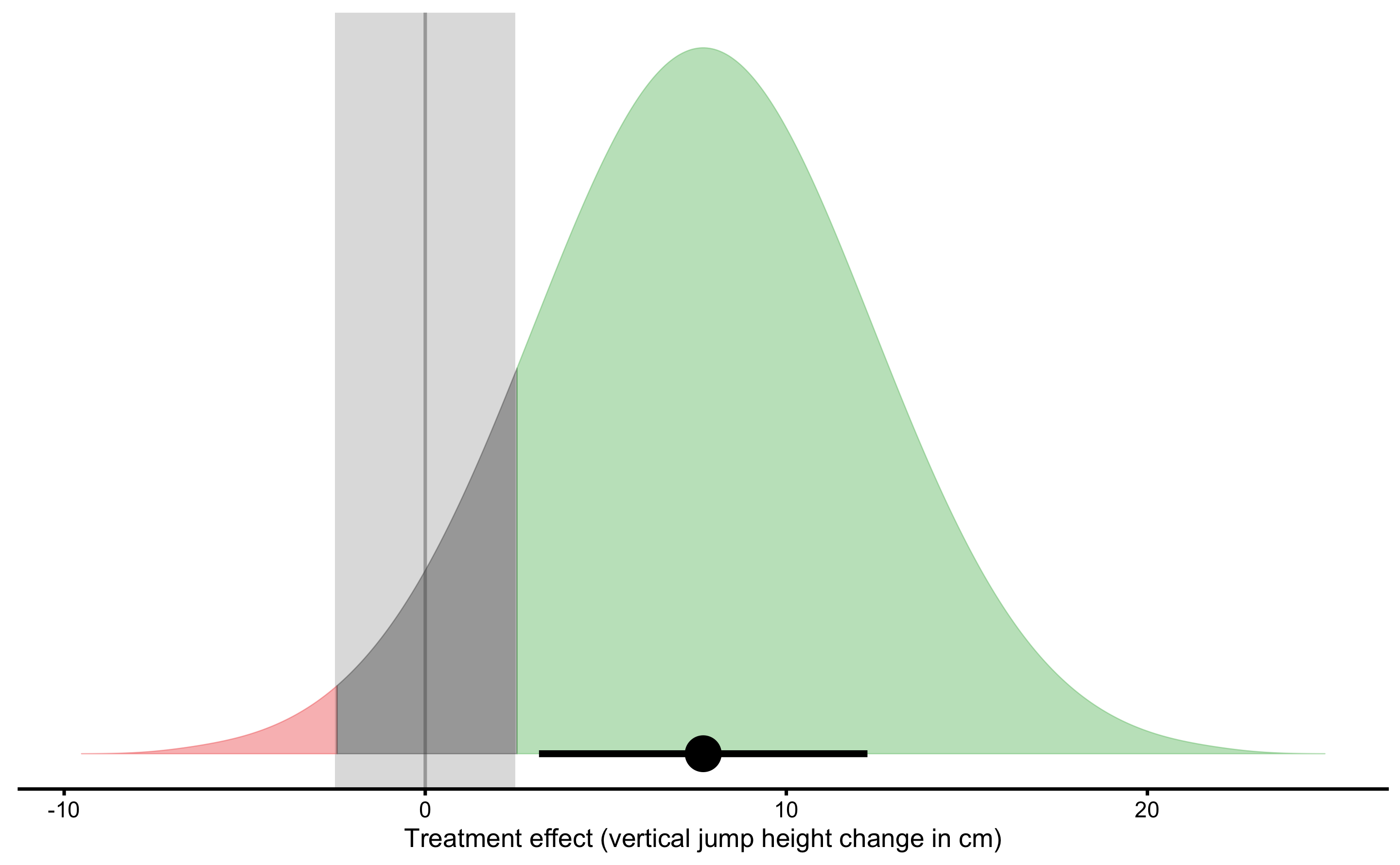
Figure 4.4: Graphical representation of the causal Treatment effect. Green area indicates proportion of higher than SESOI treatment effects, red indicates proportion of negative and lower than SESOI treatment effects, and grey indicates treatment effects that are within SESOI. Mean of treatment effect distribution represents average (or expected) causal effect or systematic treatment effect. SD of treatment effect distribution represents random systematic effect or \(SD_{TE}\)
Using SESOI, one can also estimate the proportion of lower, equivalent and higher changes (responses) caused by treatment. The estimates of the causal treatment effects, with accompanying proportions of responses are enlisted in the Table 4.12.
| Average causal effect (cm) | Random effect (cm) | SESOI (cm) | Average causal effect to SESOI | SESOI to random effect | pLower | pEquivalent | pHigher |
|---|---|---|---|---|---|---|---|
| 7.9 | 4.57 | ±2.5 | 1.58 | 1.09 | 0.01 | 0.11 | 0.88 |
Therefore, we can conclude that plyometric training over three months period, on top of the normal training, cause improvements in vertical jump height (in the sample collected; generalizations beyond sample are discussed in the Statistical inference section). The expected improvement (i.e. average causal effect or systematic effect) is equal to 7.9cm, with 1, 11, and 88% of athletes having lower, trivial and higher improvements.
4.7 Prediction as a complement to causal inference
In the previous section, RCT is analyzed using analysis of changes. In this section, I will utilize linear regression model to analyze RCT data. There are multiple ways this could be done (91) and deeper analysis is beyond the scope of this book (see also Frank Harrell post on the use of change scores). The aim of this section is to provide an introduction to model-based and prediction-based RCT analysis, as well as to demonstrate potential uses of PDP+ICE plots as tools for counterfactual analysis.
Analysis in the previous section can be represented using simple linear regression model (Equation (4.6)).
\[\begin{equation} \widehat{Change} = \hat{\beta_0} + \hat{\beta_1}Group \tag{4.6} \end{equation}\]
According to Frank Harrell, the use of change scores in the RCT analysis is problematic. Although this model definition (Equation (4.6)) will give us exactly the same results as obtained in the previous section, the use of change scores should be avoided. Thus, look at this example as training vehicle. After this initial discussion, valid model representation will be used.
Since Group column is a string, how is Group column represented in the model? Group column needs to be dummy-coded, using 0 for Control and 1 for Treatment (see Table 4.13).
| Athlete | groupTreatment | Pre-test (cm) | Post-test (cm) | Change (cm) |
|---|---|---|---|---|
| Athlete 12 | 0 | 42.56 | 44.29 | 1.01 |
| Athlete 28 | 0 | 47.06 | 47.98 | 0.55 |
| Athlete 04 | 0 | 44.53 | 45.13 | 0.12 |
| Athlete 02 | 0 | 49.63 | 48.86 | -0.01 |
| Athlete 08 | 0 | 41.11 | 42.13 | -0.45 |
| Athlete 26 | 0 | 42.31 | 41.61 | -0.51 |
| Athlete 06 | 0 | 45.96 | 45.70 | -0.52 |
| Athlete 14 | 0 | 44.51 | 42.89 | -0.63 |
| Athlete 18 | 0 | 42.57 | 42.15 | -0.74 |
| Athlete 16 | 0 | 37.63 | 37.83 | -0.75 |
| Athlete 22 | 0 | 36.52 | 34.83 | -0.97 |
| Athlete 24 | 0 | 40.15 | 39.88 | -1.03 |
| Athlete 30 | 0 | 39.34 | 38.34 | -1.21 |
| Athlete 20 | 0 | 38.94 | 36.97 | -1.72 |
| Athlete 10 | 0 | 36.77 | 34.15 | -2.26 |
| Athlete 01 | 1 | 37.98 | 52.86 | 14.93 |
| Athlete 27 | 1 | 44.79 | 58.50 | 13.43 |
| Athlete 19 | 1 | 46.77 | 59.76 | 12.99 |
| Athlete 25 | 1 | 38.90 | 49.58 | 10.81 |
| Athlete 03 | 1 | 41.29 | 51.41 | 10.34 |
| Athlete 23 | 1 | 48.41 | 57.57 | 8.58 |
| Athlete 17 | 1 | 44.81 | 51.41 | 7.85 |
| Athlete 21 | 1 | 37.14 | 44.95 | 7.37 |
| Athlete 15 | 1 | 46.69 | 52.73 | 6.14 |
| Athlete 29 | 1 | 42.77 | 47.38 | 5.02 |
| Athlete 13 | 1 | 49.66 | 54.11 | 4.46 |
| Athlete 05 | 1 | 37.92 | 41.63 | 3.78 |
| Athlete 07 | 1 | 41.03 | 45.41 | 3.42 |
| Athlete 11 | 1 | 45.27 | 46.72 | 1.82 |
| Athlete 09 | 1 | 47.61 | 45.62 | -1.57 |
Estimated parameters for this linear model are enlisted in the Table 4.14
| Intercept | groupTreatment |
|---|---|
| -0.61 | 7.9 |
Intercept in the Table 4.14 represents the mean Change in the Control group, while \(\hat{\beta_1}\) (or slope, or GroupTreatment parameter) represents estimated average treatment effect (ATE) or average causal effect, since it represents the difference in the Change means between groups. For a reference please refer to Tables 4.10 and 4.12.
Figure 4.5 depicts this model graphically.
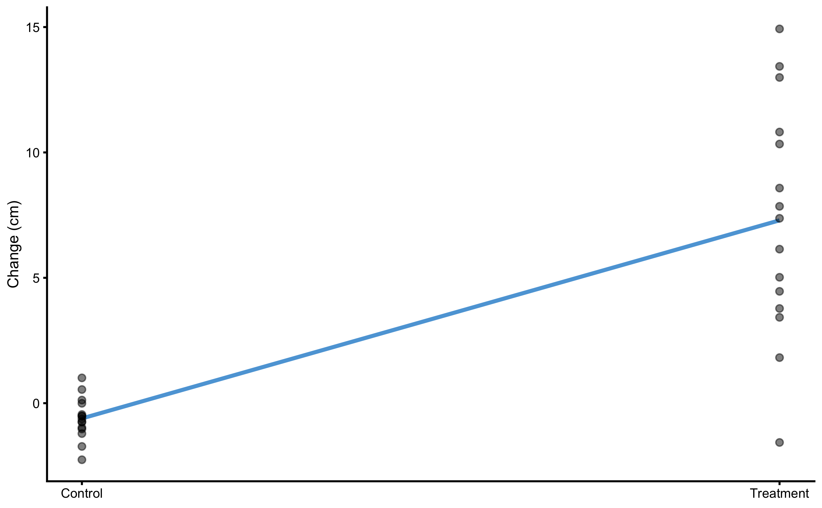
Figure 4.5: Graphical representation of the simple linear regression model for the vertical jump RCT data
Model residuals are depicted on Figure 4.6. Please note the clusters of the data-points which indicate groups (they are color-coded).
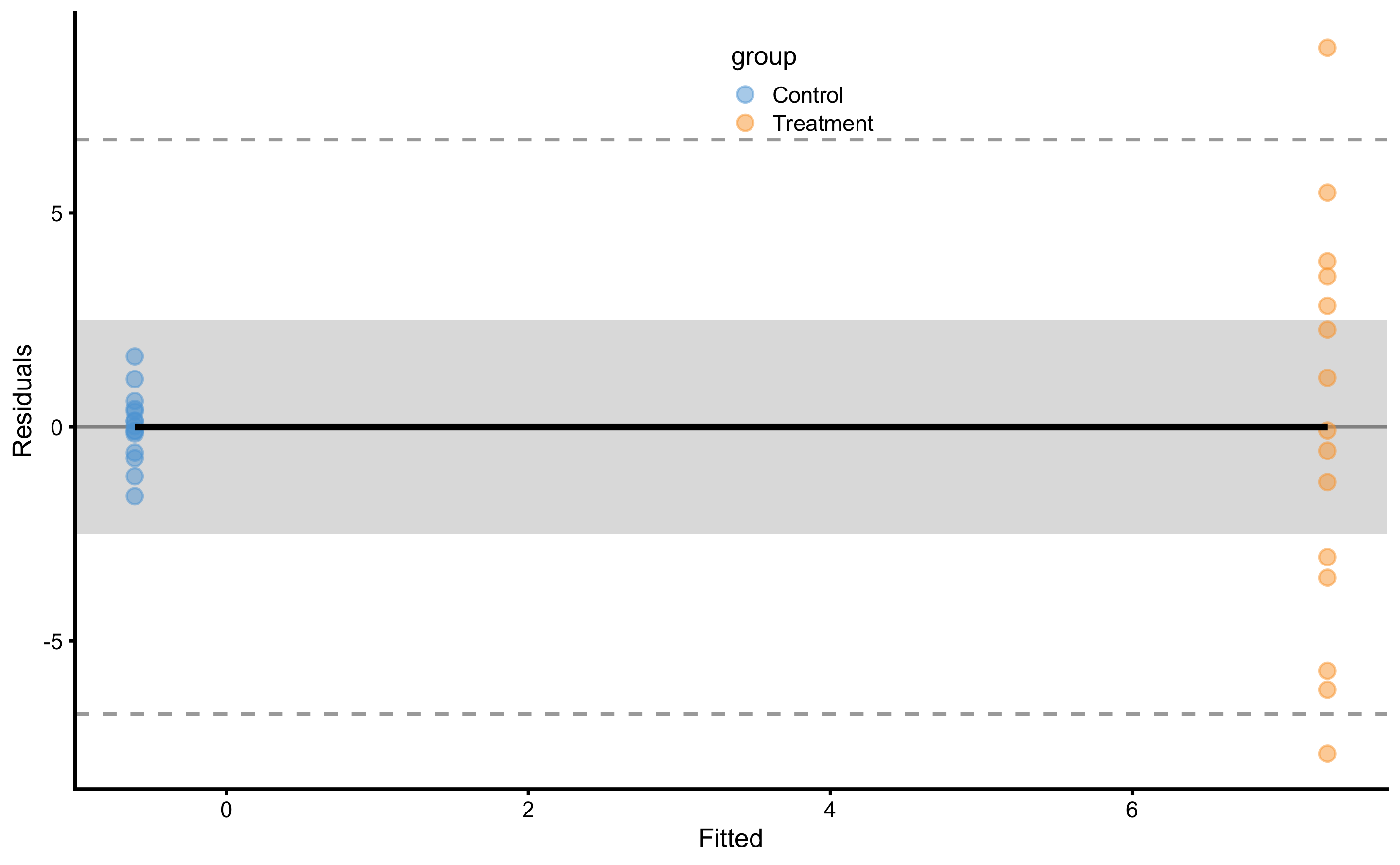
Figure 4.6: Model residuals using simple linear regression RCT model. Grey band represents SESOI of ±2.5cm. Residuals are color coded; blue are Control group and orange are Treatment group.
SD of the residuals for the Control group is equal to 0.83cm and for Treatment group is equal to 4.65cm. Please compare these estimates and estimated parameters from the Table 4.14 with Table 4.10 and Table 4.12. These estimates are identical since the model utilized (Equation (4.6)) is mathematically equivalent to the analysis done in the Example of randomized control trial section.
As alluded in the introduction of this section, RCT analysis using change scores should be avoided. Valid way to analyze the RCT in this case is to use Post-test as the outcome, and Pre-test and Group as predictors. This can be easily understood graphically (Figure 4.7). On Figure 4.7 each group (i.e. Control and Treatment) is modeled separately.
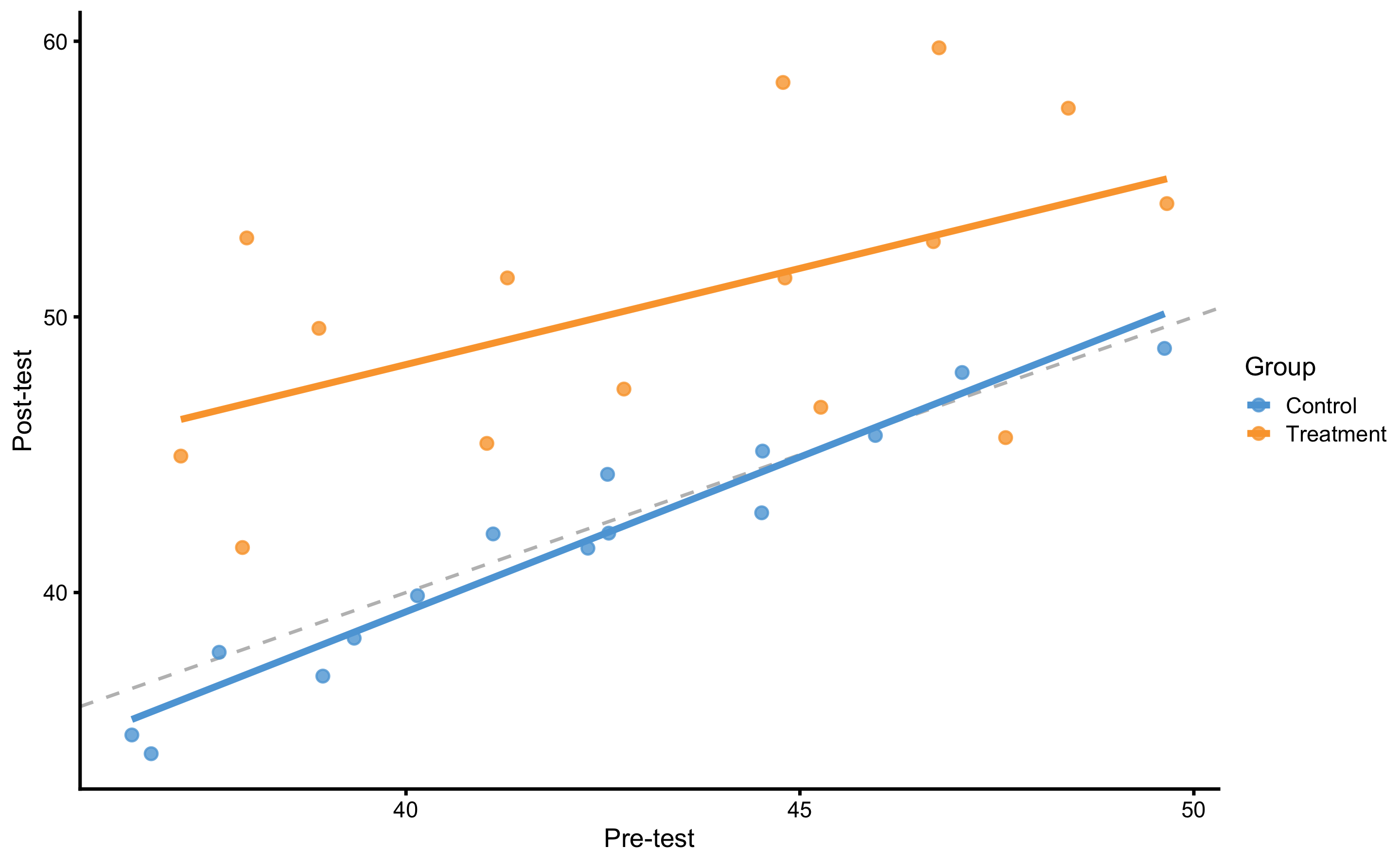
Figure 4.7: Graphical representation of the valid way to analyze RCT data. Dashed line represent identity line, where Post-test is equal to Pre-test (i.e., the no effect line). The effect of treatment represents vertical distance between the Control and Treatment lines. This is easily grasped since the lines are almost perfectly parallel. If the lines are not parallel, that would imply there is interaction between Group and Pre-test (i.e. individuals with higher Pre-test scores shows higher or lower change).
Figure 4.7 also represents ANCOVA (analysis of co-variance) design. Equation (4.7) represent model definition where effects of Group (i.e., Treatment) are estimated by controlling the effects of the Pre-test.
\[\begin{equation} \widehat{Post} = \hat{\beta_0} + \hat{\beta_1}Group + \hat{\beta_2}Pre \tag{4.7} \end{equation}\]
Estimated parameters for this linear model are enlisted in the Table 4.15. Please note the similarity with the Table 4.14.
| Intercept | groupTreatment | Pre-test |
|---|---|---|
| 3.92 | 7.85 | 0.9 |
Model residuals are depicted on Figure 4.8. Please note the clusters of the data-points which indicate groups.
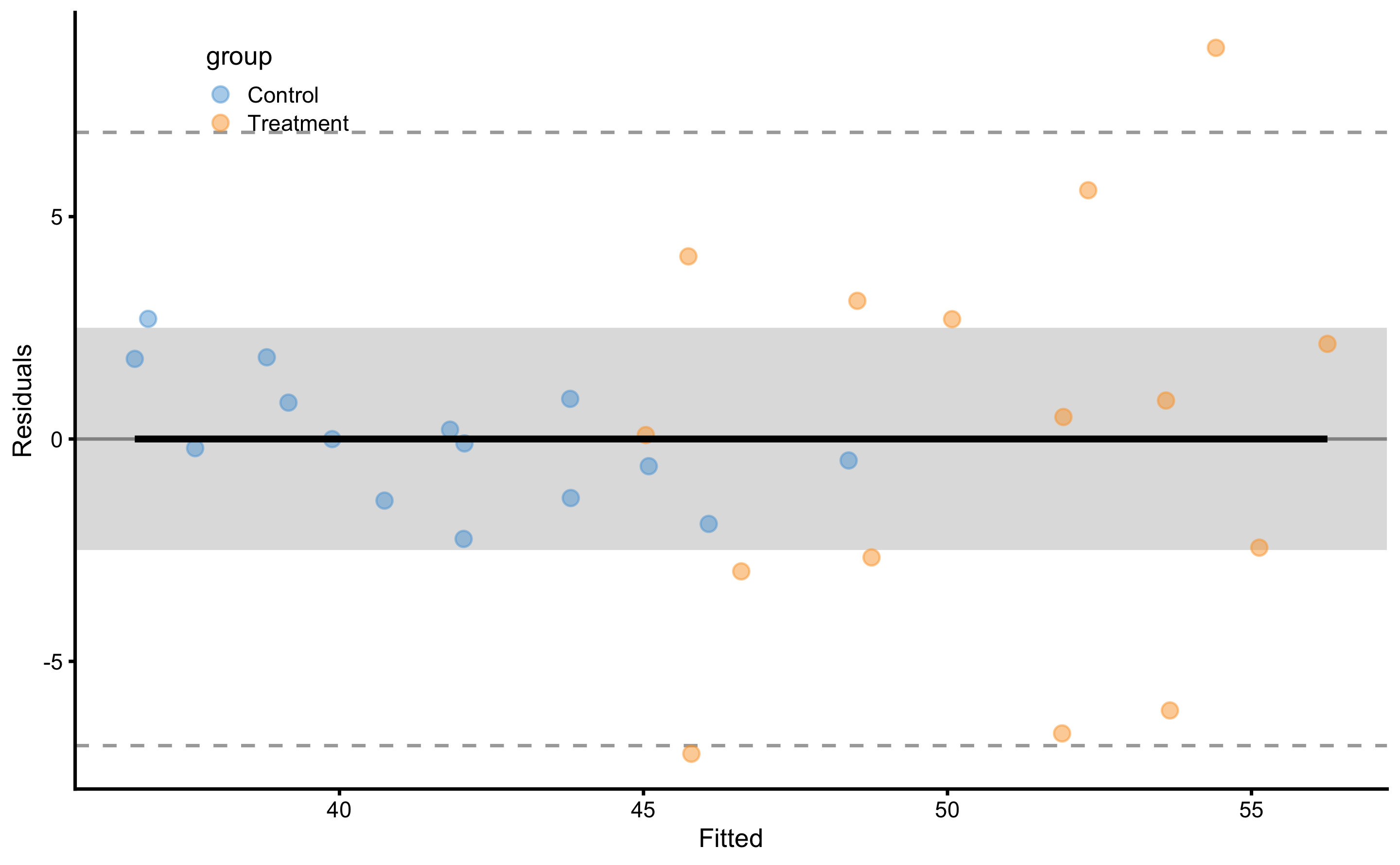
Figure 4.8: Model residuals using ANCOVA RCT model. Grey band represents SESOI of ±2.5cm. Residuals are color coded; blue are Control group and orange are Treatment group.
SD of the residuals for the Control group is equal to 1.43cm and for Treatment group is equal to 4.64cm. Please note the similarities with simple RCT model (i.e. using Change score as outcome and Group as predictor).
As explained in the Prediction section, this model can be cross-validated. Predictive performance metrics using 10 repeats of 3 folds cross-validation are enlisted in the Table 4.16. Since our RCT data has two groups (i.e. Control and Treatment), cross-validation needs to be stratified. This makes sure that each group has their own cross-validation folds, and that testing data size for each group is proportional to the group size. This avoids scenarios where most training or testing data comes from a single group (which is more probable if one group is larger).
| metric | training | training.pooled | testing.pooled | mean | SD | min | max |
|---|---|---|---|---|---|---|---|
| MBE | 0.00 | 0.00 | -0.04 | -0.04 | 1.19 | -2.00 | 2.04 |
| MAE | 2.41 | 2.37 | 2.69 | 2.69 | 0.55 | 1.68 | 4.39 |
| RMSE | 3.31 | 3.24 | 3.68 | 3.62 | 0.68 | 2.28 | 5.28 |
| PPER | 0.54 | 0.56 | 0.50 | 0.48 | 0.08 | 0.34 | 0.68 |
| SESOI to RMSE | 1.51 | 1.54 | 1.36 | 1.43 | 0.27 | 0.95 | 2.19 |
| R-squared | 0.75 | 0.76 | 0.69 | 0.70 | 0.14 | 0.25 | 0.91 |
| MinErr | -7.08 | -7.80 | -8.83 | -6.14 | 2.23 | -8.83 | -1.65 |
| MaxErr | 8.80 | 9.93 | 10.75 | 5.95 | 2.87 | 1.35 | 10.75 |
| MaxAbsErr | 8.80 | 9.93 | 10.75 | 7.91 | 1.59 | 3.78 | 10.75 |
From the Table 4.16 we can conclude, that although we have explained the causal (or treatment) effects, predicting individual Post-test is not practically meaningful since the prediction error is too large (compared to SESOI). The take-home message is that high explanatory power of the model doesn’t doesn’t automatically yield high predictive power (177). The selection of statistical analysis is thus related to the question asked. In my opinion, it would be insightful to complement causal estimates with prediction estimates. With the example above, we can predict the direction of the effect (using expected systematic change of 7.9cm and proportions of 1, 11, and 88% for lower, trivial and higher change magnitudes), but we are unable to predict individual Post-test (or changes scores) within acceptable practical precision (using SESOI as an anchor). In other words, we know that the effect will be 88% beneficial (i.e. higher than SESOI), but we are not able to predict individual responses.
For the sake of completeness, Table 4.17 contains performance metrics for the simple RCT model.
| metric | training | training.pooled | testing.pooled | mean | SD | min | max |
|---|---|---|---|---|---|---|---|
| MBE | 0.00 | 0.00 | 0.00 | 0.00 | 1.05 | -2.22 | 1.98 |
| MAE | 2.16 | 2.14 | 2.30 | 2.30 | 0.48 | 1.33 | 3.44 |
| RMSE | 3.22 | 3.19 | 3.41 | 3.35 | 0.66 | 2.02 | 4.53 |
| PPER | 0.55 | 0.57 | 0.53 | 0.51 | 0.09 | 0.39 | 0.73 |
| SESOI to RMSE | 1.55 | 1.57 | 1.47 | 1.56 | 0.35 | 1.10 | 2.48 |
| R-squared | 0.60 | 0.61 | 0.55 | 0.57 | 0.19 | -0.14 | 0.82 |
| MinErr | -7.64 | -8.73 | -9.10 | -5.97 | 2.10 | -9.10 | -1.40 |
| MaxErr | 8.86 | 9.84 | 10.33 | 5.67 | 3.05 | 0.59 | 10.33 |
| MaxAbsErr | 8.86 | 9.84 | 10.33 | 7.69 | 1.62 | 3.78 | 10.33 |
4.7.1 Analysis of the individual residuals: responders vs non-responders
One particular use of the predictive analysis is in the identification of responders and non-responders to the treatment (67,68,89,179). Common approach used in sport science (87), that I will name observed outcome approach (further discussed in Measurement error chapter and second part of this book), uses known SESOI and measurement error to estimate probability of lower, equivalent, and higher changes. In RCT, random non-treatment effect can be assumed to be due to measurement error. Figure 4.9 depicts individual adjusted change (by deducting mean Control group change from observed change) with error bars representing smallest detectable change (SDC). SDC is calculated by multiplying Control group change SD by 1.96 (to get upper and lower change levels containing 95% of change distribution). This thus represent our uncertainty in true treatment effect (using Control group as source of information about random effects).
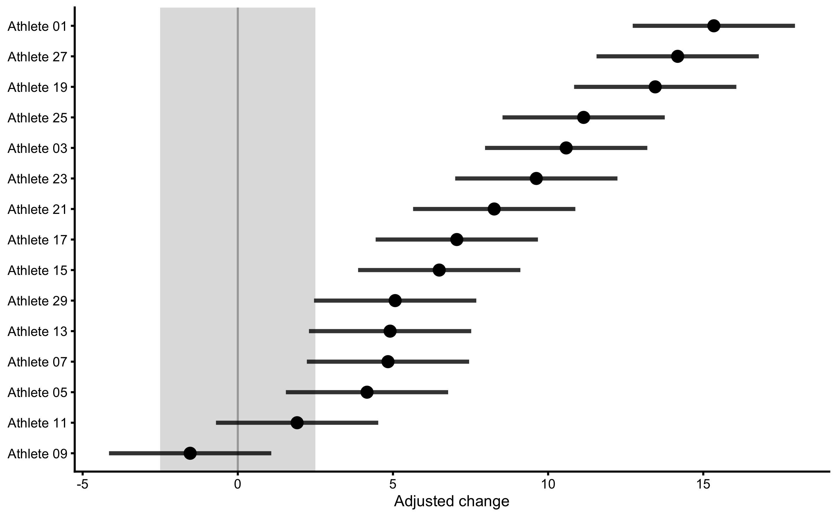
Figure 4.9: Responses analysis for the Treatment group. Change scores are adjusted by deducting Control group mean change. Error bars represent smallest detectable change (SDC) that is calculated using SD of the Control group change scores multiplied by 1.96 (to get 95% levels containing 95% of the change distribution).
Using this approach, we can classify athletes with high probability of higher change score as responders, those with high probability of equivalent change score as non-responders, and finally those with high probability of lower change score as negative-responders. This approach is useful in figuring out who responded positively or negatively to a particular treatment, but it doesn’t take into account information that might help explain the response (for example someone missing treatment session or having lower or higher treatment dose; see Direct and indirect effect, covariates and then some section). The topic is further discussed in Measurement error chapter and second part of this book.
Another approach, that I have termed residuals approach or model-based approach can be used to help identifying outliers to intervention. To explain this approach, let’s plot athletes’ residuals (\(\hat{y_i} - y_i\)) against observed Post-test (\(y_i\)) (Figure 4.10) using ANCOVA RCT model.
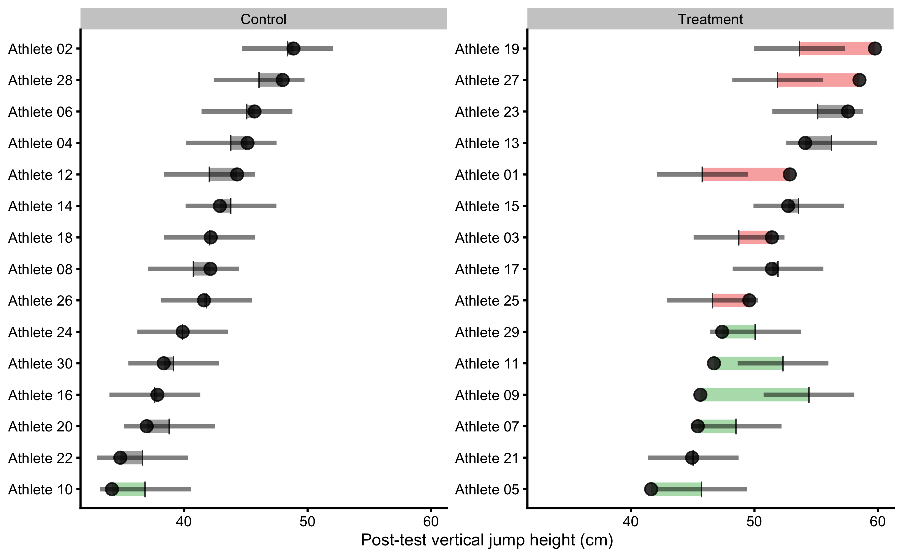
Figure 4.10: Observed Post-test in vertical jump for each athlete in the study. Black dot indicate observed Post-test value; vertical line indicate model prediction; colored bar indicated the residual magnitude compared to defined SESOI (±2.5cm in this example): grey for equivalent magnitude, green for lower magnitude, and red for higher magnitude; horizontal error bar represents cross-validated RMSE (see Table 4.16, RMSE metric, column testing.pooled) and is used to indicate model predictive performance and uncertainty around model prediction graphically
If we visualize simple model of RCT, using Change score as outcome and Group as predictor (see Figure 4.5), the predictions for athletes in each group are identical (i.e. the average change). This is depicted in Figure (Figure 4.11).
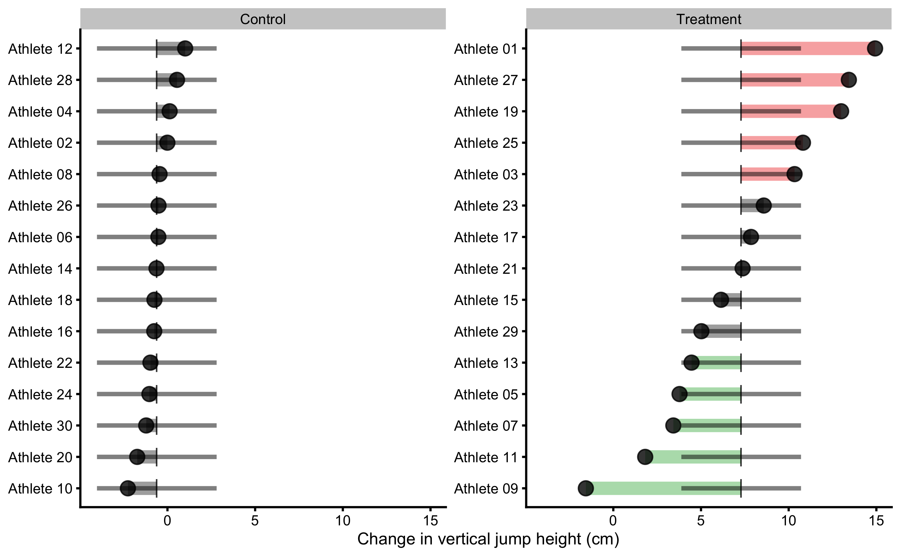
Figure 4.11: Observed Change in vertical jump for each athlete in the study. Black dot indicate observed Change value; vertical line indicate model prediction; colored bar indicated the residual magnitude compared to defined SESOI (±2.5cm in this example): grey for equivalent magnitude, green for lower magnitude, and red for higher magnitude; horizontal error bar represents cross-validated RMSE (see Table 4.17, RMSE metric, column testing.pooled) and is used to indicate model predictive performance and uncertainty around model prediction graphically
More complex models (e.g. ANCOVA RCT model in Figure 4.10), like the one utilized in Direct and indirect effect, covariates and then some section will have different predictions for each athlete.
Residuals approach uses observed scores and model predictions to indicate individuals who differ more or less than predicted by the model. If this difference between observed and predicted scores (or residual) is bigger than SESOI, this individual is flagged. But before jumping to conclusions, I need to remind you that the predictive performance of this simple model is pretty bad (see Table 4.17). Thus, this type of analysis and visualization should be interpreted given the model performance (which is indicated by horizontal line on the Figures 4.10 and 4.11 which indicates cross-validated pooled testing RMSE; see Table 4.16). I will utilize this method with a better model in the Direct and indirect effect, covariates and then some section that has much lower cross-validated RMSE. What is important to remember with this analysis is that athletes who showed lower or higher observation compared to what was predicted by the model are flagged with red or green color. As opposed to the observed outcome approach, a model-based prediction approach uses ceteris paribus in estimating responders vs. non-responders, or at least providing residuals for such a decision. For example, everything else being equal, based on predictor variables, the expected observation is higher or lower than the model prediction. This indicates that there might be something not-identified by predictive algorithm and thus needs to be flagged for a further analysis. But more about this in the Direct and indirect effect, covariates and then some.
Besides analyzing residuals in the training data-set, we can also check how model predicts for each individual within cross-validation using Bias-Variance decomposition (see Bias-Variance decomposition and trade-off section). Figure 4.12 depicts prediction error (decomposed to Bias and Variance) for each athlete using ANCOVA RCT model.
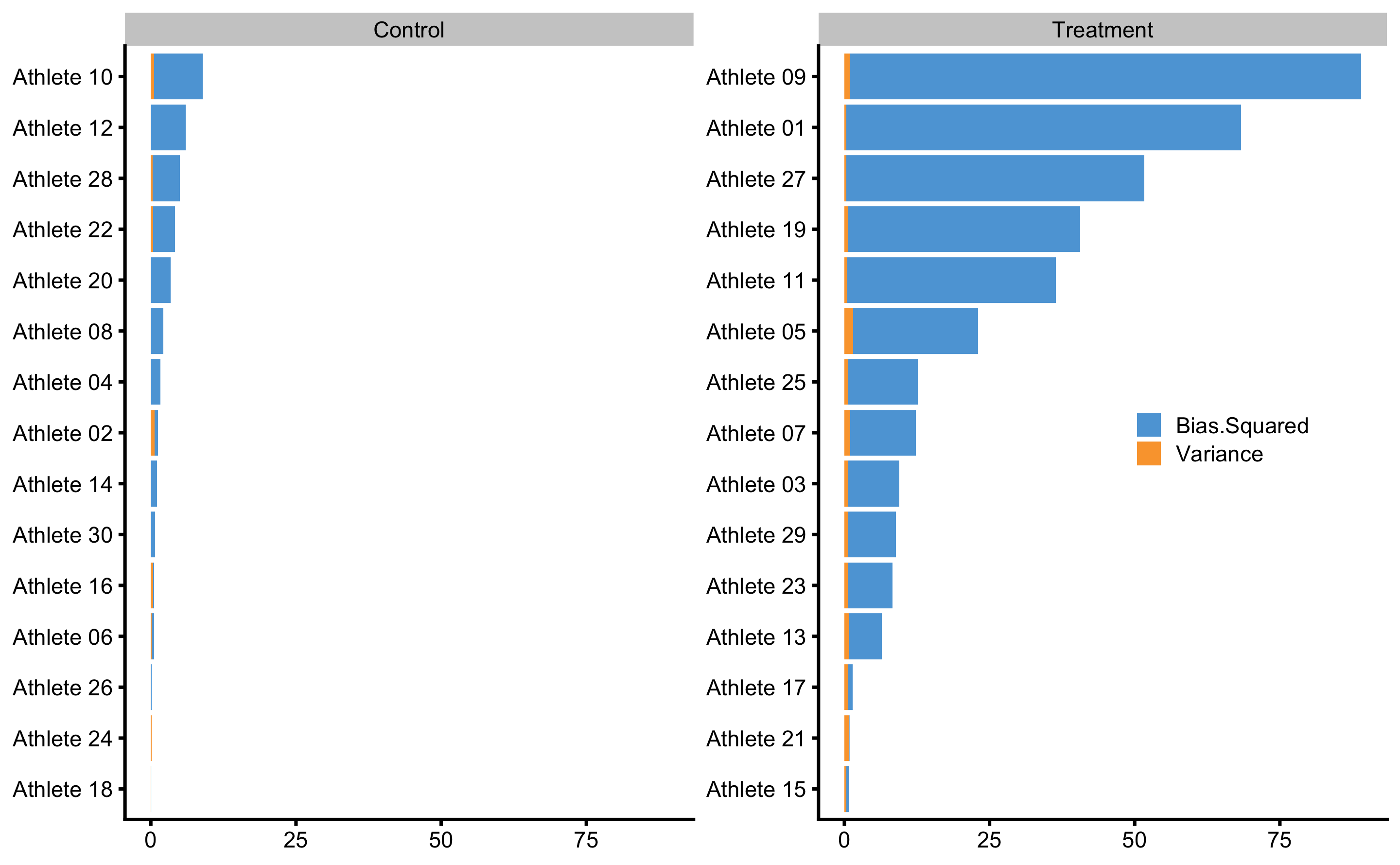
Figure 4.12: Bias-variance across 10 times repeated 3-fold cross-validation for each athlete. This analysis can also be utilize to flag certain observations (i.e. athlete in this case) that are troublesome for the predictive model
These graphs will make much more sense when more predictive model is applied in the Direct and indirect effect, covariates and then some section.
4.7.2 Counterfactual analysis and Individual Treatment Effects
As explained, causal inference and explanatory modeling aim to understand, or at least to quantify the causal (or treatment) effects. This is done by elaborate and transparent control of the confounders and study designs. Predictive modelling on the other hand is interested in providing valid predictions on new or unseen data without assuming underlying DGP by treating it as a black-box. In certain scenarios, when confounders are controlled, predictive modelling can be interpreted causally (207). With observational studies, there is always a risk of not controlling all important confounders, but transparency of the causal model is there to be falsified and discussed openly (56,71,73,75,76,78). Even with the RCTs, there might be uncertainties in applying the findings from the experiments to realistic settings (54,66).
PDP and ICE plots are model-agnostic tools for interpreting black-box models that can be used in causal interpretations only after the effort to define the causal structure with domain-specific expertise is taken into account. This approach can be used to estimate, based on the predictive model, counterfactual change and Post-test scores when athletes do not receive treatment (for the Treatment group), or when athletes receive treatment (for the Control group). This way potential outcomes are predicted.
To explain how this is done, let’s again consider the Table 4.13. Changing the Group column (in this case groupTreatment) for every observation (athletes in this case) while keeping all other variables (i.e. columns) the same, we can get a glimpse into causal effects of the treatment (assuming the model and the data are valid for such an inference). The prediction model utilized is ANCOVA RCT model.
In the Table 4.18, columns Post-test_0 (cm) and Post-test_1 (cm) indicate these counterfactual changes for which we are interested how the model predicts. These predictions are in the columns Post-test_0 (cm) and Post-test_1 (cm).
| Athlete | groupTreatment | Pre-test (cm) | Post-test (cm) | Change (cm) | groupTreatment_0 | Post-test_0 (cm) | groupTreatment_1 | Post-test_1 (cm) |
|---|---|---|---|---|---|---|---|---|
| Athlete 12 | 0 | 42.56 | 44.29 | 1.01 | 0 | 42.04 | 1 | 49.89 |
| Athlete 28 | 0 | 47.06 | 47.98 | 0.55 | 0 | 46.07 | 1 | 53.92 |
| Athlete 04 | 0 | 44.53 | 45.13 | 0.12 | 0 | 43.80 | 1 | 51.65 |
| Athlete 02 | 0 | 49.63 | 48.86 | -0.01 | 0 | 48.37 | 1 | 56.22 |
| Athlete 08 | 0 | 41.11 | 42.13 | -0.45 | 0 | 40.74 | 1 | 48.59 |
| Athlete 26 | 0 | 42.31 | 41.61 | -0.51 | 0 | 41.82 | 1 | 49.67 |
| Athlete 06 | 0 | 45.96 | 45.70 | -0.52 | 0 | 45.09 | 1 | 52.93 |
| Athlete 14 | 0 | 44.51 | 42.89 | -0.63 | 0 | 43.79 | 1 | 51.64 |
| Athlete 18 | 0 | 42.57 | 42.15 | -0.74 | 0 | 42.06 | 1 | 49.90 |
| Athlete 16 | 0 | 37.63 | 37.83 | -0.75 | 0 | 37.63 | 1 | 45.47 |
| Athlete 22 | 0 | 36.52 | 34.83 | -0.97 | 0 | 36.63 | 1 | 44.48 |
| Athlete 24 | 0 | 40.15 | 39.88 | -1.03 | 0 | 39.88 | 1 | 47.73 |
| Athlete 30 | 0 | 39.34 | 38.34 | -1.21 | 0 | 39.16 | 1 | 47.01 |
| Athlete 20 | 0 | 38.94 | 36.97 | -1.72 | 0 | 38.80 | 1 | 46.65 |
| Athlete 10 | 0 | 36.77 | 34.15 | -2.26 | 0 | 36.85 | 1 | 44.70 |
| Athlete 01 | 1 | 37.98 | 52.86 | 14.93 | 0 | 37.94 | 1 | 45.79 |
| Athlete 27 | 1 | 44.79 | 58.50 | 13.43 | 0 | 44.04 | 1 | 51.88 |
| Athlete 19 | 1 | 46.77 | 59.76 | 12.99 | 0 | 45.81 | 1 | 53.66 |
| Athlete 25 | 1 | 38.90 | 49.58 | 10.81 | 0 | 38.76 | 1 | 46.61 |
| Athlete 03 | 1 | 41.29 | 51.41 | 10.34 | 0 | 40.90 | 1 | 48.75 |
| Athlete 23 | 1 | 48.41 | 57.57 | 8.58 | 0 | 47.28 | 1 | 55.13 |
| Athlete 17 | 1 | 44.81 | 51.41 | 7.85 | 0 | 44.06 | 1 | 51.91 |
| Athlete 21 | 1 | 37.14 | 44.95 | 7.37 | 0 | 37.19 | 1 | 45.04 |
| Athlete 15 | 1 | 46.69 | 52.73 | 6.14 | 0 | 45.75 | 1 | 53.59 |
| Athlete 29 | 1 | 42.77 | 47.38 | 5.02 | 0 | 42.23 | 1 | 50.08 |
| Athlete 13 | 1 | 49.66 | 54.11 | 4.46 | 0 | 48.40 | 1 | 56.25 |
| Athlete 05 | 1 | 37.92 | 41.63 | 3.78 | 0 | 37.89 | 1 | 45.74 |
| Athlete 07 | 1 | 41.03 | 45.41 | 3.42 | 0 | 40.67 | 1 | 48.52 |
| Athlete 11 | 1 | 45.27 | 46.72 | 1.82 | 0 | 44.47 | 1 | 52.31 |
| Athlete 09 | 1 | 47.61 | 45.62 | -1.57 | 0 | 46.57 | 1 | 54.42 |
If we depict these changes in the Group for every athlete, we will get the ICE graph. Average of these predictions gives us the PDP graph. Figure 4.13 depicts PDP and ICE for the Group variable. We will get back to this graph in the Direct and indirect effect, covariates and then some section.
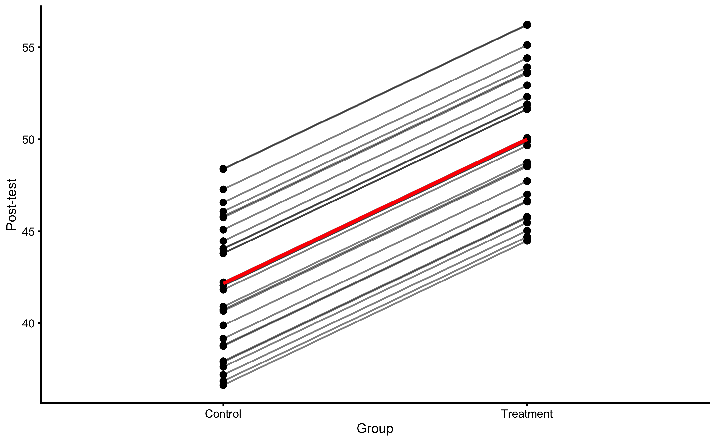
Figure 4.13: PDP and ICE plot for Group variable using ANCOVA RCT model
Besides PDP and ICE plot, we can also create a counterfactual plot for each athlete. For example, for the athletes in the Treatment group, we are interested how would the predicted Post-test change (given model used) if they are in the Control group and vice versa for the athletes from the Control group. This is done by flipping “Treatment” and “Control” in the Group column and predicting Post-test using the trained model. Figure 4.14 depicts this visually for each athlete. Arrows represents predicted Change when flipping the Group variable.
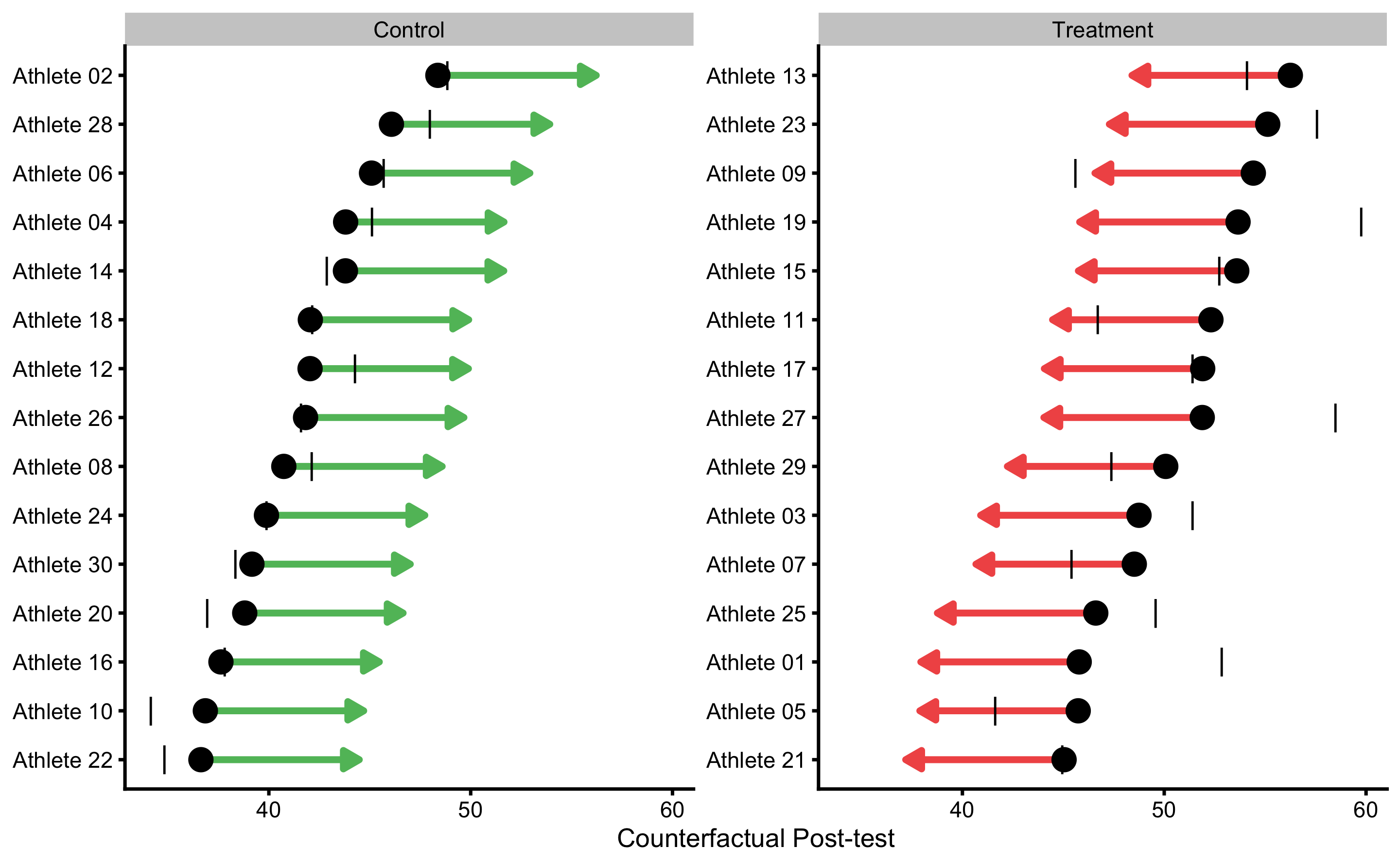
Figure 4.14: Individual counterfactual prediction when the Group changes. This way we can estimate model counterfactual predictions when the treatment changes (i.e. Controls receive treatment, and Treatment doesn’t receive treatment). Arrows thus represent model predicted Individual Treatment Effects (pITE). Arrows are color coded based on the magnitude of the effect using defined SESOI (±2.5cm in this example): grey for equivalent magnitude, green for lower magnitude, and red for higher magnitude. Vertical line indicates observed Post-test scores.
This analysis allows us to estimate counterfactual individual causal (treatment) effects (ITE) predicted by the model. These are indicated with the arrows on the Figure 4.14. Mathematically, arrow width is calculates using the Equation (4.8).
\[\begin{equation} \widehat{ITE_i} = \widehat{y_{i}^{Group=Treatment}} - \widehat{y_{i}^{Group=Control}} \tag{4.8} \end{equation}\]
Since ANCOVA RCT model is used, which predicts average Group effect for every participant, estimated counterfactual ITEs are all the same and are equal to -7.85cm. Table 4.19 contains all individual model predictions using ANCOVA RCT model.
| subject | group | observed | predicted | residual | magnitude | counterfactual | pITE | pITE_magnitude |
|---|---|---|---|---|---|---|---|---|
| Athlete 12 | Control | 44.29 | 42.04 | -2.25 | Equivalent | 49.89 | 7.85 | Higher |
| Athlete 28 | Control | 47.98 | 46.07 | -1.91 | Equivalent | 53.92 | 7.85 | Higher |
| Athlete 04 | Control | 45.13 | 43.80 | -1.33 | Equivalent | 51.65 | 7.85 | Higher |
| Athlete 02 | Control | 48.86 | 48.37 | -0.48 | Equivalent | 56.22 | 7.85 | Higher |
| Athlete 08 | Control | 42.13 | 40.74 | -1.39 | Equivalent | 48.59 | 7.85 | Higher |
| Athlete 26 | Control | 41.61 | 41.82 | 0.21 | Equivalent | 49.67 | 7.85 | Higher |
| Athlete 06 | Control | 45.70 | 45.09 | -0.61 | Equivalent | 52.93 | 7.85 | Higher |
| Athlete 14 | Control | 42.89 | 43.79 | 0.90 | Equivalent | 51.64 | 7.85 | Higher |
| Athlete 18 | Control | 42.15 | 42.06 | -0.10 | Equivalent | 49.90 | 7.85 | Higher |
| Athlete 16 | Control | 37.83 | 37.63 | -0.21 | Equivalent | 45.47 | 7.85 | Higher |
| Athlete 22 | Control | 34.83 | 36.63 | 1.80 | Equivalent | 44.48 | 7.85 | Higher |
| Athlete 24 | Control | 39.88 | 39.88 | 0.00 | Equivalent | 47.73 | 7.85 | Higher |
| Athlete 30 | Control | 38.34 | 39.16 | 0.82 | Equivalent | 47.01 | 7.85 | Higher |
| Athlete 20 | Control | 36.97 | 38.80 | 1.84 | Equivalent | 46.65 | 7.85 | Higher |
| Athlete 10 | Control | 34.15 | 36.85 | 2.70 | Higher | 44.70 | 7.85 | Higher |
| Athlete 01 | Treatment | 52.86 | 45.79 | -7.08 | Lower | 37.94 | -7.85 | Lower |
| Athlete 27 | Treatment | 58.50 | 51.88 | -6.62 | Lower | 44.04 | -7.85 | Lower |
| Athlete 19 | Treatment | 59.76 | 53.66 | -6.10 | Lower | 45.81 | -7.85 | Lower |
| Athlete 25 | Treatment | 49.58 | 46.61 | -2.98 | Lower | 38.76 | -7.85 | Lower |
| Athlete 03 | Treatment | 51.41 | 48.75 | -2.66 | Lower | 40.90 | -7.85 | Lower |
| Athlete 23 | Treatment | 57.57 | 55.13 | -2.44 | Equivalent | 47.28 | -7.85 | Lower |
| Athlete 17 | Treatment | 51.41 | 51.91 | 0.49 | Equivalent | 44.06 | -7.85 | Lower |
| Athlete 21 | Treatment | 44.95 | 45.04 | 0.09 | Equivalent | 37.19 | -7.85 | Lower |
| Athlete 15 | Treatment | 52.73 | 53.59 | 0.86 | Equivalent | 45.75 | -7.85 | Lower |
| Athlete 29 | Treatment | 47.38 | 50.08 | 2.69 | Higher | 42.23 | -7.85 | Lower |
| Athlete 13 | Treatment | 54.11 | 56.25 | 2.14 | Equivalent | 48.40 | -7.85 | Lower |
| Athlete 05 | Treatment | 41.63 | 45.74 | 4.11 | Higher | 37.89 | -7.85 | Lower |
| Athlete 07 | Treatment | 45.41 | 48.52 | 3.11 | Higher | 40.67 | -7.85 | Lower |
| Athlete 11 | Treatment | 46.72 | 52.31 | 5.59 | Higher | 44.47 | -7.85 | Lower |
| Athlete 09 | Treatment | 45.62 | 54.42 | 8.80 | Higher | 46.57 | -7.85 | Lower |
PDP and ICE plots, as well as individual treatment effects plots (and estimates) can be very valuable tool in visualizing the causal effects, which are appropriate in this case since we are analyzing RCT data. But we need to be very wary when using them with the observational data and giving them causal interpretation.
4.7.3 Direct and indirect effect, covariates and then some
In the previous RCT example, we have assumed binary treatment (either plyometric training is done or not), whereas in real life there can be nuances in the treatment, particularly in volume of jumps performed, making the treatment continuous rather than binary variable. This way, we are interested in the effects of number of jumps on the changes in vertical jump height.
There could also be hidden variables involved that moderate and mediate the effects of the treatment28. For example, the higher someone jumps in the Pre-test, the lower the change in the Post-test (i.e. it is harder to improve vertical jump height). Or, the stronger someone is in the Pre-test (measured using relative back squat 1RM) the more potentiated the effects of the plyometrics are. All these are needed expert subject-matter knowledge, required to understand the underlying DGP (and thus to avoid introducing bias in causal analyses; see (125)). With such causal structure, we do not have direct treatment effect (plyometric –> change in vertical jump) only anymore, but moderated and mediated, or indirect effects estimated using the interactions in the regression models.
To explain these concepts, let’s assume that that besides Pre-test and Post-test scores in our RCT study, we have also measured Back squat relative 1RMs since we believed that strength of the individual will moderate the effects of the plyometric treatment. This data is enlisted in the Table 4.20. Squat 1RM in this case represent characteristic of the subject, or a covariate. Additional covariates (not considered here) might include gender, experience, height, weight and so forth.
| Athlete | Squat 1RM | Group | Pre-test (cm) | Post-test (cm) | Change (cm) |
|---|---|---|---|---|---|
| Athlete 12 | 1.53 | Control | 42.56 | 44.29 | 1.01 |
| Athlete 28 | 1.59 | Control | 47.06 | 47.98 | 0.55 |
| Athlete 04 | 1.49 | Control | 44.53 | 45.13 | 0.12 |
| Athlete 02 | 1.31 | Control | 49.63 | 48.86 | -0.01 |
| Athlete 08 | 1.77 | Control | 41.11 | 42.13 | -0.45 |
| Athlete 26 | 1.34 | Control | 42.31 | 41.61 | -0.51 |
| Athlete 06 | 1.33 | Control | 45.96 | 45.70 | -0.52 |
| Athlete 14 | 2.03 | Control | 44.51 | 42.89 | -0.63 |
| Athlete 18 | 1.21 | Control | 42.57 | 42.15 | -0.74 |
| Athlete 16 | 1.91 | Control | 37.63 | 37.83 | -0.75 |
| Athlete 22 | 1.49 | Control | 36.52 | 34.83 | -0.97 |
| Athlete 24 | 1.37 | Control | 40.15 | 39.88 | -1.03 |
| Athlete 30 | 1.04 | Control | 39.34 | 38.34 | -1.21 |
| Athlete 20 | 1.58 | Control | 38.94 | 36.97 | -1.72 |
| Athlete 10 | 1.67 | Control | 36.77 | 34.15 | -2.26 |
| Athlete 01 | 2.05 | Treatment | 37.98 | 52.86 | 14.93 |
| Athlete 27 | 2.05 | Treatment | 44.79 | 58.50 | 13.43 |
| Athlete 19 | 1.87 | Treatment | 46.77 | 59.76 | 12.99 |
| Athlete 25 | 1.97 | Treatment | 38.90 | 49.58 | 10.81 |
| Athlete 03 | 1.79 | Treatment | 41.29 | 51.41 | 10.34 |
| Athlete 23 | 1.44 | Treatment | 48.41 | 57.57 | 8.58 |
| Athlete 17 | 1.21 | Treatment | 44.81 | 51.41 | 7.85 |
| Athlete 21 | 1.49 | Treatment | 37.14 | 44.95 | 7.37 |
| Athlete 15 | 1.43 | Treatment | 46.69 | 52.73 | 6.14 |
| Athlete 29 | 1.22 | Treatment | 42.77 | 47.38 | 5.02 |
| Athlete 13 | 1.18 | Treatment | 49.66 | 54.11 | 4.46 |
| Athlete 05 | 1.15 | Treatment | 37.92 | 41.63 | 3.78 |
| Athlete 07 | 1.21 | Treatment | 41.03 | 45.41 | 3.42 |
| Athlete 11 | 0.86 | Treatment | 45.27 | 46.72 | 1.82 |
| Athlete 09 | 0.69 | Treatment | 47.61 | 45.62 | -1.57 |
Since the individual are randomized into Treatment and Control groups, we expect that there is no difference between Squat 1RM betweem them. Figure 4.15 demonstrates that there is no difference between groups.
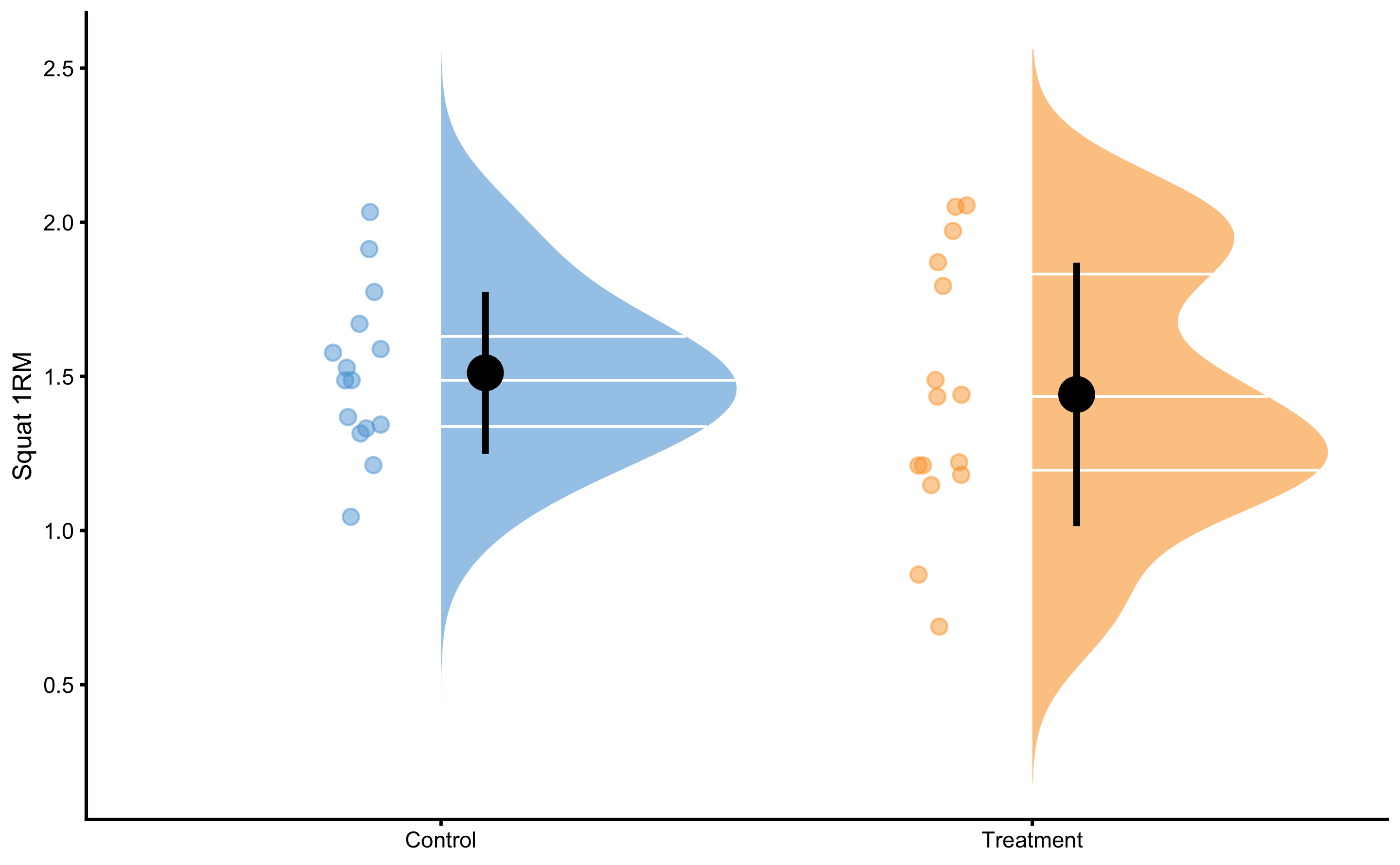
Figure 4.15: Squat 1RM scores for Control and Treatment groups. Since athletes are randomized, we expect them to be similar (i.e. no selection bias involved)
Before modeling this RCT data, let’s check visually the relationship between Pre-test and Change (panel A), Squat 1RM and Change (panel B), and Pre-test and Squat 1RM (panel C) (Figure 4.16).
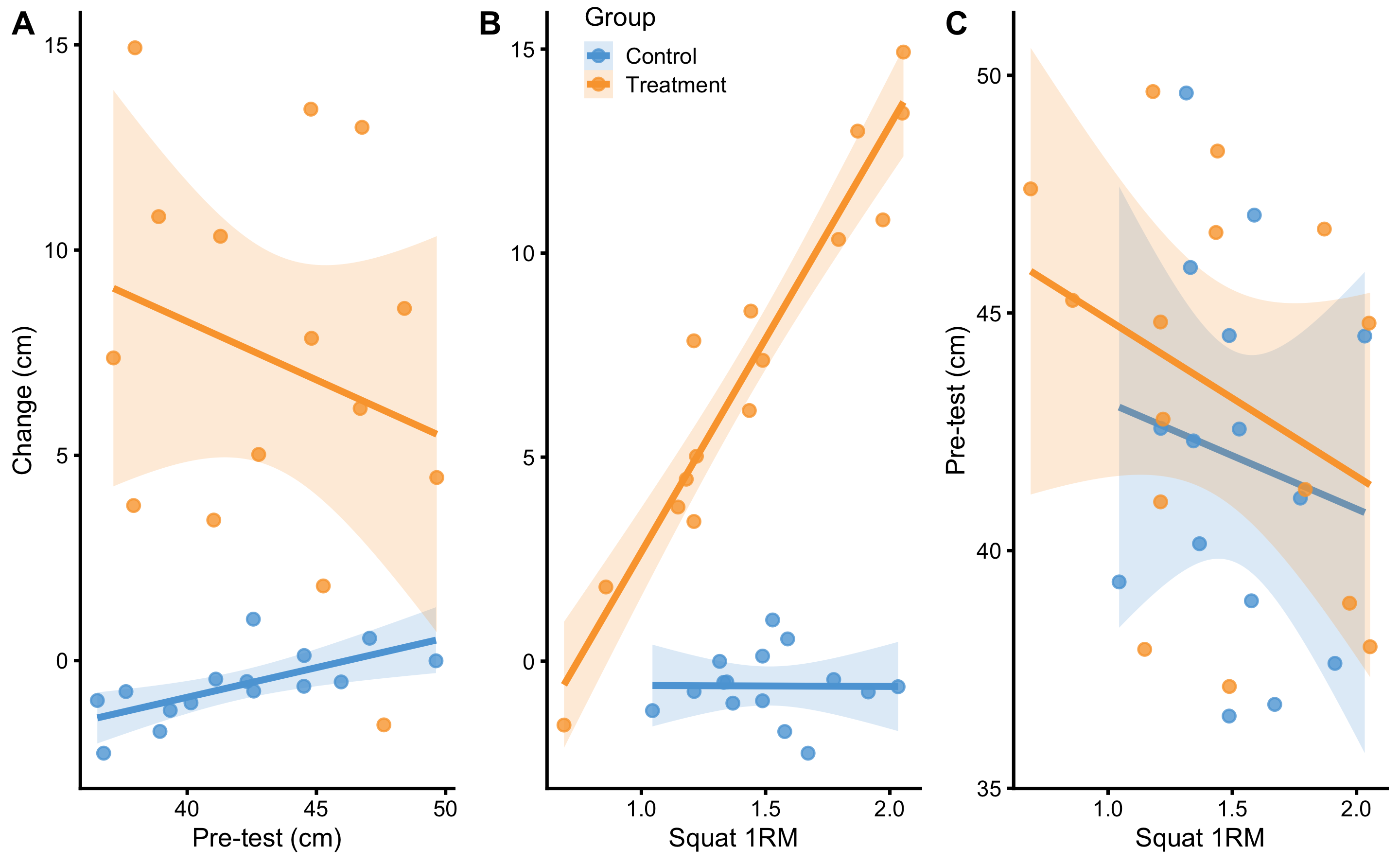
Figure 4.16: Relationship between predictors. A. Relationship between Pre-test and Change scores. Lines indicate linear regression model and are used to indicate relationship and interaction. Colored area represent 95% confidence intervals (see Statistical inference section for more information). If there is no interaction between Pre-test and Change score, the lines would be parallel. As can be seen with the Treatment group, it seems that individuals with higher Pre-test demonstrates lower Change, and vice versa for the Control group. But if we check the confidence interval area, these are due to random chance. B. Relationship between Squat 1RM and Change scores. Visual analysis indicates that individuals in the Treatment group with the higher Squat 1RM demonstrates higher changes after the training intervention. C. Relationship between Squat 1RM and Pre-test predictors. It seems that, in both groups, athletes with higher Squat 1RM scores have lower Pre-test values. Checking confidence interval areas, this relationship is due to random chance.
As can be seen from the Figure 4.16, there seems to be some interaction between Squat 1RM and Change. Other panels indicate that there might be some relationship (i.e. interaction), but 95% confidence intervals around the regression lines indicate that these are due to random chance (see Statistical inference chapter for more info; for now you do not need to understand this concept).
What does interaction mean? If we check the panel C in the Figure 4.16, interaction refers to change in regression line slopes. If the Group regression lines are parallel, then the distance between them is due to effect of treatment (i.e. direct or main effect of treatment). Since they are not parallel, it means that Squat 1RM and treatment interact: the higher the Squat 1RM for the Treatment group, the higher the Change, while that is not the case for the Control group. Mathematically, interaction is a simple multiplication between two predictors, as cab be seen in the Table 4.21.
| Athlete | groupTreatment | Squat 1RM | groupTreatment:Squat 1RM | Pre-test (cm) | Change (cm) |
|---|---|---|---|---|---|
| Athlete 12 | 0 | 1.53 | 0.00 | 42.56 | 1.01 |
| Athlete 28 | 0 | 1.59 | 0.00 | 47.06 | 0.55 |
| Athlete 04 | 0 | 1.49 | 0.00 | 44.53 | 0.12 |
| Athlete 02 | 0 | 1.31 | 0.00 | 49.63 | -0.01 |
| Athlete 08 | 0 | 1.77 | 0.00 | 41.11 | -0.45 |
| Athlete 26 | 0 | 1.34 | 0.00 | 42.31 | -0.51 |
| Athlete 06 | 0 | 1.33 | 0.00 | 45.96 | -0.52 |
| Athlete 14 | 0 | 2.03 | 0.00 | 44.51 | -0.63 |
| Athlete 18 | 0 | 1.21 | 0.00 | 42.57 | -0.74 |
| Athlete 16 | 0 | 1.91 | 0.00 | 37.63 | -0.75 |
| Athlete 22 | 0 | 1.49 | 0.00 | 36.52 | -0.97 |
| Athlete 24 | 0 | 1.37 | 0.00 | 40.15 | -1.03 |
| Athlete 30 | 0 | 1.04 | 0.00 | 39.34 | -1.21 |
| Athlete 20 | 0 | 1.58 | 0.00 | 38.94 | -1.72 |
| Athlete 10 | 0 | 1.67 | 0.00 | 36.77 | -2.26 |
| Athlete 01 | 1 | 2.05 | 2.05 | 37.98 | 14.93 |
| Athlete 27 | 1 | 2.05 | 2.05 | 44.79 | 13.43 |
| Athlete 19 | 1 | 1.87 | 1.87 | 46.77 | 12.99 |
| Athlete 25 | 1 | 1.97 | 1.97 | 38.90 | 10.81 |
| Athlete 03 | 1 | 1.79 | 1.79 | 41.29 | 10.34 |
| Athlete 23 | 1 | 1.44 | 1.44 | 48.41 | 8.58 |
| Athlete 17 | 1 | 1.21 | 1.21 | 44.81 | 7.85 |
| Athlete 21 | 1 | 1.49 | 1.49 | 37.14 | 7.37 |
| Athlete 15 | 1 | 1.43 | 1.43 | 46.69 | 6.14 |
| Athlete 29 | 1 | 1.22 | 1.22 | 42.77 | 5.02 |
| Athlete 13 | 1 | 1.18 | 1.18 | 49.66 | 4.46 |
| Athlete 05 | 1 | 1.15 | 1.15 | 37.92 | 3.78 |
| Athlete 07 | 1 | 1.21 | 1.21 | 41.03 | 3.42 |
| Athlete 11 | 1 | 0.86 | 0.86 | 45.27 | 1.82 |
| Athlete 09 | 1 | 0.69 | 0.69 | 47.61 | -1.57 |
But as already alluded, the use of Change scores should be avoided. Let’s see this exact graphs, but using Post-test (Figure 4.17) as our variable of interest (i.e. outcome variable).
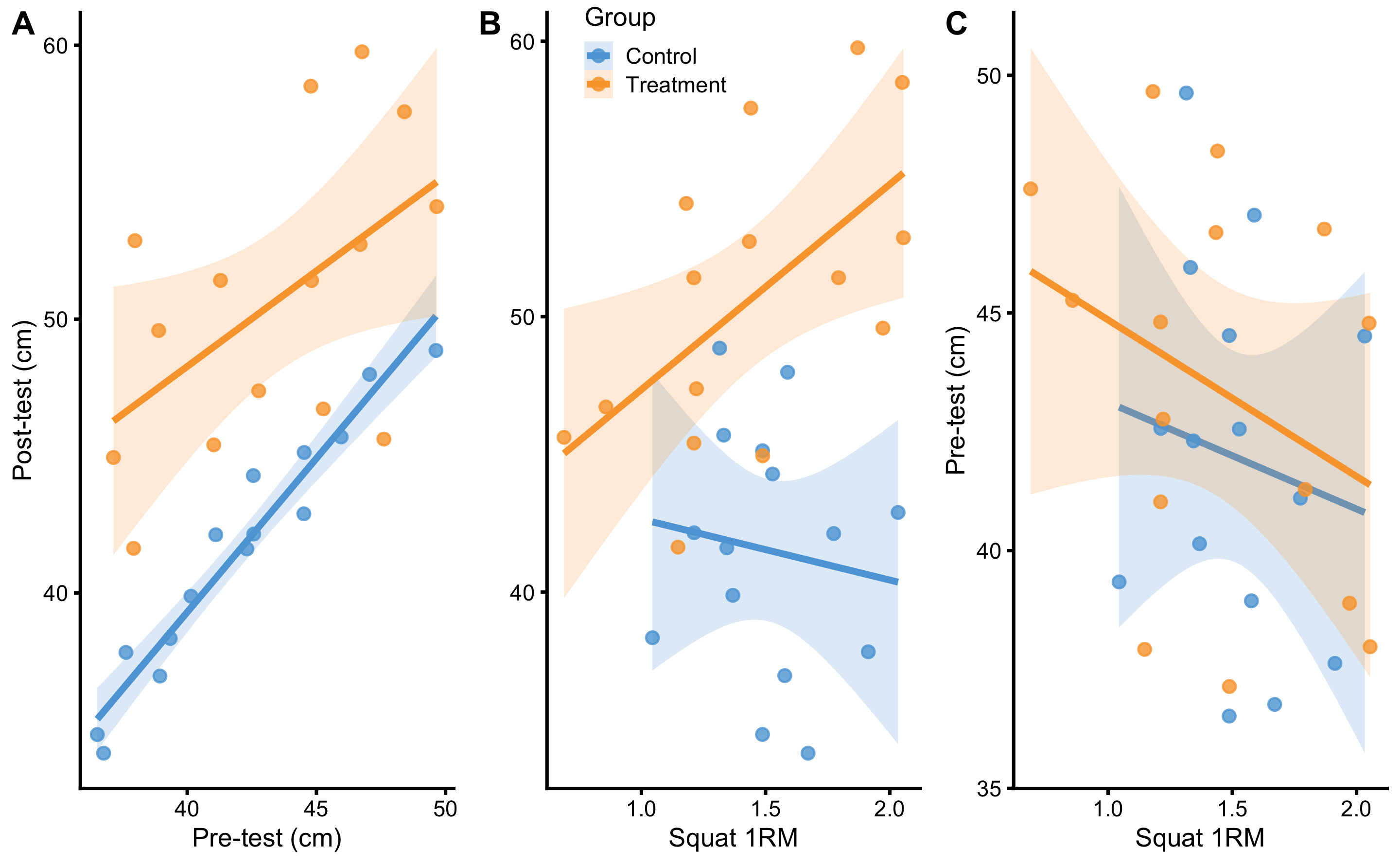
Figure 4.17: Relationship between predictors. A. Relationship between Pre-test and Post-test scores. Lines indicate linear regression model and are used to indicate relationship and interaction. Colored area represent 95% confidence intervals (see Statistical inference section for more information). If there is no interaction between Pre-test and Post-test score, the lines would be parallel. As can be seen on the figure, there doesn’t seem to be interaction involved. B. Relationship between Squat 1RM and Post-test scores. Visual analysis indicates that individuals in the Treatment group with the higher Squat 1RM demonstrates higher Post-test scores after the training intervention. C. Relationship between Squat 1RM and Pre-test predictors. It seems that, in both groups, athletes with higher Squat 1RM scores have lower Pre-test values. Checking confidence interval areas, this relationship is due to random chance.
Let’s apply linear regression model to these predictors. The parameters we are going to estimate are enlisted in the linear Equation (4.9).
\[\begin{equation} \widehat{Post} = \hat{\beta_0} + \hat{\beta_1}Group + \hat{\beta_2}Pre + \hat{\beta_3}Squat\:1RM + \hat{\beta_4}Group:Squat\:1RM \tag{4.9} \end{equation}\]
Estimated parameters for this linear model with interaction are enlisted in the Table 4.22.
| Intercept | groupTreatment | Pre-test | Squat 1RM | Group:Squat 1RM |
|---|---|---|---|---|
| -5.21 | -8.03 | 1.1 | 0.26 | 10.82 |
If we check the estimated coefficient for the group Treatment in the Table 4.22, which is equal to -8.03, can we conclude that this is the whole effect of treatment (i.e. plyometric treatment)? Luckily no! This coefficient represents direct treatment effect, but there are indirect treatment effects due to Squat 1RM and interaction between Squat 1RM and Group. This also assumes that we have not introduced bias in treatment effect estimation by adjusting (or by not adjusting) for covariates that we should not adjust for (or vice versa; for great applied paper please refer to (125)).
Figure 4.18 depicts residuals of the RCT model with interactions.
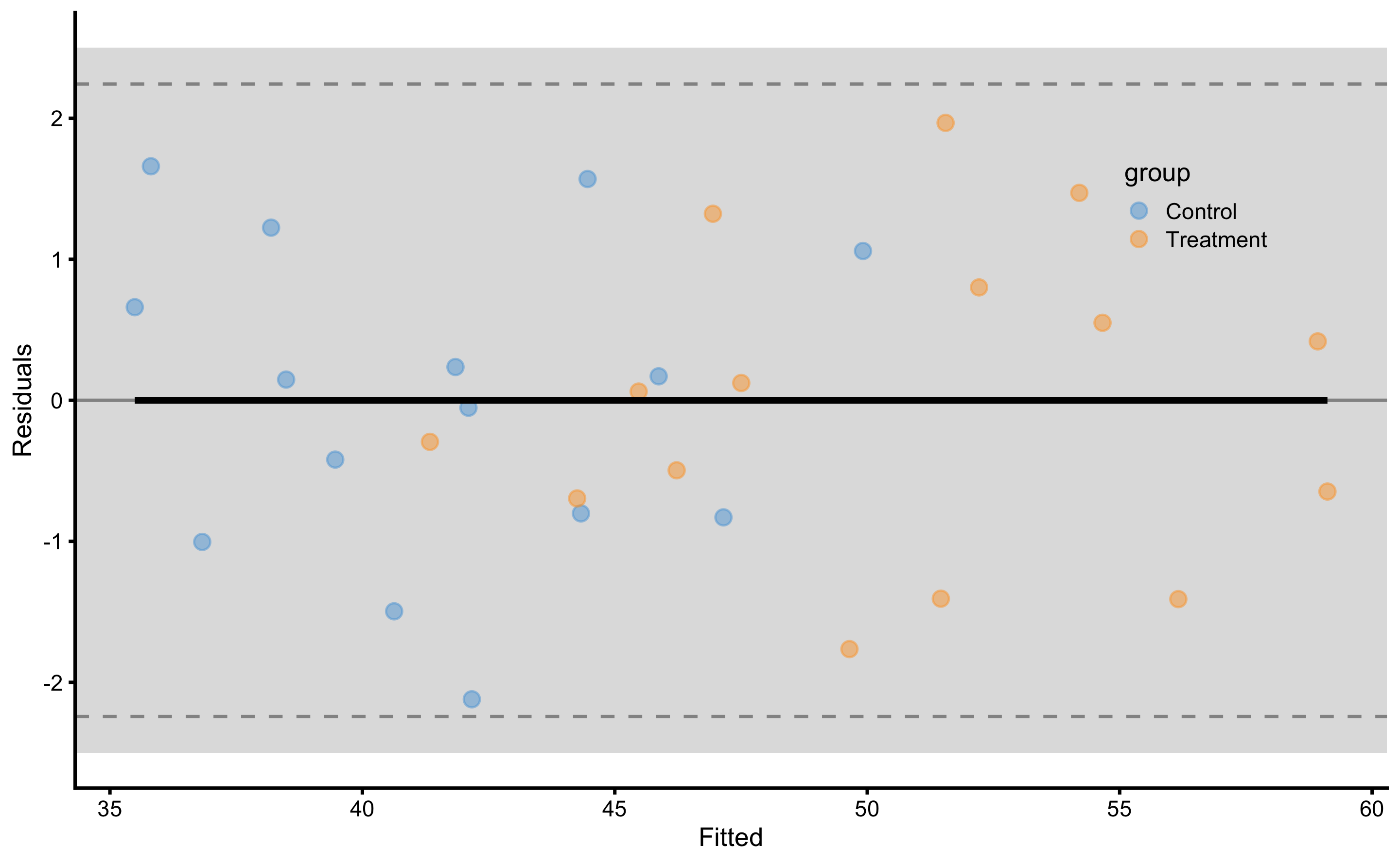
Figure 4.18: Residuals of the linear regression RCT model with interaction. Grey band on both panels represents SESOI of ±2.5cm
As opposed to the Figures 4.6 and 4.8, we can quickly see that this model have almost all residuals in the SESOI band. Table 4.23 contains cross-validated model performance (using the same 10 repeats of 3 folds cross-validation splits as used in the simple and ANCOVA RCT models).
| metric | training | training.pooled | testing.pooled | mean | SD | min | max |
|---|---|---|---|---|---|---|---|
| MBE | 0.00 | 0.00 | 0.07 | 0.07 | 0.61 | -1.40 | 1.18 |
| MAE | 0.90 | 0.81 | 1.19 | 1.19 | 0.25 | 0.75 | 1.76 |
| RMSE | 1.08 | 1.00 | 1.46 | 1.43 | 0.27 | 0.89 | 1.99 |
| PPER | 0.97 | 0.99 | 0.91 | 0.87 | 0.06 | 0.74 | 0.97 |
| SESOI to RMSE | 4.64 | 5.02 | 3.43 | 3.61 | 0.73 | 2.52 | 5.61 |
| R-squared | 0.97 | 0.98 | 0.95 | 0.95 | 0.02 | 0.88 | 0.98 |
| MinErr | -2.12 | -2.40 | -2.72 | -1.90 | 0.58 | -2.72 | -0.76 |
| MaxErr | 1.97 | 2.12 | 3.15 | 2.27 | 0.80 | 0.32 | 3.15 |
| MaxAbsErr | 2.12 | 2.40 | 3.15 | 2.57 | 0.42 | 1.65 | 3.15 |
As expected, predictive performance metrics are now much better. Let’s inspect the athlete’s residuals (Figure 4.19).
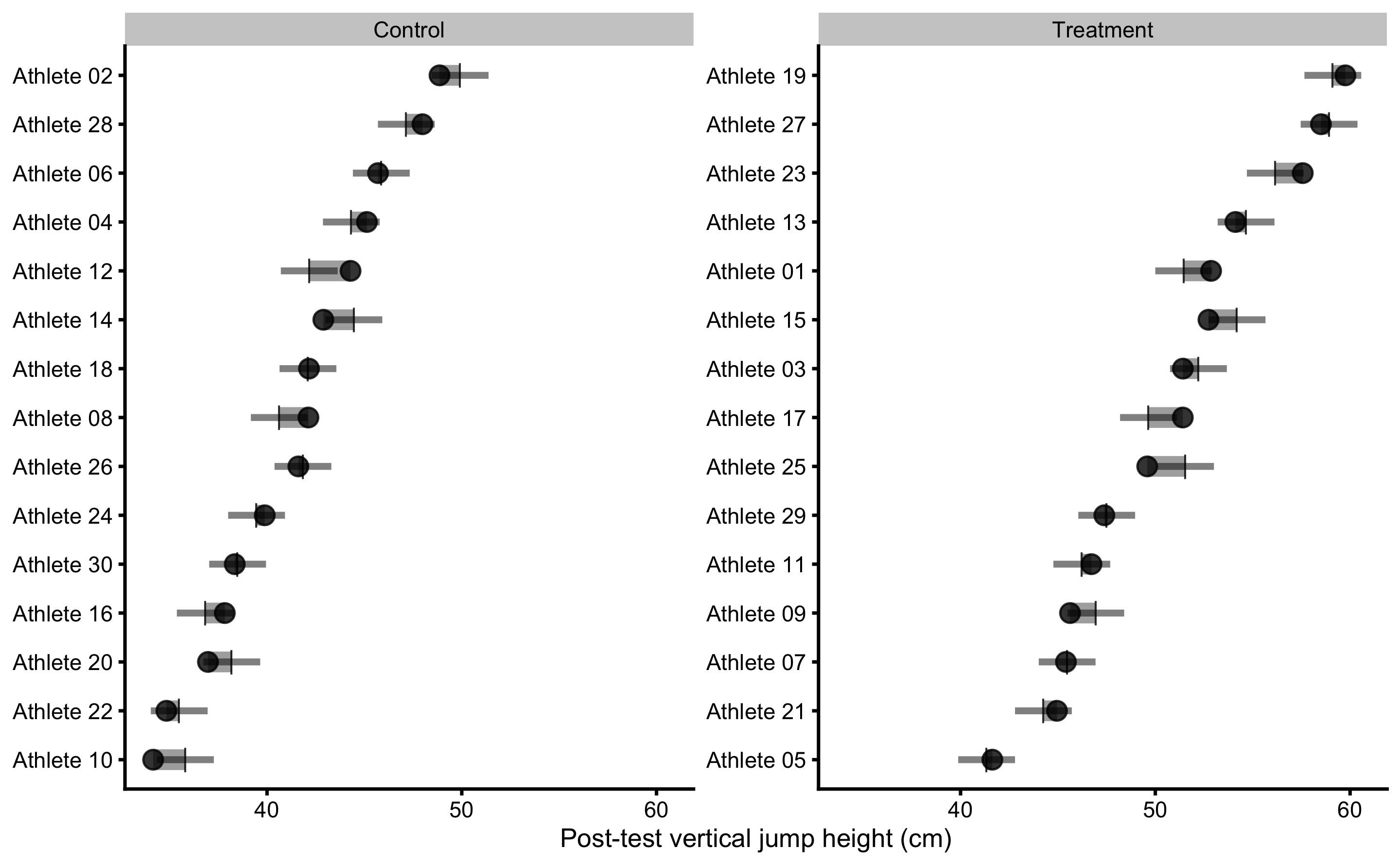
Figure 4.19: Observed Post-test in vertical jump for each athlete in the study. Black dot indicate observed Post-test; vertical line indicate model prediction; colored bar indicated the residual magnitude compared to defined SESOI (±2.5cm in this example): grey for equivalent magnitude, green for lower magnitude, and red for higher magnitude; horizontal error bar represents cross-validated RMSE (see Table 4.23, RMSE metric, column testing.pooled) and is used to indicate visually model predictive performance and uncertainty around model prediction
If we compare residuals from the simple model (Figure 4.11) and ANCOVA RCT model (Figure 4.10), in RCT model with interactions the residuals are much smaller, indicating better prediction. You can also see that model predictions differ, as opposed to simple model that predicted same Change values for all athletes in the Control and Treatment groups. Athletes who are flagged (have residual bigger than SESOI) might need further inspection, since given training data and model, these demonstrate Post-test that is larger/smaller than expected taking their covariates into account (in this case Strength 1RM).
Figure 4.20 depicts prediction errors during cross-validation for each athlete. This analysis, together with the Figure 4.19, can be used to detect athletes that are troublesome for the predictive model, and thus bear some further inspection.
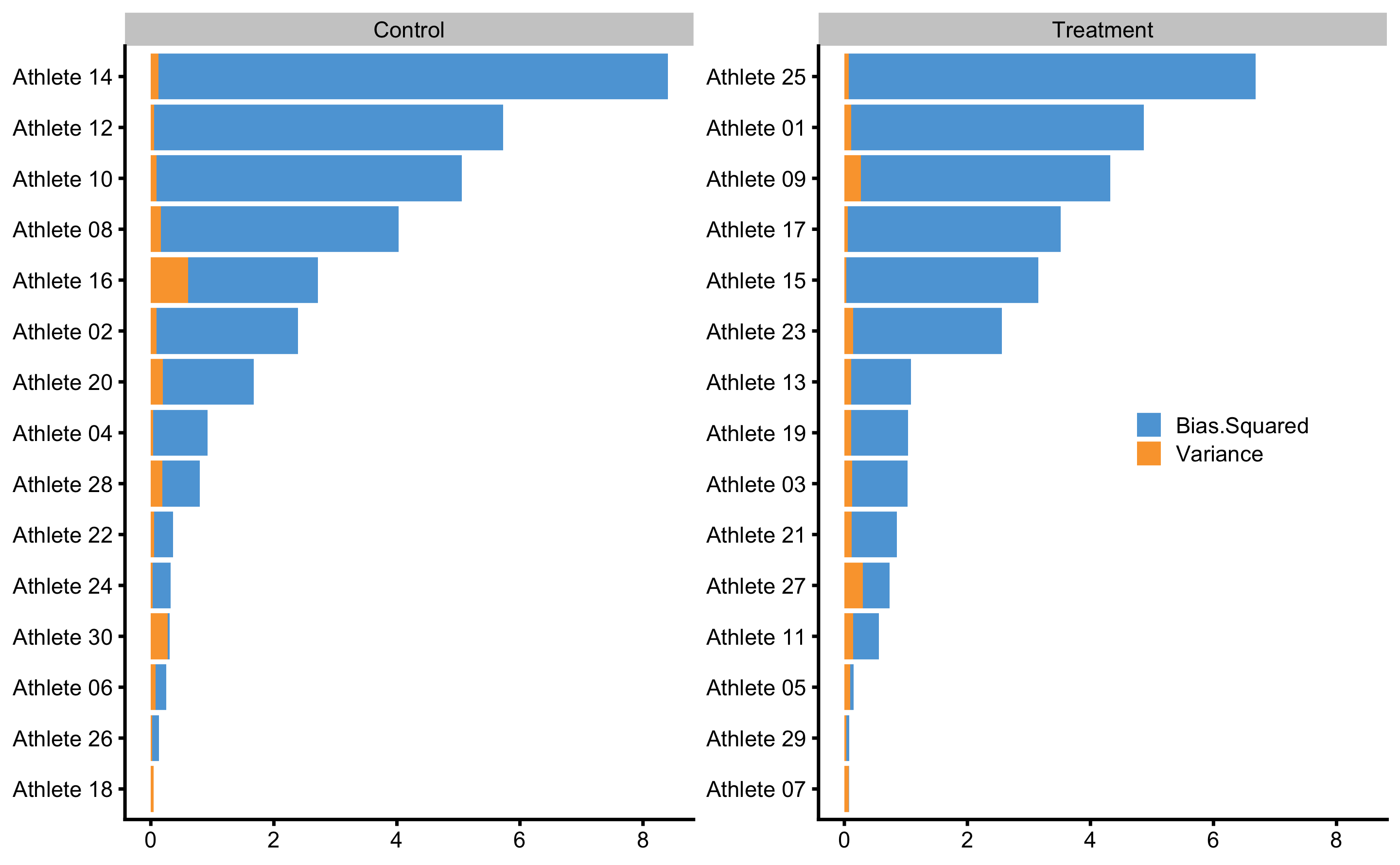
Figure 4.20: Bias-variance across 10 times repeated 3-fold cross-validation for each athlete. This analysis can also be utilize to flag certain observations (i.e. athlete in this case) that are troublesome for the predictive model
Interpreting and understanding direct and indirect effects can be quite difficult, especially when causal structure becomes complex. Visualization techniques such as already mentioned PDP and ICE graphs can be utilized to understand the causal mechanism (60,207). These techniques can also be implemented in observational studies, but with considerable domain knowledge and assumptions needed (207). Although predictive analysis, particularly those using black box machine learning models, has been criticized to lack causal interpretation (76,148,150), they can complement causal (or explanatory) analysis (27,177,206). Figure 4.21 depicts PDP and ICE plots for Group and Strength 1RM predictors.
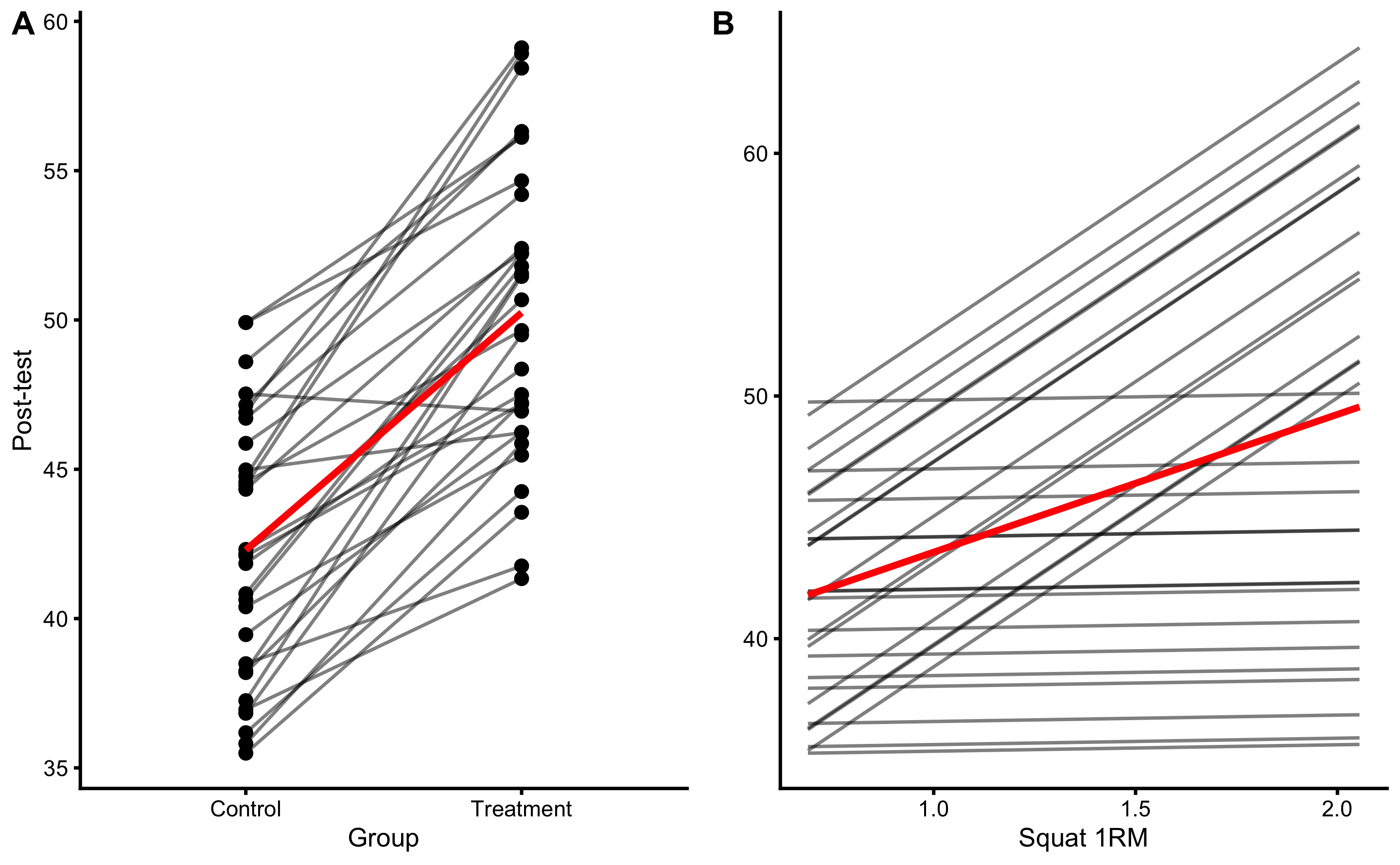
Figure 4.21: PDP and ICE plots for Group and Strength 1RM predictors using RCT model with interaction
Since this is RCT, we can give causal interpretation to PDP and ICE plot, particularly panel B in the Figure 4.21. According to this analysis (given the data and the model), if one increase Squat 1RM, the effect of treatment (i.e. plyometric training) will be higher. This can be further analyzed using each athlete. The question we would like to answer (given the data collected and the model) is “How would particular athlete respond to the treatment if his strength was higher or lower?”. Figure 4.22 shows ICE plots in separate facets. This gives us the ability to analyze (given the data and the model) how would each athlete respond if his or her Squat 1RM changed.
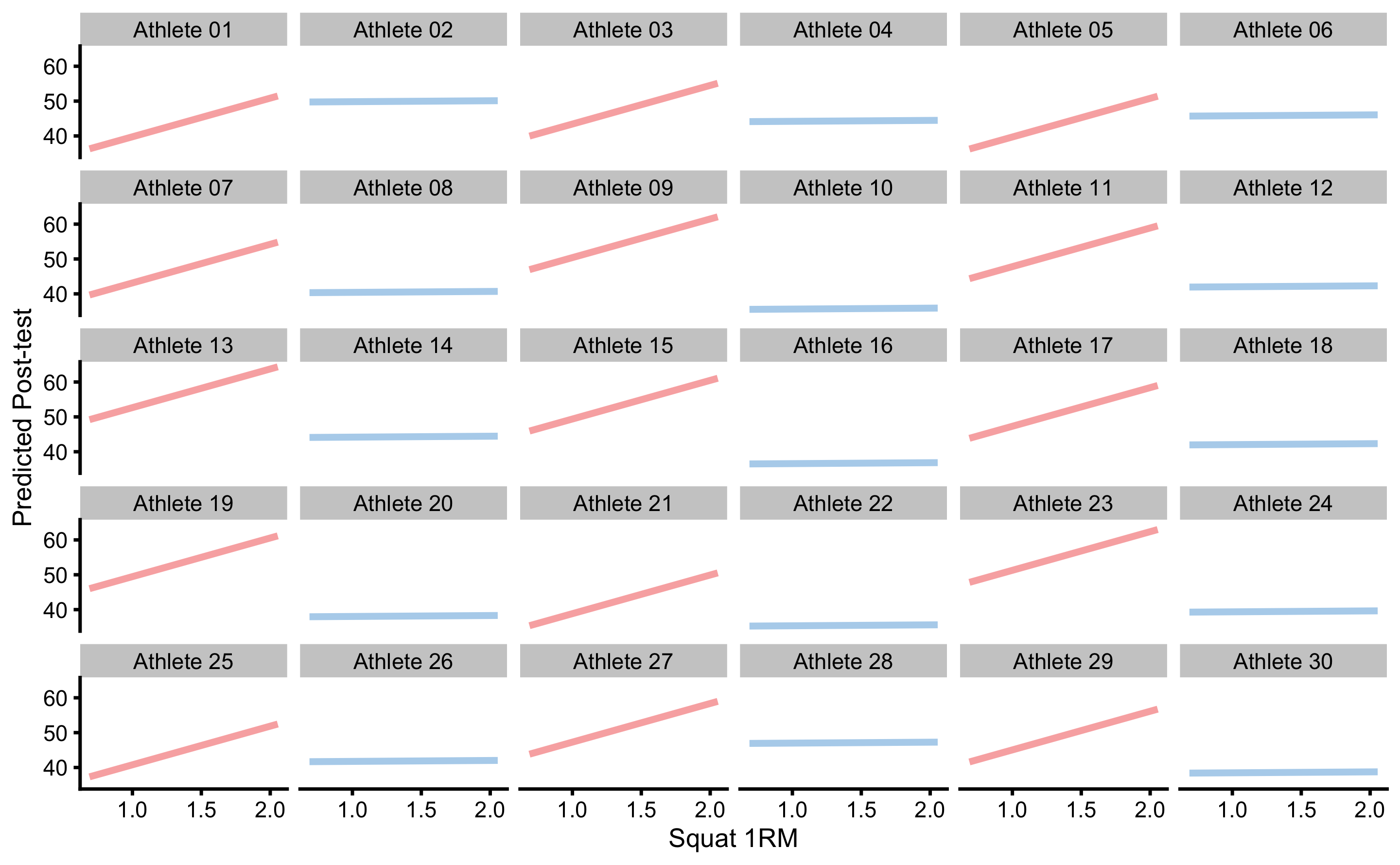
Figure 4.22: ICE plots for each athlete
Figure 4.23 depicts predicted ITE (i.e. what would happen if Groups flipped and everything else being equal). If we compare Figure 4.23 with Figure 4.14, we can quickly see that the ITEs differ and are not equal for every individual. If we calculate the mean of the ITEs (i.e. arrow lengths), we will get an estimate of ATE. SD of ITEs will give us estimate how variable the treatment effects are, or estimate of VTE. Since these are predicted with the model, I’ve used the terms pATE and pVTE indicating that they are estimated with the predictive model.
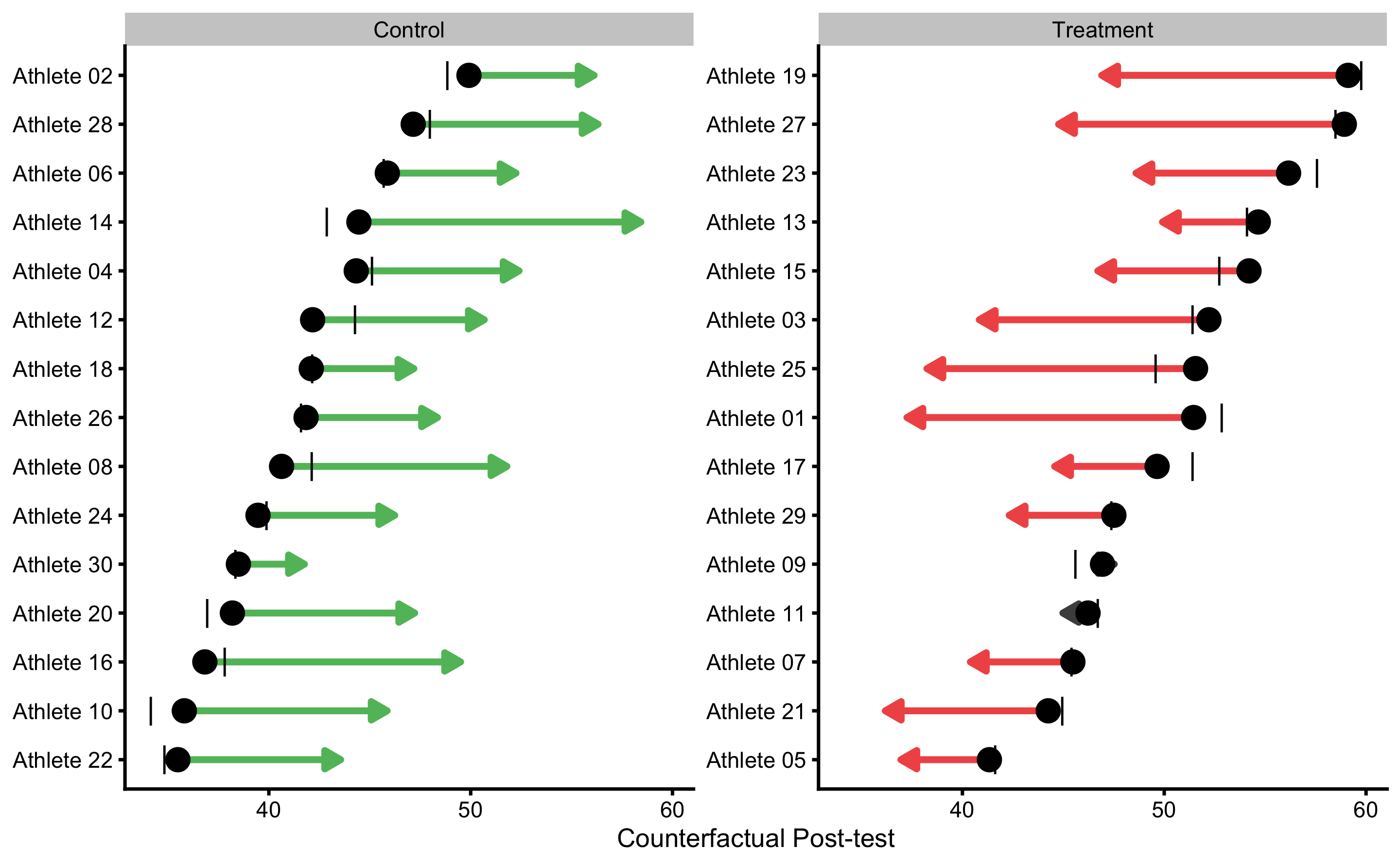
Figure 4.23: Individual counterfactual prediction when the Group changes. This way we can estimate model counterfactual predictions when the treatment changes (i.e. Controls receive treatment, and Treatment doesn’t receive treatment). Arrows thus represent model predicted Individual Treatment Effects (ITE). Vertical line indicates observed Change
Table 4.24 contains comparison between the ANCOVA RCT model (\(\widehat{Post} = \hat{\beta_0} + \hat{\beta_1}Group + \hat{\beta_2}Pre\)) and model with Squat 1RM and interaction term (\(\widehat{Post} = \hat{\beta_0} + \hat{\beta_1}Group + \hat{\beta_2}Pre + \hat{\beta_3}Squat\:1RM + \hat{\beta_4}Group:Squat\:1RM\)) for few estimators that are insightful for the comparison.
| estimator | ANCOVA.model | Interaction.model |
|---|---|---|
| Training RMSE | 3.31 | 1.08 |
| Training PPER | 0.54 | 0.97 |
| Training SESOI to RMSE | 1.51 | 4.64 |
| Training R-squared | 0.75 | 0.97 |
| CV RMSE | 3.68 | 1.46 |
| CV PPER | 0.50 | 0.91 |
| CV SESOI to RMSE | 1.36 | 3.43 |
| CV R-squared | 0.69 | 0.95 |
| SD Residual (Treatment) | 1.43 | 1.12 |
| SD Residual (Control) | 4.64 | 1.11 |
| pATE (Treatment) | -7.85 | -7.57 |
| pATE (Control) | 7.85 | 8.33 |
| pVTE (Treatment) | 0.00 | 4.62 |
| pVTE (Control) | 0.00 | 2.84 |
As can be seen in the Table 4.24, linear model with interactions predicts Post-test in the vertical jump height better than the ANCOVA model. This means that the variance in the treatment effect (SD Residual in the Table 4.24) is now explained with additional variables and their interactions29.
We are not only interested in prediction, but rather in the underlying causal structure and explaining this model performance when we intervene on variables (i.e. what happens to the target variable when I change X from a to b, while keeping other variables fixed - which is ceteris paribus condition). For this reason, PDP and ICE plots can be used to give causal interpretation of the model (see Figure 4.21). The main critique of Judea Pearl regarding the use of predictive models and techniques is the lack of counterfactual causal interpretation (148,150), particularly with observational studies. I agree that “the role of expert knowledge is the key difference between prediction and causal inference tasks” (76) and that “both prediction and causal inference require expert knowledge to formulate the scientific question, but only causal inference requires causal expert knowledge to answer the question” (76), but this doesn’t negate the need for providing predictive performance, as well as helping in interpreting the model when such data is available (207).
According to Zhao and Hastie (207): “There are three requirements to make causal interpretations: a model with good predictive performance, some domain knowledge in the form of a causal diagram and suitable visualization tools.”. The common denominator among multiple experts is that for causal inference and causal interpretation there is a need for domain knowledge, particularly when RCTs are not available. This domain knowledge can be made more transparent by using DAGs and other structural diagrams, and thus help in falsifying assumptions (56,71,74,76). Adding prediction to explanatory models can be seen as complement, particularly since statistical analysis has been neglecting predictive analysis over explanatory analysis (27,177,206).
4.7.4 Model selection
Besides applying model with a single interaction term, we can also apply models with more interactions, or quadratic or polynomial terms, or what have you. As we have seen in the Prediction chapter, these models can overfit quite easily. That is why we utilized cross-validation to check for model performance on the unseen data. But what if two or more models of different complexity perform similarly on the unseen data (i.e. when cross-validated)? This is the problem of model selection and comparison. Generally, we want to select the simplest model that gives us reliable predictions. Discussions regarding the model comparison and model selection are beyond the scope of this book, although I will provide few examples in the second part of the book.
The model definition should rely on pre-existing beliefs (i.e. subject-matter expert knowledge) around causal structure underlying intervention. If the statistical analysis is done to confirm the structural causal model, then this represents confirmatory analysis. Usually, these studies need to be pre-registered with the exact analysis workflow and assumption defined before data is collected. This is required because in the exploratory analysis one can play with the data, different models can be tried and the model that fits the data best can be selected. Exploratory analysis is useful for generating models and hypothesis for future studies, but also introduces hindsight bias since the model is selected after seeing the data or the results of multiple analyses. Very related is so called p-harking (Hypothesizing After Results are Known) which involves modifying the hypothesis or in this case causal model, after seeing the results, most often with the aim to reach statistical significance (discussed later in the Statistical inference section). In predictive analysis this hindsight bias is reduced by using hold-out sample, cross-validation, and evaluating the final model performance on the data that has not been seen by the model.
4.8 Ergodicity
Ergodic process is underlying DGP that is equivalent at between-individual (or inter-individual; or group-based analysis) and within-individual (or intra-individual or simply individual-based analysis) levels. Thus the causal effects identified using between-individual analysis can be applied to understand within-individual causation as well. Non-Ergodic process on the other hand differs between these two levels and effects identified at between-individual level cannot be inferred to within individual level.
Few authors have already brought into question the generalizability of group-based research to individual-based prediction and causal inferences (47,59,135,136). Here is an interesting quote from Molenaar (136):
“Most research methodology in the behavioral sciences employs inter-individual analyses, which provide information about the state of affairs of the population. However, as shown by classical mathematical-statistical theorems (the ergodic theorems), such analyses do not provide information for, and cannot be applied at, the level of the individual, except on rare occasions when the processes of interest meet certain stringent conditions. When psychological processes violate these conditions, the inter-individual analyses that are now standardly applied have to be replaced by analysis of intra-individual variation in order to obtain valid results.”
The individual counterfactual predictions (ITEs) and ICE plots thus rely on ergodicity, which represents big assumption. This means that we should be cautious when generalizing model predictions and causal explanations from group-based level to individual-level.
Data analysis at the individual level (i.e. collecting multiple data point for individuals) and identifying individual causal effects and predictions might be the step forward, but even with such an approach we are retrodicting under ceteris paribus conditions and we might not be able to predict future responses. For example, if we have collected responses to various interventions for a particular individual, we might not be able to estimate with certainty how he or she is going to respond to a familiar treatment in the future, since such a prediction relies on stationarity of the parameters or the underlying DGP (136).
But this doesn’t imply that all our efforts are useless. We just need to accept the uncertainty and the assumptions involved. For example, for completely novel subject, the best response estimate or prediction estimate is the expected response calculated by using the group-based analysis (i.e. average treatment effect). This represents the most likely response or prediction. But on top of providing these distribution-based or group-based estimates, one can provide expected uncertainties showing individual-based or response proportions as anchor-based (magnitude-based) estimates (44,143). It is important to note that these usually estimate the same information (44,143); e.g. the higher the Cohen's d the higher the proportion of higher responses. Thus reporting magnitude-based proportions as uncertainties together with expected responses using average-based approach at least help in communicating uncertainties much better than reporting solely average-based estimates. When warranted with the research question, researchers should also report predictive performances on unseen data, as well as underlying assumption using graphical models such as DAGs.
It might be the best to conclude the section on causal inference with the quote from Andrew Gelman’s paper (54):
“Casual inference will always be a challenge, partly because our psychological intuitions do not always match how the world works. We like to think of simple causal stories, but in the social world, causes and effects are complex. We—in the scientific community—still have not come to any agreement on how best to form consensus on causal questions: there is a general acceptance that experimentation is a gold standard, but it is not at clear how much experimentation should be done, to what extent we can trust inference from observational data, and to what extent experimentation should be more fully incorporated into daily practice (as suggested by some in the “evidence-based medicine” movement)."
References
9. Angrist, JD and Pischke, J-S. Mastering ’metrics: The path from cause to effect. Princeton ; Oxford: Princeton University Press, 2015.
27. Breiman, L. Statistical Modeling: The Two Cultures. Statistical Science 16: 199–215, 2001.
44. Estrada, E, Ferrer, E, and Pardo, A. Statistics for Evaluating Pre-post Change: Relation Between Change in the Distribution Center and Change in the Individual Scores. Frontiers in Psychology 9, 2019.
47. Fisher, AJ, Medaglia, JD, and Jeronimus, BF. Lack of group-to-individual generalizability is a threat to human subjects research. Proceedings of the National Academy of Sciences 115: E6106–E6115, 2018.
54. Gelman, A. Causality and Statistical Learning. American Journal of Sociology 117: 955–966, 2011.
56. Gelman, A and Hennig, C. Beyond subjective and objective in statistics. Journal of the Royal Statistical Society: Series A (Statistics in Society) 180: 967–1033, 2017.
59. Glazier, PS and Mehdizadeh, S. Challenging Conventional Paradigms in Applied Sports Biomechanics Research. Sports Medicine, 2018.
60. Goldstein, A, Kapelner, A, Bleich, J, and Pitkin, E. Peeking Inside the Black Box: Visualizing Statistical Learning with Plots of Individual Conditional Expectation. arXiv:13096392 [stat], 2013.Available from: http://arxiv.org/abs/1309.6392
66. Heckman, JJ. Rejoinder: Response to Sobel. Sociological Methodology 35: 135–150, 2005.
67. Hecksteden, A, Kraushaar, J, Scharhag-Rosenberger, F, Theisen, D, Senn, S, and Meyer, T. Individual response to exercise training - a statistical perspective. Journal of Applied Physiology 118: 1450–1459, 2015.
68. Hecksteden, A, Pitsch, W, Rosenberger, F, and Meyer, T. Repeated testing for the assessment of individual response to exercise training. Journal of Applied Physiology 124: 1567–1579, 2018.
71. Hernan, MA. Causal Knowledge as a Prerequisite for Confounding Evaluation: An Application to Birth Defects Epidemiology. American Journal of Epidemiology 155: 176–184, 2002.
73. Hernán, MA. Does water kill? A call for less casual causal inferences. Annals of epidemiology 26: 674–680, 2016.
74. Hernán, MA. Causal Diagrams: Draw Your Assumptions Before Your Conclusions Course | PH559x | edX. edX., 2017.Available from: https://courses.edx.org/courses/course-v1:HarvardX+PH559x+3T2017/course/
75. Hernán, MA. The C-Word: Scientific Euphemisms Do Not Improve Causal Inference From Observational Data. American Journal of Public Health 108: 616–619, 2018.
76. Hernán, MA, Hsu, J, and Healy, B. A Second Chance to Get Causal Inference Right: A Classification of Data Science Tasks. CHANCE 32: 42–49, 2019.
77. Hernán, MA and Robins, J. Causal Inference. Boca Raton: Chapman & Hall/CRC,.
78. Hernán, MA and Taubman, SL. Does obesity shorten life? The importance of well-defined interventions to answer causal questions. International Journal of Obesity 32: S8–S14, 2008.
87. Hopkins, WG. How to Interpret Changes in an Athletic Performance Test. 2, 2004.
89. Hopkins, WG. Individual responses made easy. Journal of Applied Physiology 118: 1444–1446, 2015.
91. J, T, L, B, T, H, J, R, M, W, and M, H. Different ways to estimate treatment effects in randomised controlled trials. Contemporary Clinical Trials Communications 10: 80–85, 2018.Available from: https://linkinghub.elsevier.com/retrieve/pii/S2451865417301849
105. Kleinberg, S. Why: A Guide to Finding and Using Causes. 1 edition. Beijing ; Boston: O’Reilly Media, 2015.
119. Lederer, DJ, Bell, SC, Branson, RD, Chalmers, JD, Marshall, R, Maslove, DM, et al. Control of Confounding and Reporting of Results in Causal Inference Studies. Guidance for Authors from Editors of Respiratory, Sleep, and Critical Care Journals. Annals of the American Thoracic Society 16: 22–28, 2019.
125. Lübke, K, Gehrke, M, Horst, J, and Szepannek, G. Why We Should Teach Causal Inference: Examples in Linear Regression With Simulated Data. Journal of Statistics Education 1–7, 2020.
135. Molenaar, PCM. A Manifesto on Psychology as Idiographic Science: Bringing the Person Back Into Scientific Psychology, This Time Forever. Measurement: Interdisciplinary Research & Perspective 2: 201–218, 2004.
136. Molenaar, PCM and Campbell, CG. The New Person-Specific Paradigm in Psychology. Current Directions in Psychological Science 18: 112–117, 2009.
143. Norman, GR, Gwadry Sridhar, F, Guyatt, GH, and Walter, SD. Relation of Distribution- and Anchor-Based Approaches in Interpretation of Changes in Health-Related Quality of Life: Medical Care 39: 1039–1047, 2001.
148. Pearl, J. The seven tools of causal inference, with reflections on machine learning. Communications of the ACM 62: 54–60, 2019.
150. Pearl, J and Mackenzie, D. The Book of Why: The New Science of Cause and Effect. 1 edition. New York: Basic Books, 2018.
158. Rohrer, JM. Thinking Clearly About Correlations and Causation: Graphical Causal Models for Observational Data. Advances in Methods and Practices in Psychological Science 1: 27–42, 2018.
163. Saddiki, H and Balzer, LB. A Primer on Causality in Data Science. arXiv:180902408 [stat], 2018.Available from: http://arxiv.org/abs/1809.02408
177. Shmueli, G. To Explain or to Predict? Statistical Science 25: 289–310, 2010.
178. Shrier, I and Platt, RW. Reducing bias through directed acyclic graphs. BMC Medical Research Methodology 8, 2008.
179. Swinton, PA, Hemingway, BS, Saunders, B, Gualano, B, and Dolan, E. A Statistical Framework to Interpret Individual Response to Intervention: Paving the Way for Personalized Nutrition and Exercise Prescription. Frontiers in Nutrition 5, 2018.
181. Textor, J, van der Zander, B, Gilthorpe, MS, Li’skiewicz, M, and Ellison, GTH. Robust causal inference using directed acyclic graphs: The R package “dagitty”. International Journal of Epidemiology dyw341, 2017.
206. Yarkoni, T and Westfall, J. Choosing Prediction Over Explanation in Psychology: Lessons From Machine Learning. Perspectives on Psychological Science 12: 1100–1122, 2017.
207. Zhao, Q and Hastie, T. Causal Interpretations of Black-Box Models. Journal of Business & Economic Statistics 1–10, 2019.
Another term used is average treatment effect (ATE)↩︎
Also referred to as \(SD_{IR}\) or standard deviation of the intervention responses (89,179). \(SD_{IR}\) or \(SD_{TE}\) represent estimate of treatment effect heterogeneity, also referred to as variable treatment effect (VTE)↩︎
Using the randomization in the RCT it is assumed that these hidden variables are equally distributed, and that there is no selection bias involved.↩︎
If you remember the footnote discussion on aleatory and epistemic uncertainty, this is example where what we believed to be aleatory uncertainty (inter-individual residual error or variation that we could not predict:
SD Residualin the Table 4.24) was actually epistemic uncertainty that we reduced with introducing new variables (Squat 1RM and interaction term) to the model. Although the inter-individual variation in the treatment effect remains (\(SD_{TE}\) or \(SD_{IR}\)), we are now able to predict individual responses more accurately.↩︎